Poor practice in plotting
August 9, 2013 at 8:30 AM by Dr. Drang
I think I’ve mentioned here before that I was among the last group of people whose first programs were written on punched cards. In the Fortran course I took as a freshman, we spent as much time learning how to use a keypunch machine as we did learning about DO loops.
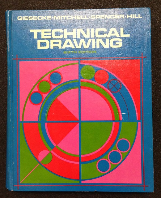
I was, similarly, among the last group of engineers who were required to take a drafting course. The text for the class was the sixth edition of Technical Drawing, by Giesecke, et al. Like many of my undergraduate texts, the cover design screams SEVENTIES.
The place of drafting in the engineering curriculum could be seen in the list of authors on the cover page. Professors of Drawing in engineering colleges were dying out and weren’t being replaced.
In addition to the expected topics of lettering, multiview projections, sectioning, and dimensioning, Technical Drawing had a few chapters at the end covering the construction of graphs and charts. This may seem weird, but of course we didn’t have computers to do our plotting for us. We did have graph paper in a multitude of designs, and that’s what was used for day-to-day plotting, but publication quality graphs weren’t done on graph paper, they were drawn by hand without the clutter of a fine background grid. It was pretty common in those days for the preface of an engineering textbook to acknowledge the draftsman who drew the book’s charts.1
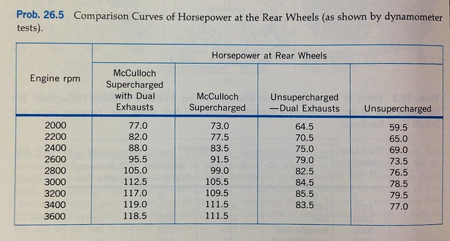
Some of the homework problems in the graphing chapters of Technical Drawing seem laughably simple to us now—a table of numbers that were to be turned into a bar or line chart.
But there were also nomograph problems that were quite tricky.
A teaching technique used throughout the book was to give examples of “poor practice.” These were constructions that weren’t wrong, per se, but weren’t exactly right, either. Sometimes the poor practice examples were just ugly; more often they lacked clarity. Engineering drawings are a means of communication, and clarity is valued for its efficiency. An example of poor practice was given in this set of labeled axes.
There’s nothing wrong with using numbers to designate the months of a year—it’s easy enough to convert from numbers to names—but it isn’t standard and wastes the time of the reader.
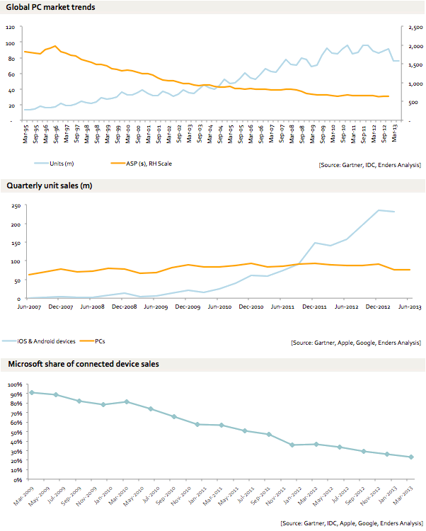
I thought about “poor practice” when I saw the graphs in this post by Benedict Evans a couple of weeks ago. There’s nothing wrong with his plots—it’s easy enough to interpret them—but they could use some tuning up for the sake of clarity.
Here, mashed together, are the three plots he used to make his case on the irrelevance of Microsoft:
The first thing we notice is that he uses three different ways of labeling the time axes: horizontal text, vertical text, and angled text. I can see using horizontal text in a graph that covers a short period of time, but there’s no reason to use both angled and vertical labels in the same article. Either one is fine—pick one and stick with it.
Second, if you’re going to present quarterly data and label every other quarter on your time axes, be consistent in which quarters you label. The top graph alternates between March and September while the middle graph alternates between June and December. There’s no reason for this inconsistency, especially since one of the data sets being graphed is the same in both plots. And since the date is quarterly, wouldn’t it be better for the ticks to be labeled as quarters (Q1, Q2, Q3, Q4) instead of months?
Also, why include ticks for the unlabeled quarters in the top graph, where the axis is much more crowded, and not in the middle graph, where there’s plenty of breathing room?
Two-digit years, four-digit years—either is fine. Choose.
Finally, the ticks and labels on the bottom graph are bizarre. The data being plotted are quarterly, but the ticks are spaced bimonthly. Half the ticks don’t correspond to any data point. The result is a graph that uses angled labels to squeeze more in even though it covers a shorter period of time than the middle graph. Also, angled labels are supposed to point toward their corresponding tick marks—see how Giesecke did it with the state labels.
These problems aren’t entirely Evans’ fault. The source of the inconsistencies, I’m sure, is the software he used to produce them. When scaling and labeling are chosen by an algorithm, they often aren’t the same from one graph to the next. This is a problem that wasn’t common in the old days when plots were made by hand and their design was decided upon ahead of time.
Still, it’s the responsibility of the author or designer to override the software defaults and bring order and clarity to the work as a whole. Evans obviously cares about his prose; he should bring that level of care to his graphs.
-
Just as it was common to acknowledge the department secretary who typed up the manuscript. ↩


