Tweetbot 3 and sign errors
October 24, 2013 at 10:32 PM by Dr. Drang
Looking over my sons’ math homework, I’m reminded of how frustrating sign errors can be. You remember sign errors, right? You’d go through a long set of algebra, getting all the concepts right, but somewhere along the way a minus sign would inadvertently get turned into a plus and you’d get the problem wrong. Partial credit, sure, but not the full credit you deserved. Tweetbot 3, which hit the App Store today, gets partial credit for its parallax implementation.
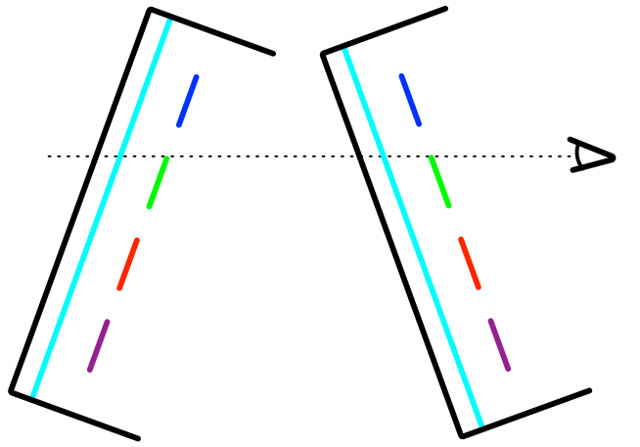
Shortly after iOS 7 came out, I wrote about how it gets parallax wrong in the Control Center. More recently, I showed how it gets it right with the Sharing pane. The key to getting parallax right is the relative movement between the front layer and the rear layer as the phone is tilted.
In a device with real, physical layers, the front layer appears lower against the background when the device is tilted forward and higher against the background when the device is tilted back. When simulating this effect, it doesn’t matter which layer moves; the important thing is to get the relative motion right.
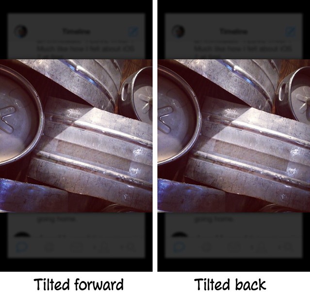
When you tap on an image attached to a tweet, Tweetbot brings up a larger version of the image to take the foreground layer and does three things to make the tweet list look like it’s receded into the background: it shrinks it, blurs it, and darkens it.
The first time I saw this effect, I assumed Tweetbot was going to do some parallax movement when I tilted the phone. Nope.
As you can see, the foreground and background layers are static. I was a little disappointed by this because the Tweetbot guys are known for going the extra mile in visual effects. This static technique for simulating 3D is the iOS 6 way of doing it. Oh well. I figured they must have been feeling some pressure to get a new version out and decided a static 3D effect would do.
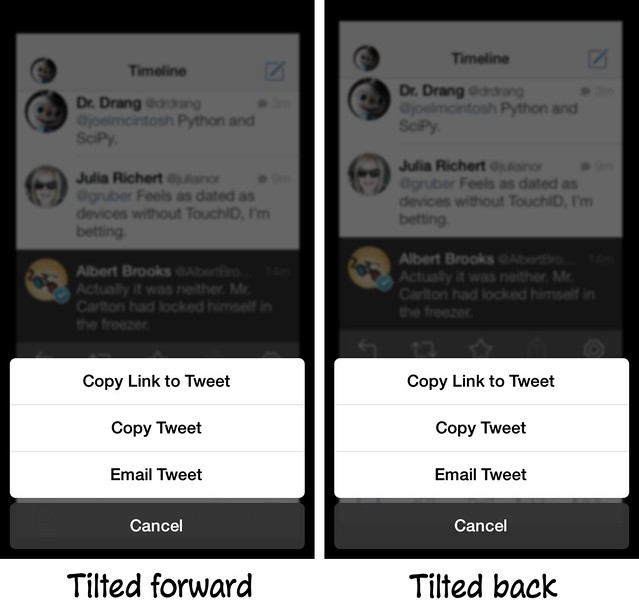
But later I tapped the Share button and saw that they had included a parallax effect when the Sharing pane was onscreen. As before, the list of tweets shrank, blurred, and darkened as it dropped into the background, but this time it moved around in response to the tilt of the phone. Unfortunately, it moved the wrong way. Here’s an example:
As you can see, Tweetbot is moving the background image, which is fine, but it’s moving it in the wrong direction. When you tilt the phone forward, you should be able to see more of the background image over the top of the Sharing pane, not less. It’s a sign error.
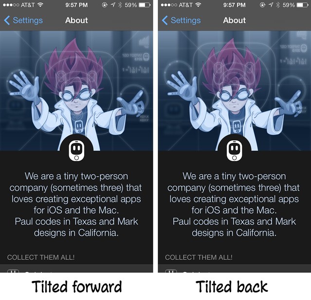
If you read Federico Viticci’s review of Tweetbot 3, you might have noticed that he praises Tweetbot’s parallax effect in the About screen. Sure enough, it’s there, and it’s done correctly.
Here, the Dragonball Zish designer is in the background and the screen he’s working on is between him and us. In this case, Tweetbot moves the foreground, not the background, which is the key to why this motion is correct and the Sharing motion is wrong.
If you compare the Sharing pane screenshots with the About screenshots, you see that in both cases the moving image goes down when the phone is tilted forward and up when the phone is tilted back. The difference is that when the Sharing pane is up, it’s the background image that’s being moved; and when the About screen is up, its the foreground image that’s being moved. They can’t both be right.
Since I know nothing about iOS programming I could be completely wrong about this, but my guess is that the parallax mistake with the Sharing pane is easy to fix. The code for moving the background image is written, it’s just being applied at the wrong time or with the wrong sign—going up when it should go down, left when it should go right, and vice versa. Reverse the motion and everything should be fine.
By the way, I like Tweetbot 3. I think it does a good job of incorporating the iOS 7 look without being too spare. And it’s not just a new paint job. In particular, it’s new way of simultaneously accessing both the details of a tweet and the conversation it’s a part of is a big improvement over the old version.


