MacBook Touch
January 24, 2014 at 11:03 PM by Dr. Drang
OK, one last punditesque post before I return to the usual crap. I read Jason Snell’s interview with Apple executives and this bit by Phil Schiller and Craig Federighi stood out:
“The reason OS X has a different interface than iOS isn’t because one came after the other or because this one’s old and this one’s new,” Federighi said. Instead, it’s because using a mouse and keyboard just isn’t the same as tapping with your finger. “This device,” Federighi said, pointing at a MacBook Air screen, “has been honed over 30 years to be optimal” for keyboards and mice. Schiller and Federighi both made clear that Apple believes that competitors who try to attach a touchscreen to a PC or a clamshell keyboard onto a tablet are barking up the wrong tree.
“It’s obvious and easy enough to slap a touchscreen on a piece of hardware, but is that a good experience?” Federighi said. “We believe, no.”
Personally, I think touchscreens are a natural for notebook computers, but not for every task and certainly not for the user interfaces we have today.
A couple of weeks ago, I got to do the kind of observation that user interface experts like to do. I was at a high school swim meet, in the stands a few rows behind a dad who was working on a touchscreen notebook computer between his son’s events. In between my son’s events and checking my email and Twitter, I could look down and see how he used the machine. What I saw is only one data point, but it represents real-world use, not the somewhat artificial use of a test subject who knows he’s a test subject.
The action I saw again and again was him reaching up to touch a button or a menu, bringing his hand away, and then going back to touch the screen again because he missed the target. He was pretty patient about it, which suggests it was behavior he was used to. Had it been me, I would have flung the damned thing into the pool.
This is exactly what Federighi was talking about. Targets in Windows—which is what he was using, of course—and OS X aren’t designed to be hit with a finger. They’re designed to be hit with the much more precise tip of a mouse pointer.
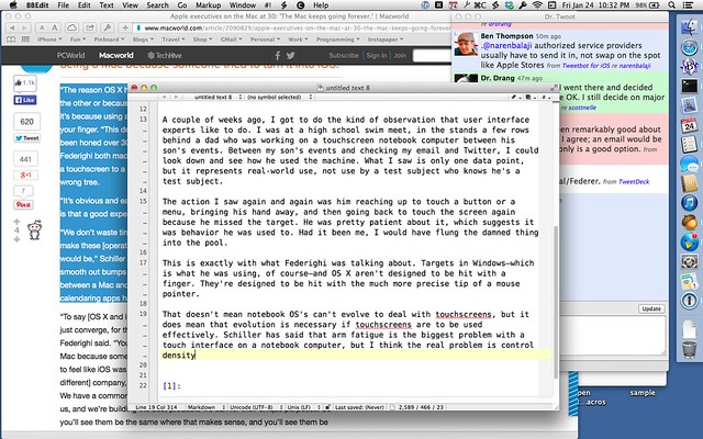
That doesn’t mean notebook OSes can’t evolve to deal with touchscreens, but it does mean that evolution is necessary if touchscreens are to be used effectively. Schiller has said that arm fatigue is the biggest problem with a touch interface on a notebook computer, but I think the real problem is control density. Here’s what my screen looks like now:
Look at all the targets. If they were all increased to a size that’s easy to tap with a fingertip, there’d be very little room left on the screen for content.
This is why iOS apps are so simple. More features means more big targets on the screen, which means less room for what you’re supposed to be looking at and working with.
Does this mean I think notebooks have to adopt tablet OSes if they’re going to be equipped with touchscreens? Or that touchscreens are simply a non-starter for OSes that have (and need to have) lots of controls? I hope the answer to both of these questions is “no.” I’d like to get the convenience of touch for gross manipulations like panning and zooming while maintaining the precision of a mouse for fine operations like menu selection and cursor positioning in text.
I have no idea how a such a dual-input interface would turn out, but I’m sure a lot of smart people in Cupertino and Redmond are working on it. I’m betting the ones in Cupertino will do it better.

