Displaying multiple images in Twitter
July 5, 2014 at 2:46 PM by Dr. Drang
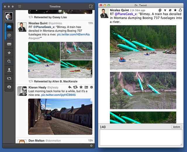
The Tapbots crew beat me to it by a couple of days, but I did manage to update Dr. Twoot to handle Twitter’s new multiple image format. And I have to say I prefer my display of multiple images to both Tweetbot’s and Twitter’s.
This isn’t to say that Dr. Twoot is truly comparable to a full-featured Twitter client like Tweetbot, but the great advantage of making your own software is that you can customize it to match your own idiosyncrasies. Thus, Dr. Twoot
- displays tweets in chronological rather than reverse chronological order;
- uses background colors to distinguish tweets by me and replying to me from the general stream;
- gives me one-click blocking and spam reporting;
- shows the Twitter client used to write every tweet;
- has a popup for displaying information about the tweeter;
- has an edit (really delete-and-rewrite) button for fixing typos in tweets that have already been posted; and
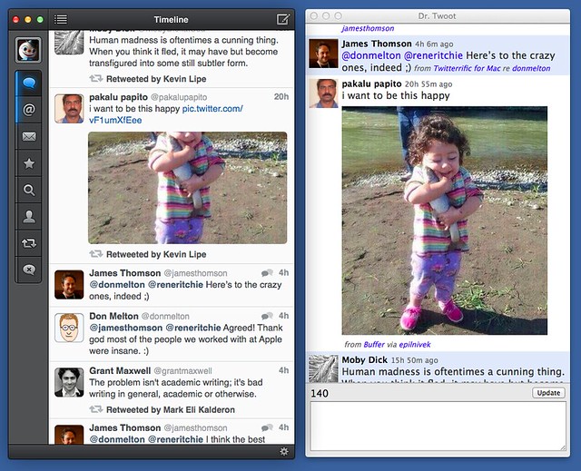
- shows the full frame of included images instead of cropped versions.
Tweetbot follows Twitter’s own convention of displaying only a portion of the attached image unless the aspect ratio of the image happens to match the roughly 9:5 frame Tweetbot uses. For most images Tweetbot crops off the top and bottom, which often leaves you wondering what’s really there. Dr. Twoot, on the other hand, shows the whole image. It’s resized to fit in the space, but it’s all there. No need to open it in another window just to see what you’re missing.
In this, Tweetbot follows Twitter’s lead. On the Twitter web page, you see only cropped images until you click on the Expand button or the image itself.
There’s a certain neatness to the Twitter/Tweetbot approach. An individual tweet will never get so tall as to take up the entire window. Still, I prefer to see the whole image right away and am willing to sacrifice vertical uniformity to get it.
Similarly, in the display of multiple images, I prefer to show them full frame and stack them one on top of the other, even if that means I have to scroll to see them all.
Again, there’s nothing wrong with what Tweetbot does—it’s a perfectly valid way to lay things out and is a clever way to pack more images into a single frame. I just have a different preference. And because I’m Dr. Twoot’s only user, my preference wins.
Update 7/5/14
Both paullu and Stephen Hackett pointed out on Twitter that I could change Tweetbot’s Image Thumbnail setting from Large to Small, which changes the aspect ratio from 9:5 to 1:1 and makes the cropping of most images—and portrait images in particular—less severe. That’s true, but it makes the images too small for comfort, especially on the non-Retina screens of my iMac and MacBook Air. I like my images the way I like my men: large and fully framed.


