The personal touch
July 10, 2014 at 12:30 AM by Dr. Drang
A couple of weeks ago, my old rant against stacked area charts got linked on Hacker News, resulting in a bunch of traffic and, somewhat surprisingly, generally favorable comments from the Hacker Newsies. I’m going to take this as evidence of my authority on data visualization—which we used to just call graphing—and inflict more of my opinions on you.
First, though, you should go read this wonderful post by Dr. Bunsen. The main topic is a pair of dynamic, interactive graphs he made from the split and final times of the top runners in the last five Boston Marathons. Each part of each graph is quite simple, but the way he combines the parts leads to a result that’s both dense in the data it presents and crystal clear in how it presents it. It’s a nice piece of work, and he gives you behind-the-scenes access to how it works through this GitHub repository.
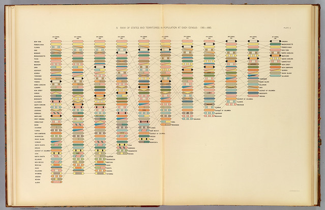
Late in the post, Seth reveals the inspiration for his dynamic graphs: this chart by Henry Gannett from the 1890 Statistical Atlas of the United States.
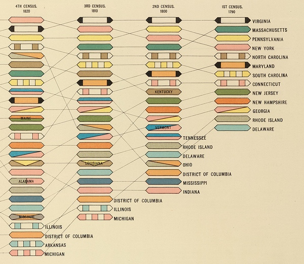
It’s a timeline of state population ranking from census to census. You’ll get a better sense of how it works by looking at this detail from the right side of the chart.
Several things struck me about this graph:
- There’s no key or other explanation. Everything you need to know can be found by reading the title and looking at the chart.
- Gannett chose to run his time from right to left. I think he’s using our convention of reading from left to right to make us think of this as a stepwise look back through our past from today’s (1890) point of view.
- The lozenges Gannett uses for the states. He can’t just use color—the gradations would be too fine and printing costs would skyrocket—so he combines color and pattern to make each state distinct and easy to follow back to its first appearance in the census.
- The placement of the state labels is inconsistent, but purposely so. Most often, a state or territory’s first appearance is near the bottom of the ranking, so the name is off to the side of the lozenge. But in some instances—Kentucky and Vermont in 1800, for example—the state comes in near the middle and to putting its name off to the side would be messy. In those cases, the label goes in the lozenge.
It’s hard to imagine a chart made today looking like this because—in a graphical version of the Sapir-Whorf hypothesis—the software we use to make our charts directs and limits our design decisions. How often do you see timelines that run from right to left? Or patterns instead of color to distinguish items?1
And inconsistency, even inconsistency with a purpose, is antithetical to software-driven graphing. If you use graphing software a lot, or if there’s a graphing program or package that’s common in your business, I’ll bet you can instantly identify charts made with it because there is a sameness to them. That sameness isn’t necessarily a bad thing, but sometimes the conventions get in the way of communication. And there are ways to improve our graphs, to make them look less mechanical and to tell our stories more clearly.
The easiest way is to import a plot into a drawing program and add the sort of customization that used to be common back when graphs were done by hand. Tweak the positions and orientations of labels so they don’t interfere with each other or with the rest of the plot. Change the points of your scattergraph to a symbol that evokes the item that’s being plotted. Adjust the lengths of unlabeled tickmarks to make it easier to read the axis subdivisions (think of how rulers are marked). Tweak the widths of lines so the data are more prominent than the chrome around the edges of the plot. In general, think about what you wish you could do in your plotting program and do it “by hand” in a drawing program.
For years, I’ve been using OmniGraffle to enhance the graphs I put in my reports and presentations. It’s great for adding items like labels and arrows to a plot, but it’s limited in that a PDF you add to an OmniGraffle document comes in as a single monolithic object—you can draw on top of it, but you can’t change its internals. Recently I’ve been playing with iDraw, which is a little squirrelly but doesn’t have OmniGraffle’s limitation: when you import the PDF of a chart into iDraw, each object within the chart is individually selectable and editable. I can change, for example, the style of a line within the plot or grab an existing label and rotate it to match the slope of the trend line it’s captioning.
The harder way to make better graphs is to use a more powerful graphing program, preferably one that’s programmable or is a plotting package for a programming language you already know.2 This gives you more flexibility than a canned program like Excel or (God help you) Numbers in formatting the parts of your plot. It’s certainly harder to write a program that makes a plot than to just select a column of numbers and click a few options, but that time and effort is repaid when you need to make dozens of plots of the same type. Once that program is tweaked to output exactly what you want, you can apply it to dataset after dataset.
After many years of using Gnuplot, I switched to Matplotlib and have been very happy with the results. But I still do some tweaks “by hand” instead of in Matplotlib. If I know I’m only making one or two graphs and the tweaks I want to make are easy to do in iDraw, I’ll accept Matplotlib’s defaults and make the changes in iDraw. If, on the other hand, I know I’ll be making essentially the same plot over and over again, I’ll spend the time with the Matplotlib documentation to program in all the stylistic refinements so I can crank out plots with no effort later.
I confess that the plots I occasionally post here don’t get the attention suggested in the previous paragraphs. This might be because I know you’re all so smart you don’t that kind of hand holding. Or it might be because you don’t pay my bills.
-
In the early days of the Mac, patterns were common because that’s all we had on our little black-and-white screens and Bill Atkinson’s QuickDraw gave programmers easy access to many fill patterns. But those patterns were pretty ugly, and because they were bitmapped, they didn’t translate well to the LaserWriter. ↩
-
Or you could go super hardcore and program your plots from drawing primitives, which seems to be what Seth did in his Boston Marathon graphs. ↩


