Calendar layouts
November 23, 2014 at 1:07 PM by Dr. Drang
As I read Lukas Mathis’s critique of Google’s new calendar app for Android, I came across a passage that triggered one of my pet peeves: my firm belief that calendar apps are designed by people who don’t use calendars.
Lukas is complaining that the new Android calendar shows only 5 days at a time in its “week” view and scrolls forward and back by that same amount:
It’s now a «5 Day» view, because it only shows five days. This is confusing, because it means that the starting day in this view changes. Instead of always being Monday (or Sunday in the US), it’s now a random day.
Lukas’s criticism is spot-on, but his parenthetical remark is dead wrong. Weekly calendar/planners in the US start on Mondays. You can look at Day Runner, Day-Timer, At-A-Glance;1 They all start on Monday and have for the 30+ years I’ve been paying attention. Monthly calendars in the US do start on Sundays, but never weekly calendars. (At this point, I’d normally make a cutting remark about how Europeans think they understand American culture from watching movies and TV shows, but I’m taking the high road today.)
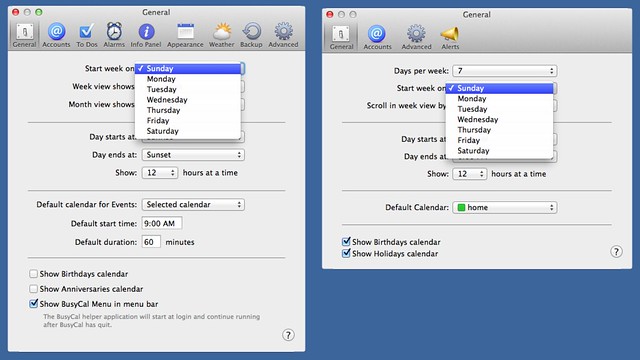
So where did Lukas get the idea that Americans like to start their weekly calendars on Sunday? Probably from the poorly designed calendar software we’re forced to use. Here are the settings for BusyCal and Apple’s Calendar:
They let you start the week on any day—accommodating the untold millions of people who start their work week on a Thursday—but the setting applies to both monthly and weekly views. And they do this despite a longstanding history of paper calendars in which monthly and weekly views start on different days.
Google’s web calendar is more restrictive in what it allows you to choose as the beginning of the week, which makes you think some actual thought was put into it, but it, too, forces you to use the same start day for monthly and weekly views.
I have no experience with Microsoft Outlook. Maybe it allows you to set different start days for different views, but from what I can see on tutorial pages like this one, I doubt it.
The great thing about software is its fluidity. With paper calendars, you pretty much have to choose whether you’re a daily, a weekly, or a monthly person—switching between different views on paper requires too much copying and recopying. Switching views in a software calendar is just a click away.
But for some reason, designers of software calendars have not seen fit to give us that one extra option that would make our calendar layouts match the way most of us in the US prefer to work. I can only assume this is because they don’t use the weekly view themselves, and their ideas of how it should be laid out come from looking at other software, not direct experience. They should spend a few bucks on paper calendars and learn what decades of experience has taught those designers.
Update 11/24/14 9:49 AM
Turns out™ you can get Apple’s Calendar to start its week on a Monday in week view and on a Sunday in month view, but it’s still not the solution I’d like to see. As David Rosenblum explained in a tweet this morning:
@drdrang open week view, then scroll horizontally. You can position the week view to start on any day. Works on OS X and iOS.
— David Rosenblum (@TweetByDavid) Nov 24 2014 9:39 AM
What’s nice about this solution is that once you have week view aligned to Monday, subsequent presses of ⌘→ and ⌘← will scroll forward and backward seven days, maintaining the Monday alignment. What’s less nice is that if you shift to month view and then back to week view again (or if you quit and restart Calendar) the alignment goes back to Sunday, and you have to realign it again. Because I think being able to shift smoothly between the two views is important, I don’t like having to do this extra fiddling.
Still, it’s better than what BusyCal does. With BusyCal’s starting day set to Sunday, you can get its week view to align on a Monday by either ⌥-scrolling or pressing ⌥⌘→. Unfortunately, this doesn’t “stick.” Subsequent presses of ⌘→ and ⌘← realign the weekly layout to Sunday. And, as you might expect, the week view realigns to Sunday when you shift to month view and then back.
My solution to this is to just stay in month view. When I’m on the phone with a client trying to schedule a meeting, it’s usually “when are you free in late January, early February?” not “when are you free later this week?” so month view makes the most sense most of the time. A good part of the reason I use BusyCal is that I prefer the way its month view looks.
I’d like to be able to flip between month and week views regularly, but I just can’t get used to seeing weekly calendars that start on Sunday or monthly calendars that start on Monday. And I shouldn’t have to. The computer is supposed to adapt to my way of working; it doesn’t have to break 30 years of habit.
-
Am I the only one who didn’t know that all of these once-proud, independent brands are now owned by Mead? An insidious calendrical monopoly is creeping over the country, preparing to force us all into using Trapper Keepers. ↩


