Tables again
May 13, 2017 at 10:29 PM by Dr. Drang
A couple of months ago, I wrote a couple of posts about my frustrations with including complex tables in my reports for work. I write my reports in Markdown (MultiMarkdown, actually) and export them to LaTeX before generating the PDFs I send to my clients. As I said in the first post, even though MultiMarkdown has facilities for handling certain complexities, like column spans, I often find myself editing the LaTeX of my tables directly to get the look I want. This gets the Markdown and LaTeX source out of sync with each other—not the worst problem in the world, but something I’d rather avoid.
The bigger problem is that LaTeX’s table syntax is awful, so filled with ampersands and braces that it’s nearly unreadable. And something I like to include in most of my tables—a column of right-aligned numbers centered under its header—is not part of standard LaTeX table syntax. Even packages like dcolumn and siunitx, which are supposed to handle this situation, have given me trouble, often moving columns well away from where they should be.
The solution I began toying with was to consider tables as graphic elements, to build them outside of the report text and import them with the \includegraphics command from LaTeX’s graphicx package. I outlined a few possibilities for building the table graphics in the first post, and presented an OmniGraffle example in the second. In that example, I used a rather fragile Keyboard Maestro macro to copy the data from a spreadsheet into an OmniGraffle table.
To be honest, this solution sucked. Not the formatting of the table in OmniGraffle; that was fine. But the importing macro was just too delicate, too easily thrown off by small changes in the original data format. I never felt comfortable using it in production.
Last week, I sent out a report with several tables using a faster and more robust technique. The steps are:
- Build the table in Numbers. Now, I use Jupyter and Pandas for most of my analytical work, so “building a table in Numbers” really means exporting the data from Jupyter as a CSV file and then opening it in Numbers.
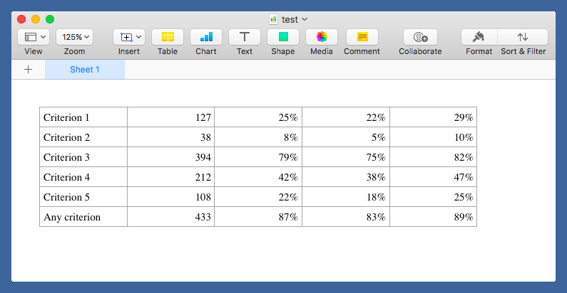
Don’t try to add too much formatting to the table in Numbers, but make sure the font is what I want in my report (Times 12, typically) and that the column alignment matches what I want for the bulk of the table. Like this:
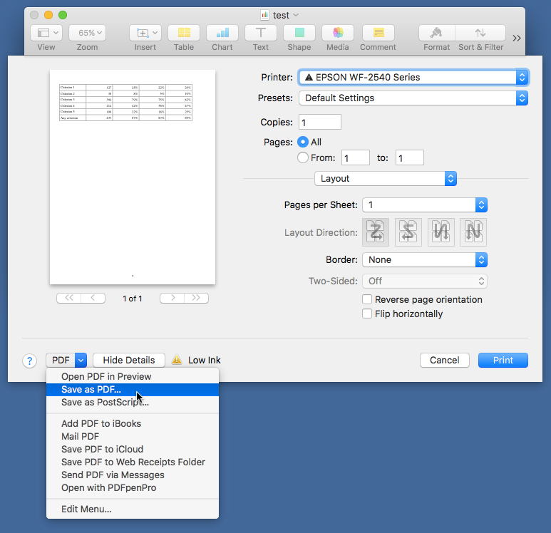
Generate a PDF from the table using the standard popup feature in the Print sheet.
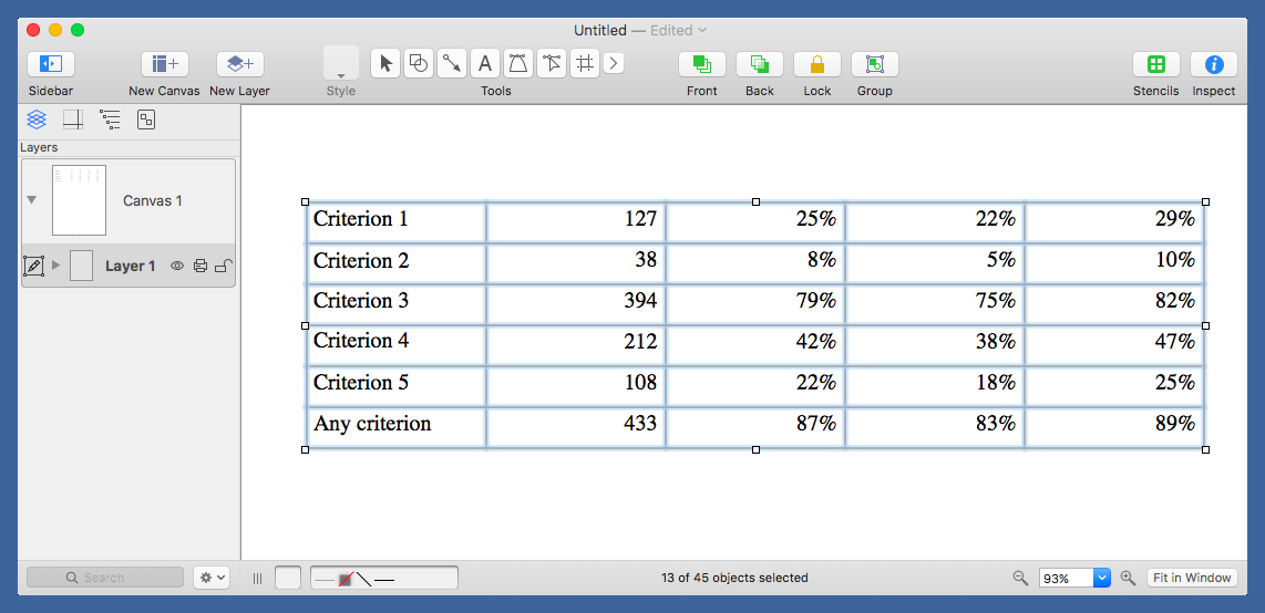
Open the new PDF in OmniGraffle, ungroup the elements, and delete all the crap: the gridlines, the page number, the big white background rectangle. Everything must go except the table data itself.
Now start grouping and spacing the data. At this point, I’m still working mostly by eye, but I’m keeping notes on what seems to look good for row spacing and the placement of horizontal rules.
Eventually, I’ll turn these notes into macros or JXA scripts for automating some of the process, but I don’t expect everything to be automated. One of the reasons I’m doing this is to make tables that are tweaked to be better, more communicative, than the usual rigid grids.
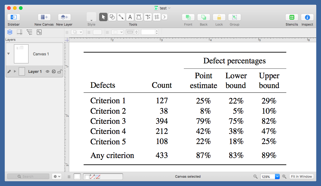
Here’s the example in final form:
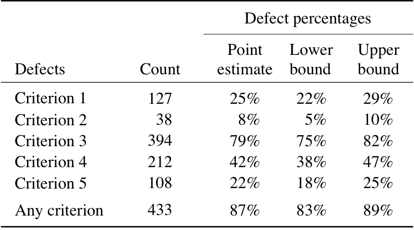
Note that the numeric columns are right-justified but are centered under their headings. The three percentage columns are clustered together, set apart from the Count column. Also, the percentage columns are evenly spaced in the body of the table but not in the headings. In a normal LaTeX table, the extra width of “estimate” would push its column away from the other two.1 Finally, the first five rows are spaced uniformly and the last row is set off a bit from the others because the first five are individual defect critera and the last is the union of the five.
In my recent report, I had several tables structured like the one you see above. Once I had the skeleton worked out, I could duplicate it and change out the data very quickly. Even the first table didn’t take very long to make, no longer than it would have taken to tweak and retweak a comparable table in LaTeX.
I haven’t quite worked out how I’m going to specify tables like this in Markdown, but the LaTeX for including one is easy:
tex:
\begin{table}[htbp]
\centering
\vspace{.125in}
\includegraphics{building-a-defects.pdf}
\vspace{-.0625in}
\caption{Defect summary for Building A.}
\label{counts}
\end{table}
The vspace above the graphic separates the table from the text above it by an amount about the same as what I get with a normal tabular table. Similarly, the vspace below the graphic shifts the caption to more or less the position it would have below a tabular table.
An obvious downside to including tables as graphic elements is that the data are no longer in the source of the report. I don’t see this as a serious problem, as I’ll still have the data set in a spreadsheet and, even better, a CSV file. It’ll still be accessible to me and easy to share with others.
Now I need to work on a Markdown-like syntax for table graphics.
-
Yes, I know how to get those columns spaced evenly in LaTeX, but it adds even more code to something that’s already messy. ↩
