A modest proposal
November 6, 2017 at 9:27 PM by Dr. Drang
With Apple sales and graphing on my mind, I’d like to make a small complaint and suggestion to the folks at MacStories: some of your quarterly graphs could use a little scrubbing; they’d be much easier on the eyes if they were cleaned up a bit.
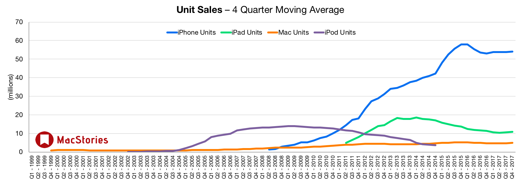
I’m talking about the ones that look like this:

My complaint is with the clutter along the x-axis. That uniform gray mass of text detracts from the data above it. And although putting a label at each quarter seems to provide more information to the reader, the reader actually gets less out of it because it’s too hard to read. The axis would be improved if it had just yearly Q1 labels. Maybe even one label every other year. Fewer labels would mean they could be turned back horizontal, which would be easier to read and would give more vertical space for the data.
I suspect every data point is labeled because that’s the way Numbers wants to do it, and MacStories’ automated system for generating these graphs follows the Numbers defaults. But if you were making these graphs by hand, you’d never label the x-axis this way. An automated system shouldn’t, either.
On the Mac, Numbers has a way to skip labels on the x-axis by selecting Custom Category Intervals from the Category Labels popup menu and then choosing how often to put the labels.

Sadly, I can’t find that option in the iOS version. Maybe it’s tucked away in a less obvious place.

Personally, I’m not a fan of either version of Numbers when it comes to making graphs because I like way more control than they give. But Numbers (like most graphing programs and libraries) can make nice graphs if you’re willing to break away from its defaults.
I don’t really want to pick on MacStories. Their graphs are as good as, if not better than, what you typically find in blogs and news sites. Most graphs, unfortunately, are based on the default settings of the software that made them, and come out looking a little clumsy.
I read MacStories because it has stylish writing. I’d like its graphs to be just as stylish.
Update Nov 7, 2017 8:55 PM
I was informed on Twitter by two authoritative sources (this one and this one) that the MacStories graphs are made with Excel, not Numbers. I haven’t used Excel for graphing since the mid-90s, but even then it had more customization options than Numbers has now. So I’m crossing my fingers for cleaner x-axes in January’s graphs.
