Subplots, axes, Matplotlib, OmniGraffle, and LaTeXiT
January 29, 2018 at 9:36 PM by Dr. Drang
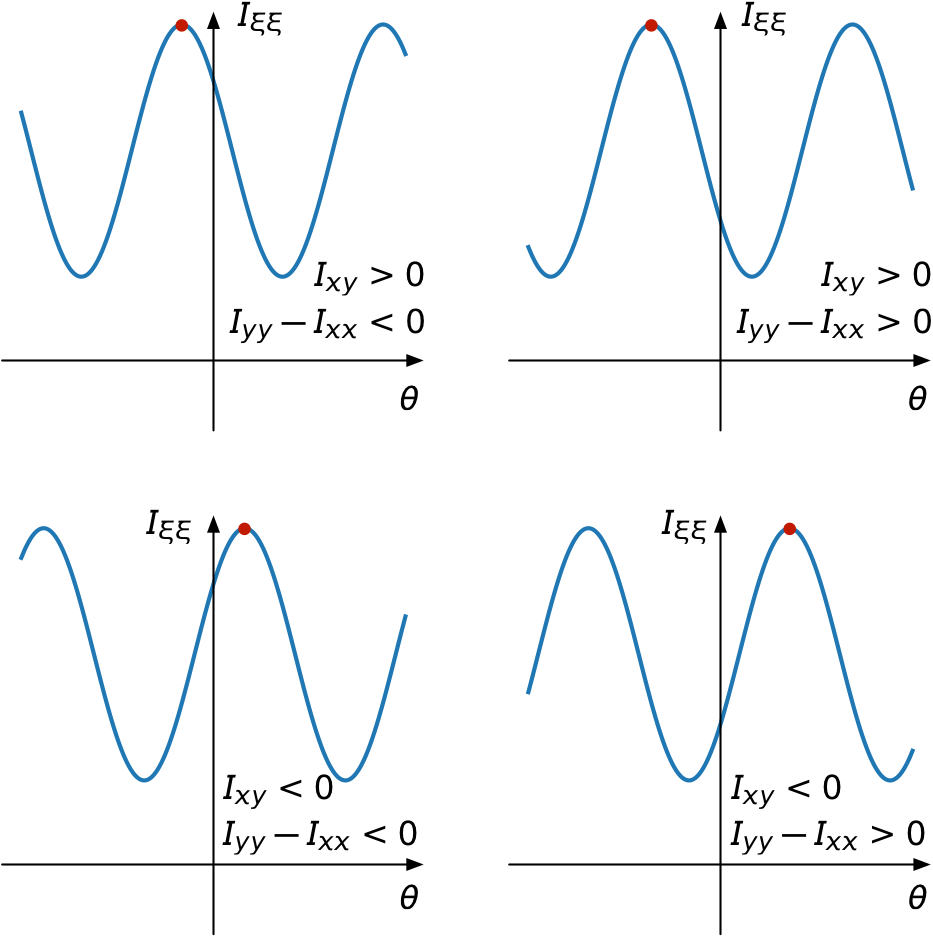
When I learn something new in Matplotlib, I usually write a short post about it to reinforce what I’ve learned and to give me a place to look it up when I need to do it again. In my section properties post from last week, I had a 2×2 set of plots that helped explain which arctangent result I wanted to choose under different circumstances.
Here’s the plot:

And here’s the code that made most of it:
python:
 1:  #!/usr/bin/env python
 2:
 3:  import matplotlib.pyplot as plt
 4:  import numpy as np
 5:
 6:  x = np.linspace(-3, 3, 101)
 7:  y1 = (10+6)/2 - (10-6)/2*np.cos(2*x) - 3*np.sin(2*x)
 8:  y2 = (10+6)/2 - (6-10)/2*np.cos(2*x) - 3*np.sin(2*x)
 9:  y3 = (10+6)/2 - (6-10)/2*np.cos(2*x) + 3*np.sin(2*x)
10:  y4 = (10+6)/2 - (10-6)/2*np.cos(2*x) + 3*np.sin(2*x)
11:
12:  f, axarr = plt.subplots(2, 2, figsize=(8, 8))
13:  axarr[0, 0].plot(x, y2, lw=2)
14:  axarr[0, 0].axhline(y=2, color='k', lw=1)
15:  axarr[0, 0].axvline(x=0, color='k')
16:  axarr[0, 0].set_ylim(0, 12)
17:  axarr[0, 0].set_xticks([])
18:  axarr[0, 0].set_yticks([])
19:  axarr[0, 0].set_frame_on(False)
20:
21:  axarr[0, 1].plot(x, y1, lw=2)
22:  axarr[0, 1].axhline(y=2, color='k', lw=1)
23:  axarr[0, 1].axvline(x=0, color='k')
24:  axarr[0, 1].set_ylim(0, 12)
25:  axarr[0, 1].set_xticks([])
26:  axarr[0, 1].set_yticks([])
27:  axarr[0, 1].set_frame_on(False)
28:
29:  axarr[1, 0].plot(x, y3, lw=2)
30:  axarr[1, 0].axhline(y=2, color='k', lw=1)
31:  axarr[1, 0].axvline(x=0, color='k')
32:  axarr[1, 0].set_ylim(0, 12)
33:  axarr[1, 0].set_xticks([])
34:  axarr[1, 0].set_yticks([])
35:  axarr[1, 0].set_frame_on(False)
36:
37:  axarr[1, 1].plot(x, y4, lw=2)
38:  axarr[1, 1].axhline(y=2, color='k', lw=1)
39:  axarr[1, 1].axvline(x=0, color='k')
40:  axarr[1, 1].set_ylim(0, 12)
41:  axarr[1, 1].set_xticks([])
42:  axarr[1, 1].set_yticks([])
43:  axarr[1, 1].set_frame_on(False)
44:
45:  plt.savefig('quadrants.pdf', format='pdf')
What was new to me was the use of the pyplot.subplots function to generate both the overall figure and the grid of subplots in one fell swoop. It’s possible that this technique was new to me because the documentation for Matplotlib’s Pyplot API doesn’t contain an entry for subplots.1 I don’t remember where I first learned about it—Stack Overflow would be a good guess—but I’ve since learned that pyplot.subplots is basically a combination of pyplot.figure and Figure.subplots.
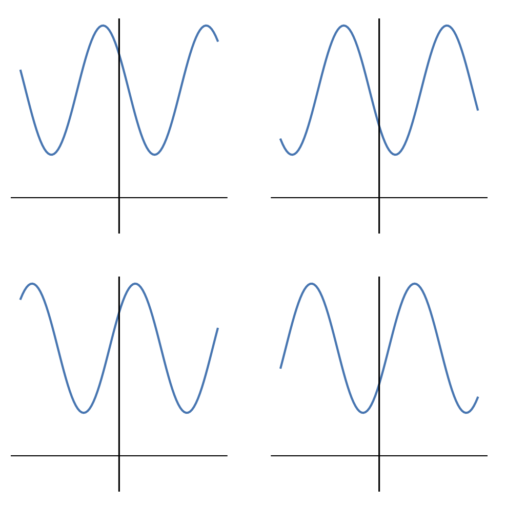
Lines 6–10 define the four functions to be plotted. The x values are the same for each and the y values are named according to the quadrant they’re going to appear in. The y values are defined so the moments and product of inertia match the annotations shown in the graph. The actual numbers used in these definitions are less important than their signs and their relative magnitudes, as the plots are intended to be generic.
Line 12 then defines the figure and the array of “axes,” where you have to remember that Matplotlib unfortunately uses that word in a way that doesn’t fit the rest of the world’s usage. In Matplotlib, “axes” is usually treated as a singular noun and refers to the area of an individual plot. After Line 12, the axarr variable is a 2×2 array of Matplotlib axes.
Lines 13–19 then define the subplot in the upper left quadrant (what you learned as Quadrant II in analytic geometry class). Line 19 turns off the usual plot frame, and Lines 17–18 ensure there are no tick marks or labels. Lines 14—15 draw the and axes (here I’m using the normal definition of the word). You’ll notice that I’ve drawn the axis at instead of . I didn’t like the way the graphs looked with the axis lower, so I moved it up. Again, this doesn’t change the meaning behind the graph because it’s generic.
The rest of the lines down through 43 are just repetitions for the the other quadrants. Finally, Line 45 saves the figure to a PDF file that looks like this:

Now it’s time to annotate the figure. In theory, I could do this in Matplotlib, but that’s a lot of programming for something that’s more visual than algorithmic. If I were making dozens of these figures, I’d probably invest the time in annotating them in Matplotlib, but for a one-off it’s much faster to do it in OmniGraffle.
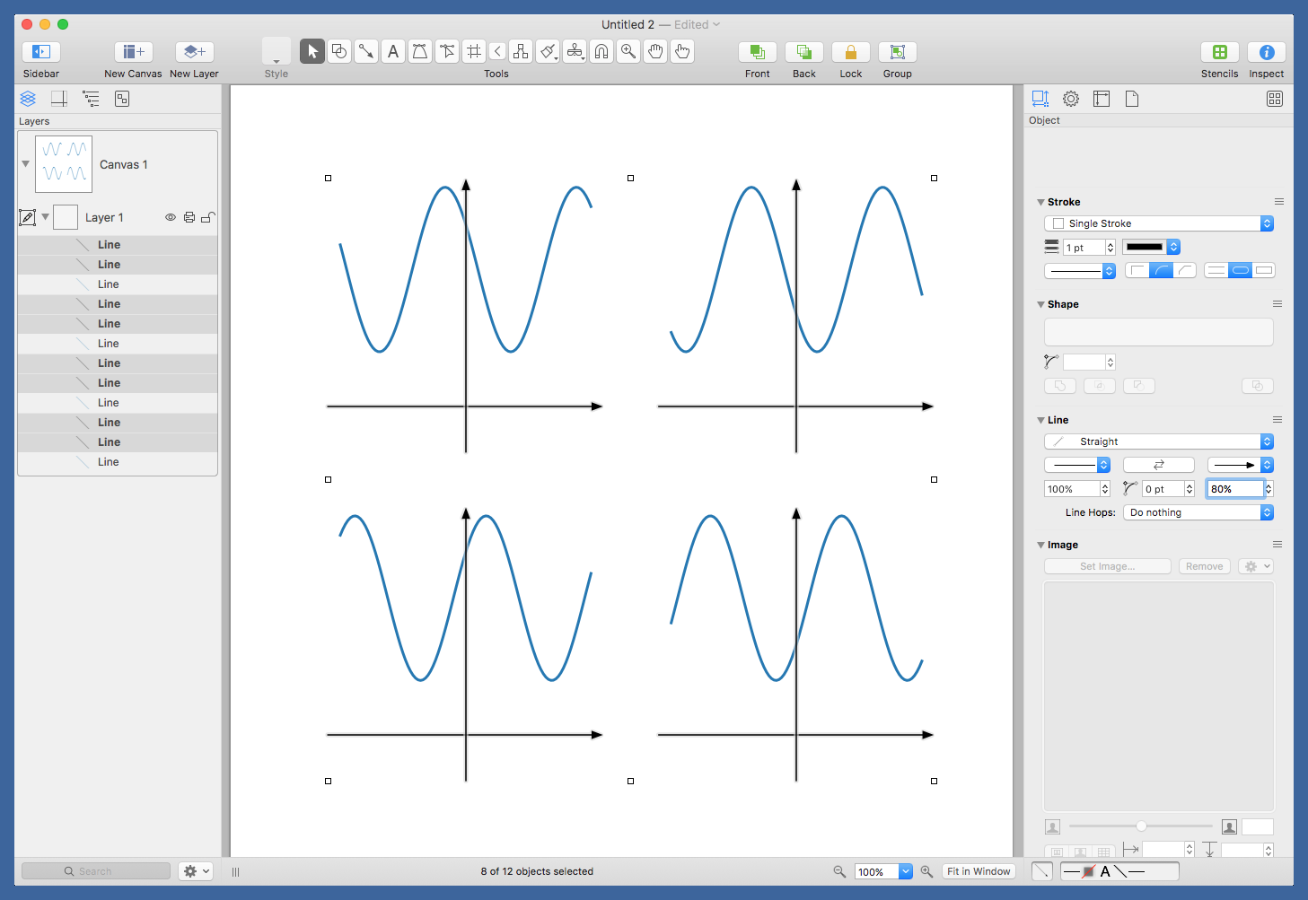
I can open the PDF directly in OmniGraffle and start editing. First, I select the white background rectangle that’s usually included in files like this and delete it. It doesn’t add anything, and it’s too easy to select by mistake. Then I select all the axes (again, the usual definition) and add the arrowheads.

The command is very helpful in selecting repeated elements like this.
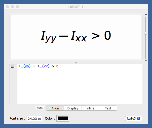
After placing red circles at the maxima, it was time to label the axes (yes, usual definition; we’re out of Matplotlib now) and add the annotations. I made the annotations in LaTeXiT, a very nice little program for generating equations to be pasted into graphics programs. I’ve been using it for ages.

LaTeXiT cleverly ties into your existing LaTeX installation, so you can take advantage of all the packages you’re used to having available. I usually have LaTeXiT use the Arev package because I like its sans-serif look in figures.
After adding all the annotations, I export the figure from OmniGraffle as a PNG, run it through OptiPNG to save a little bandwidth, and upload it to the server. If this were a figure for a report instead of the blog, I’d export it as a PDF.
-
I’ve complained about Matplotlib’s documentation before, so I’ll spare you the rant this time. ↩
