One table following another
March 11, 2018 at 10:39 PM by Dr. Drang
Justin Grieser of the Washington Post had a story about Daylight Saving Time a couple of days ago, and unlike most such stories, it was generally favorable. I’ve said what I think about DST and don’t intend to revisit the topic here, but I do want to talk about how the WaPo article presented the sunrise and sunset data.
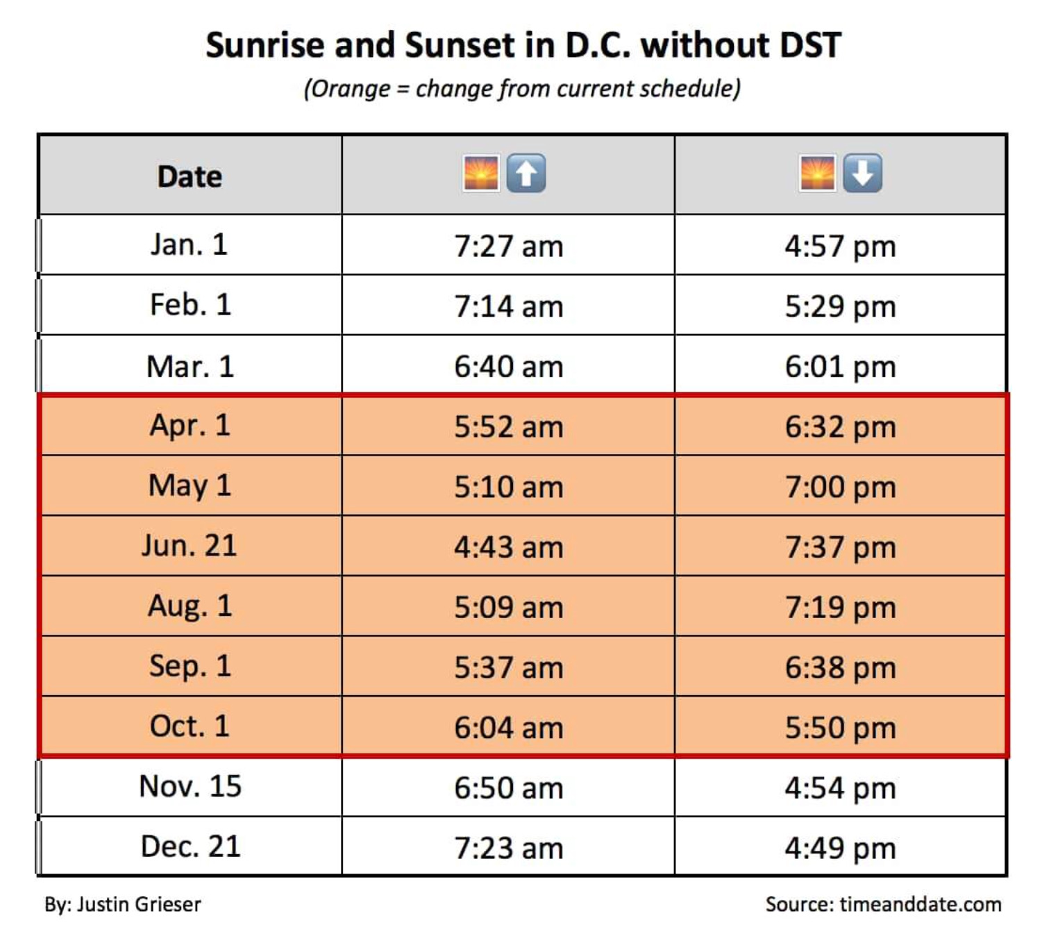
The gist of the article was similar to any argument in favor of DST: without it, we have lots of summer sunlight in the early morning, when it’s wasted for most of us. The argument was encapsulated in this table, which presents sunrise and sunset times in Washington, DC, using standard time throughout the year.

There are a few odd things about this table. Let’s start at the top. The headings for sunrise and sunset are given in emoji rather than words. I’m sure this seemed like a cute idea at the time, but it wasn’t very helpful to those of us who read the article on our phones, where the sun emoji, less than 2 mm across, looked more like a burnt orange smear than a sun. (Also, the emoji is officially named “Sunrise,” so it probably shouldn’t be used for sunset, even with the down arrow.) More distinct glyphs would have been the regular sun, ☀️, or even the sun with a face, 🌞, although the latter might be confused with one of the regular face emojis.
The next oddity is the distribution of dates. There’s no rule that says the dates have to be uniformly distributed throughout the year, but there’s no good reason for the haphazard scattering in this table. It starts out on the first of every month, then jumps to the 21st of June (to get the summer solstice), skips July entirely (because July 1 is too close to June 21?), jumps from October 1 to November 15 (to get back into standard time, I guess), and finishes up with December 21 (the winter solstice, but awfully close to January 1, where we started). A better choice would have been to use the 15th of every month. That would give a better sense of how sunrises and sunsets change throughout the year and would be close enough to the solstices. Hitting the solstices isn’t that important, anyway, as the sunrise and sunset extremes don’t occur on the solstices.
The weirdest thing, though, is why the article used a table at all. You can show a whole year’s worth of data in a graph, and it would give readers a better overall view of when the sunrise is too damned early. Graphs usually aren’t as good as tables for providing exact figures, but exact figures aren’t important here.
I took the US Naval Observatory’s sunrise and sunset data for Chicago in standard time and plotted them. This would be the Chicago equivalent of WaPo’s DC table.
I didn’t label the axes because I thought they were obvious. The USNO uses a 24-hour clock in its data set,1 so I stuck with that for the vertical axis.
The graph is better than any table at showing the sinusoidal flow of rise and set times over the course of a year. The labels are little smaller than I intended, but unlike the WaPo app, you can zoom in to see details.
Another way to present the data would be to include the DST shift:
Here you can see how DST saves us from the earliest sunrise times, but at the expense of fairly late sunrise times at the two ends of DST. We didn’t get such late sunrises back when DST covered a shorter fraction of the year.2
I’ve also added the duration of daylight, the time between sunrise and sunset, as the dashed purple line. This is cheating, as I’m using the vertical axis for both time and duration, which are not the same; but the units work out, and I don’t think it’s confusing.
I’m not sure why Justin Grieser used tables instead of graphs in his article, but I have a guess. Most graphing programs have standard facilities for handing times and dates along the horizontal axis because timelines are so common. Plotting time along the vertical axis isn’t as common, and I suspect the software WaPo uses doesn’t make it easy to build the plots I did. If that’s the case, it’s another example of something I’ve complained about in the past: graphs being made—or in this case, not made—to accommodate the limitations of the software rather than the needs of the data.


