The sunrise plot
March 12, 2018 at 11:09 PM by Dr. Drang
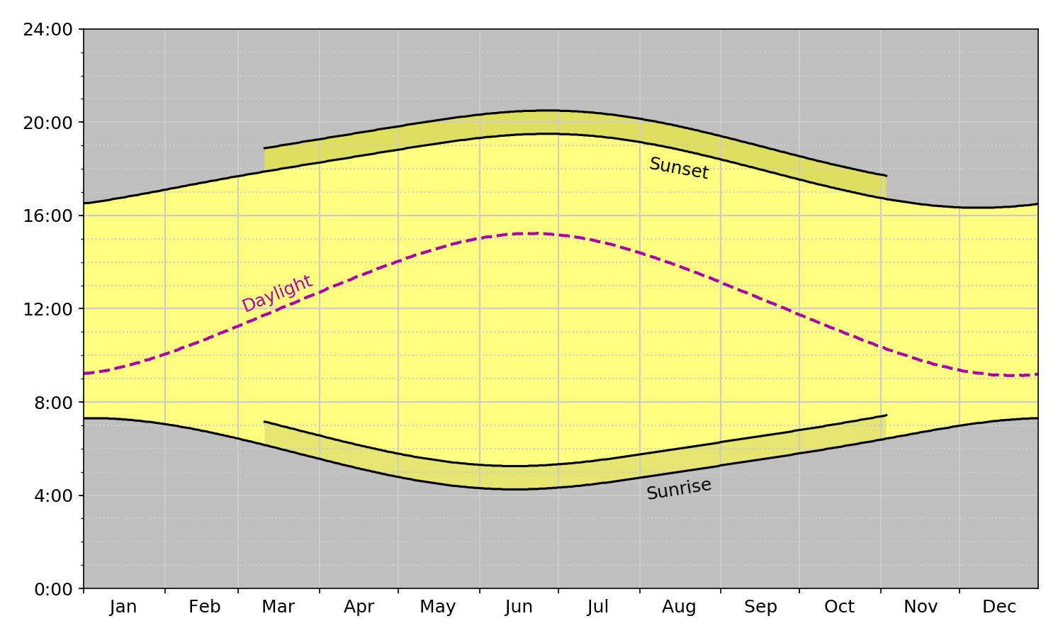
Since I almost never make a graph without showing the code for it, here’s how the sunrise/sunset plots in yesterday’s post were made.
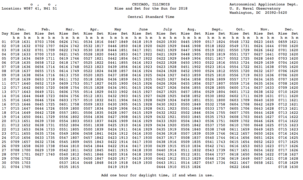
I started with the US Naval Observatory’s 2018 sunrise/sunset data for Chicago, which is a plain text table (i.e, monospaced font using space characters to align columns) that looks like this:
I copied the table, pasted it into BBEdit, and did some editing to get it into this form:
2018-01-01  0718 1631
2018-01-02  0718 1632
2018-01-03  0718 1632
2018-01-04  0718 1633
2018-01-05  0718 1634
2018-01-06  0718 1635
2018-01-07  0718 1636
2018-01-08  0718 1637
2018-01-09  0718 1638
2018-01-10  0718 1639
2018-01-11  0717 1640
2018-01-12  0717 1642
2018-01-13  0717 1643
2018-01-14  0716 1644
2018-01-15  0716 1645
2018-01-16  0715 1646
2018-01-17  0715 1647
2018-01-18  0714 1649
2018-01-19  0714 1650
2018-01-20  0713 1651
        etc.
Most of the editing consisted of selecting columns for February through December and pasting them under the January data. Then I prepended the year and month (with hyphens) in front of the the days. That left me with a file, called chicago-riseset.txt, with 365 lines and three columns. If I were going to do this sort of thing on a regular basis, I’d write a script to handle this editing, but for a one-off I just did it “by hand.”
The script that parsed the data and created the graphs is this:
python:
 1:  #!/usr/bin/env python
 2:
 3:  from fileinput import input
 4:  from dateutil.parser import parse
 5:  from datetime import datetime
 6:  import numpy as np
 7:  from matplotlib import pyplot as plt
 8:  import matplotlib.dates as mdates
 9:  from matplotlib.ticker import MultipleLocator, FormatStrFormatter
10:
11:  # Read in the sunrise and sunset data in CST
12:  # and convert to floating point hours
13:  days = []
14:  rises = []
15:  sets = []
16:  for line in input():
17:    d, r, s = line.split()
18:    days.append(parse(d))
19:    hr, min = int(r[:2]), int(r[-2:])
20:    rises.append(hr + min/60)
21:    hr, min = int(s[:2]), int(s[-2:])
22:    sets.append(hr + min/60)
23:
24:  # Daylight lengths
25:  lengths = np.array(sets) - np.array(rises)
26:
27:  # Get the portion of the year that uses CDT
28:  cdtStart = days.index(datetime(2018, 3, 11))
29:  cstStart = days.index(datetime(2018, 11, 4))
30:  cdtdays = days[cdtStart:cstStart]
31:  cstrises = rises[cdtStart:cstStart]
32:  cdtrises = [ x + 1 for x in cstrises ]
33:  cstsets = sets[cdtStart:cstStart]
34:  cdtsets = [ x + 1 for x in cstsets ]
35:
36:  # Plot the data
37:  fig, ax =plt.subplots(figsize=(10,6))
38:  plt.fill_between(days, rises, sets, facecolor='yellow', alpha=.5)
39:  plt.fill_between(days, 0, rises, facecolor='black', alpha=.25)
40:  plt.fill_between(days, sets, 24, facecolor='black', alpha=.25)
41:  plt.fill_between(cdtdays, cstsets, cdtsets, facecolor='yellow', alpha=.5)
42:  plt.fill_between(cdtdays, cdtrises, cstrises, facecolor='black', alpha=.1)
43:  plt.plot(days, rises, color='k')
44:  plt.plot(days, sets, color='k')
45:  plt.plot(cdtdays, cdtrises, color='k')
46:  plt.plot(cdtdays, cdtsets, color='k')
47:  plt.plot(days, lengths, color='#aa00aa', linestyle='--', lw=2)
48:
49:  # Add annotations
50:  ax.text(datetime(2018,8,16), 4.25, 'Sunrise', fontsize=12, color='black', ha='center', rotation=9)
51:  ax.text(datetime(2018,8,16), 18, 'Sunset', fontsize=12, color='black', ha='center', rotation=-10)
52:  ax.text(datetime(2018,3,16), 13, 'Daylight', fontsize=12, color='#aa00aa', ha='center', rotation=22)
53:
54:  # Background grids
55:  ax.grid(linewidth=1, which='major', color='#cccccc', linestyle='-', lw=.5)
56:  ax.grid(linewidth=1, which='minor', color='#cccccc', linestyle=':', lw=.5)
57:
58:  # Horizontal axis
59:  ax.tick_params(axis='both', which='major', labelsize=12)
60:  plt.xlim(datetime(2018, 1, 1), datetime(2018, 12, 31))
61:  m = mdates.MonthLocator(bymonthday=1)
62:  mfmt = mdates.DateFormatter('              %b')
63:  ax.xaxis.set_major_locator(m)
64:  ax.xaxis.set_major_formatter(mfmt)
65:
66:  # Vertical axis
67:  plt.ylim(0, 24)
68:  ymajor = MultipleLocator(4)
69:  yminor = MultipleLocator(1)
70:  tfmt = FormatStrFormatter('%d:00')
71:  ax.yaxis.set_major_locator(ymajor)
72:  ax.yaxis.set_minor_locator(yminor)
73:  ax.yaxis.set_major_formatter(tfmt)
74:
75:  # Tighten up the white border and save
76:  fig.set_tight_layout({'pad': 1.5})
77:  plt.savefig('riseset.png', format='png', dpi=150)
After all the imports in Lines 3–9, the script begins by using the fileinput module to read and parse the lines of the data file, one by one. Each line is split into date, rise time, and set time in Line 17. Line 18 parses the date using the dateutil library, returning a datetime object. Lines 19–20 then split the sunrise time into the hour and minute parts and convert them into a single floating point number. Lines 21–22 do the same thing to the sunset time. The dates and times are accumulated into the days, rises, and sets lists.
The duration of daylight is calculated by subtracting the rise time from the set time in Line 25. I could have done this within the loop of Lines 16–22, but chose to do it through NumPy array arithmetic instead.
Lines 28–34 handle the daylight saving time stuff. The USNO data are given in standard time. To convert to DST, I needed to create new date and time lists that extend only over the duration of DST—from March 11 through November 3—and add an hour to the sunrise and sunset times. Lines 28–29 get the indices necessary to slice the lists, Line 30 slices the list of dates, Lines 31 and 33 slice the lists of rise and set times, and Lines 32 and 34 add the DST hour to the rise and set times. It sounds more complicated than it is.
Then we start using Matplotlib to make our graph. Lines 37–47 create the plot and add all of the various lines and areas. The fill_between function creates the areas, and the plot function draws the lines. I use the alpha parameter in the fill_between calls to get the shading I wanted and to allow the gridlines to show through the filled-in areas. There was a bit of trial and error to get alphas that made the two DST zones look about the same.
The parts of the plot were labeled in Lines 50–52. The text function puts the given text (third parameter) at the given x- and y-coordinates (first and second parameters). The neat thing about this function is that the coordinates are given in the same units as the data, which is why you see the x-coordinate given as a datetime. The ha parameter is short for “horizontal alignment,” which allowed me to specify the center of the text so it would fall between the vertical gridlines. The rotation values were chosen through trial and error to get the text tilted to match (by eye) their curves.
Lines 55–56 display the gridlines. I set the linewidth to .5 points, but thin lines like that are better for PDF output than PNG.
After setting the font size for all the tick labels in Line 59, the horizontal axis is formatted in Lines 60–64. The horizontal limits were set to run the length of the year, and the tick marks delineate the month boundaries. The date format in Line 62 uses the standard strftime system, and has a bunch of space characters at the beginning to get the month labels to be (more or less) centered in the middle of each month instead of centered under the tick mark at the beginning of the month. There should be a better way to do this, but I haven’t found it.
The vertical axis is formatted in Lines 67–73. Lines 68 and 69 set the major and minor tick marks to be 4 hours and 1 hour apart, respectively. Recall that the rise and set times are just numbers—we can’t use the strftime system Line 70 formats the time labels, which are just numbers, to look like like hours.
Finally, Line 76 gets rid of a lot of the whitespace border that would otherwise surround the plot, and Line 77 saves it to a PNG file. The 10″ by 6″ plot size set back in Line 37, combined with the dpi=150 setting in Line 77, gives us an image that’s 1500×900 pixels.
I did make one small change to the script. As I mentioned in yesterday’s post, I thought the curve and tick labels were too small for the size of the graph as it appears in the blog. I bumped the font size up from 10 to 12 to make the text more legible. Not a huge difference, but a definite improvement.


