Twitterrific
June 15, 2019 at 1:16 PM by Dr. Drang
Twitterrific 6 was released a couple of days ago, and by now you’ve probably read Ryan Christoffel’s article and Jason Snell’s. I’ve been a Tweetbot user for ages, but I thought it was worth giveng Twitterrific a try. I can’t say yet that I’ll switch, but I’ve been pleased with my first two days of use.
Before getting into the app itself, I’d like to thank Iconfactory for providing useful subscription tiers for trying out the app. You can install Twitterrific for free, in which case you’ll see ads at the top of the screen. Personally, I don’t think this is a good way to evaluate an app, because the presence of the ads takes away from the true app experience. For 99¢, though, you can get a month subscription, which is what I chose. This is a cheap way to get a decent length of time to decide whether it’s going to replace Tweetbot.
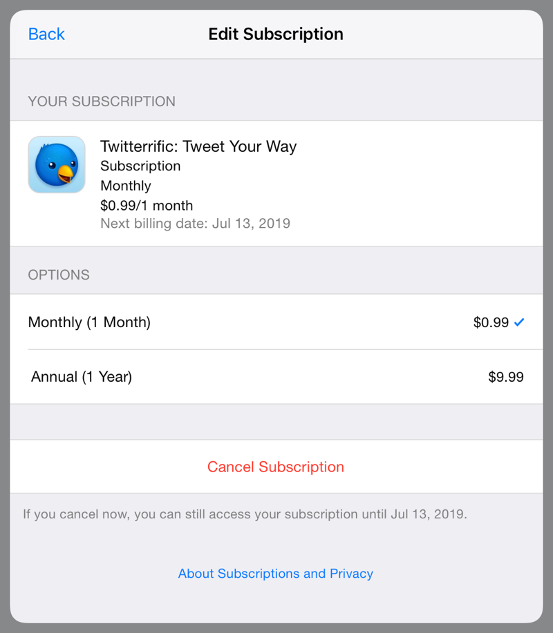
At the end of the month, I’ll decide whether to switch to the year subscription or go back to Tweetbot.1
The main reason I haven’t used Twitterrific in the past is that I was put off by its color schemes. I could never identify exactly what I didn’t like about them, but they just didn’t seem right. Now the default light theme, which is what I use almost all the time, is just about perfect, and I’ve settled on a dark theme that works well, too.
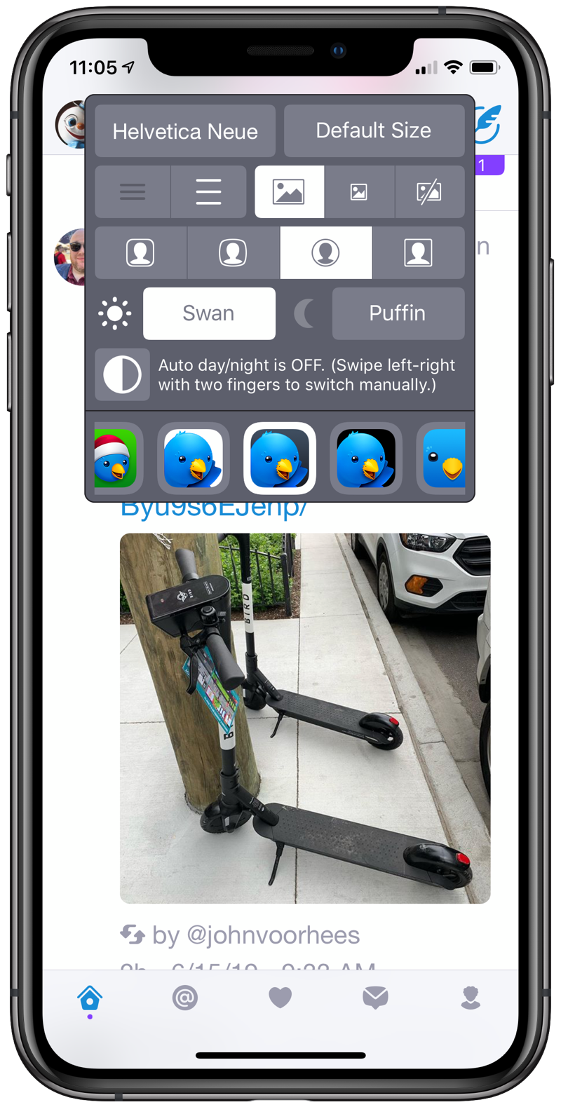
As Jason says in his article, you can tweak the theme by editing a plist file and putting it into the Day or Night subfolder of the Twitterrific iCloud Drive folder. Officially, this is an “unsupported” feature, but there’s a sample plist file in the Themes subfolder that you can use as a starting point and a README file with some details.
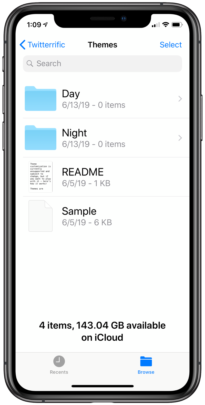
It would be nice if Iconfactory provided plists for each of the standard themes so you could pick the one closest to your taste and just change a few colors. Maybe we’ll get that in a later release.
Even without editing a theme, you have pretty good control over the way your Twitterrific screen looks. Here are the options for font size:
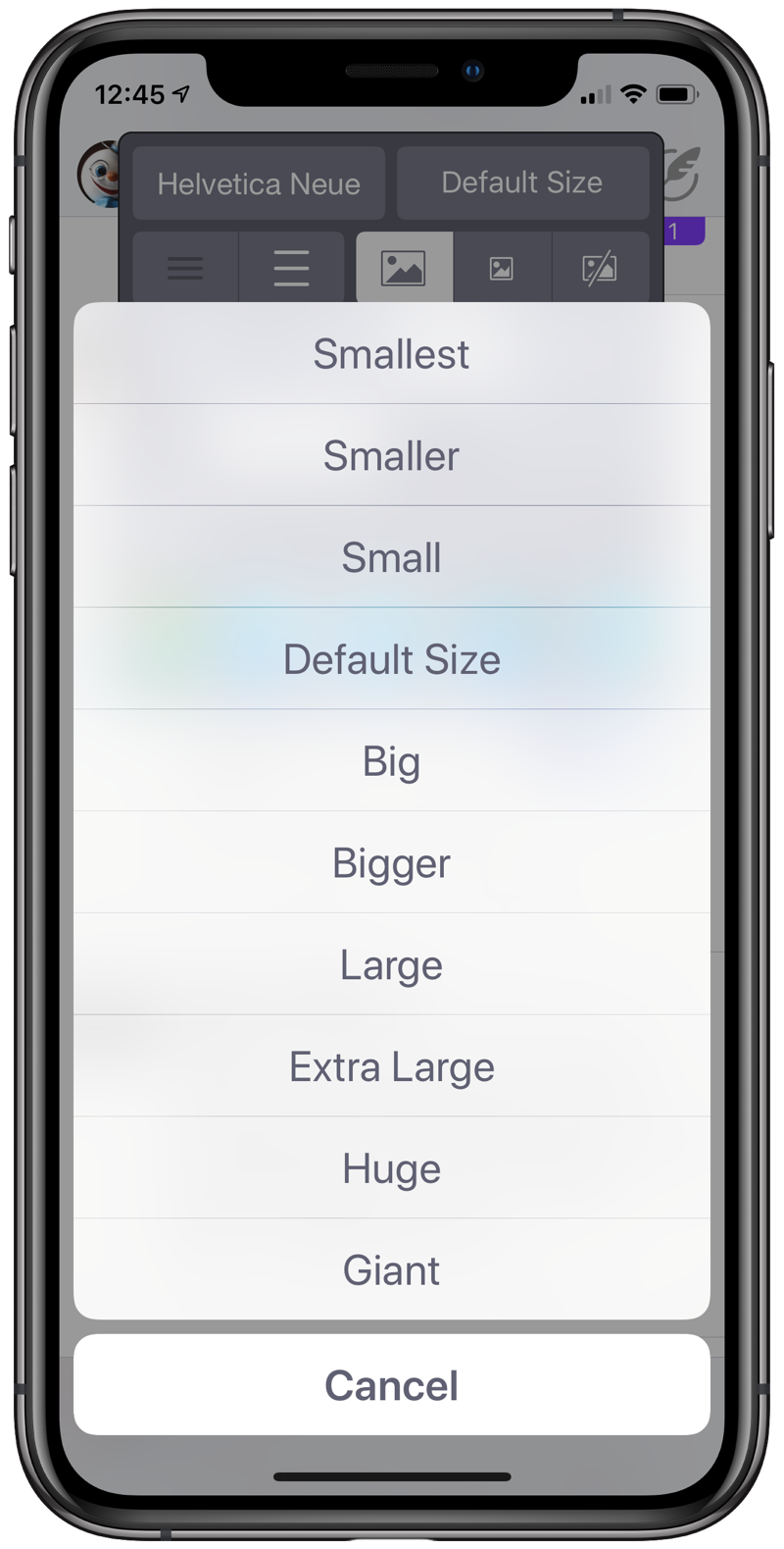
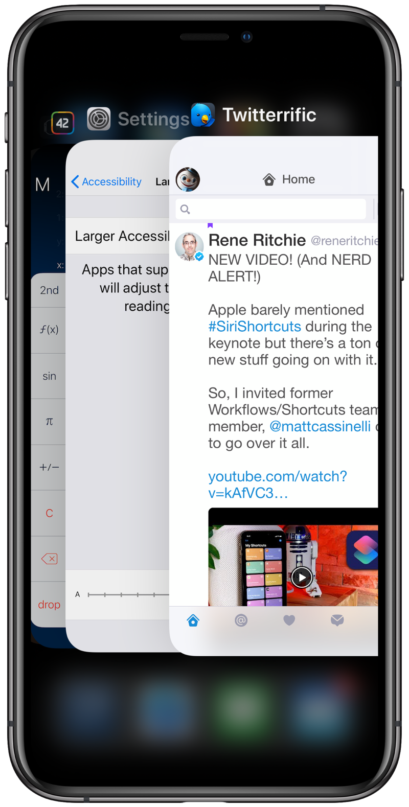
If you can’f find what you want in that list, you may need to write your own Twitter client. By the way, all of these font sizes are relative to the default size, which matches the size chosen in the Accessibility settings. You can see this if you put Twitterrific and Settings next to each other in the app carousel.
A small but welcome feature is how Twitterrific lets you navigate the hierarchy of settings. As you can see below, the sidebar has a gear icon at the lower right. Clicking it brings up the first level of settings, most items of which lead to another level of choices.
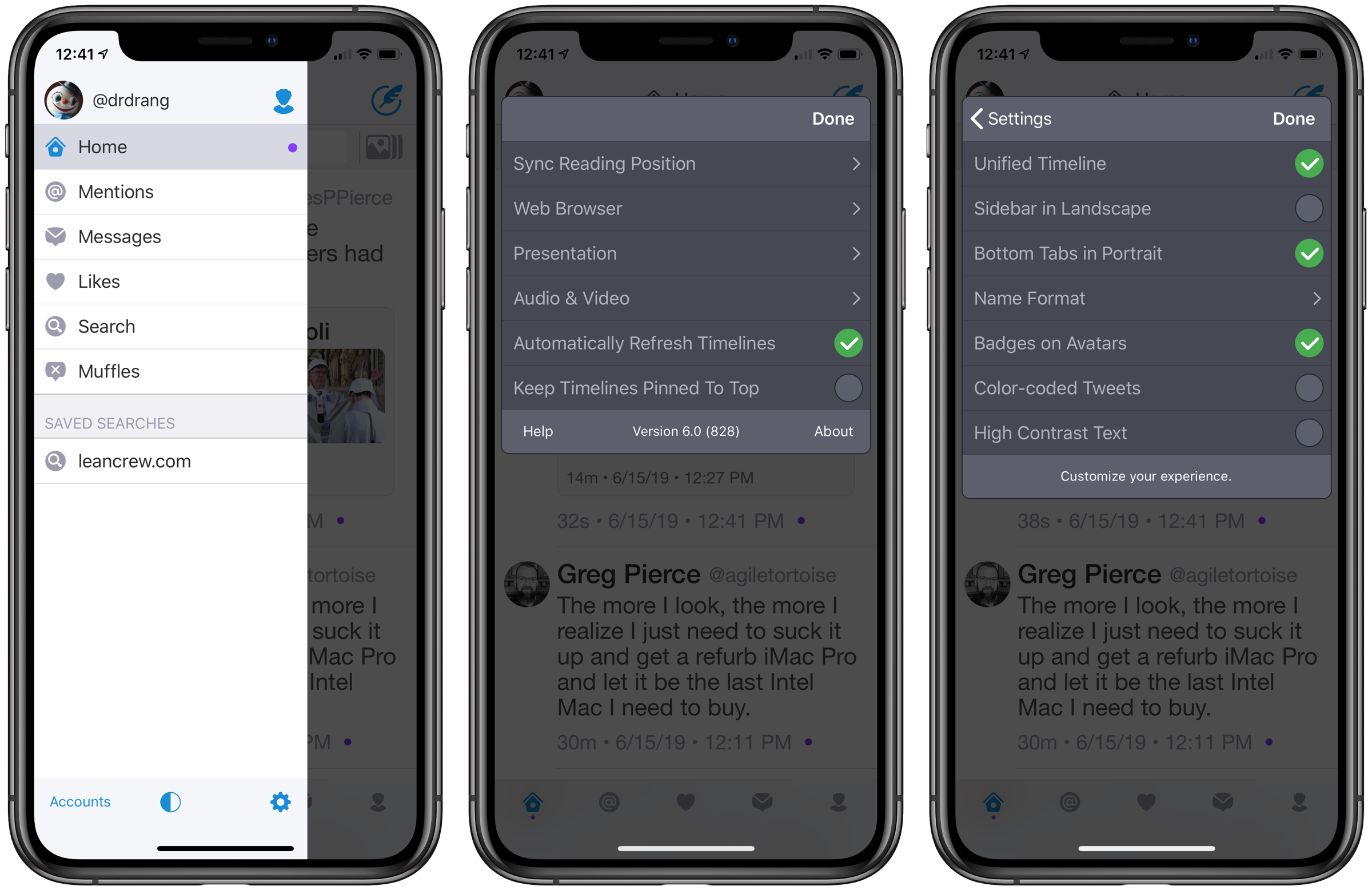
In most apps, after going down the hierarchy to change what you want, you have to go back up the hierarchy one step at a time before you can dismiss the settings popover. But Twitterrific gives you a Done button that allows you to bail out of settings and go back to the app at every step. I suppose this becomes less helpful with time, as once you get the settings you like you tend to stick with them, but it’s a surprisingly big time saver when you’re first starting out.
In summary, Twitterrific 6 is looking good so far. I’ll be back in a few weeks with a final verdict.
-
There’s also a one-time payment option of $29.99 (shocking!) that doesn’t appear in the Subscriptions area of Settings. ↩
