2019 Apple scorecard
February 1, 2020 at 11:58 AM by Dr. Drang
Jason Snell’s annual Apple report card came out yesterday, and it was, as usual, interesting to hear both the harmony and discord among the choir of Apple watchers.
The questionnaires were sent out late last year and were compiled earlier in January. If you’ve been following John Gruber’s recent posts on the deficiencies of the iPad UI, you’ll find what may have been the seeds of those posts in his comments to Jason. I’ve been trying to sum up my own complicated thoughts on the iPad for some time. Gruber’s posts jibe with a lot of my thinking, but my feelings are more than just “me, too.” I hope to have something coherent written soon.
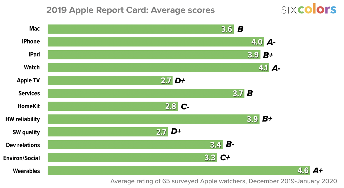
Back to the report card: There is a small but admirable thing Jason does with his graph of overall scores. I didn’t notice it until this year, but it’s been the case for as long as he’s been doing the report card.

Image from Six Colors.
Compare the length of the bar for HomeKit, which has a score of 2.8, to that of Wearables, which has a score of 4.6. You’ll see that the latter is twice the length of the former, even though 4.6 isn’t twice 2.8.
This is correct because Jason doesn’t ask for rankings between zero and five, he asks for rankings between one and five. Therefore, the baseline at the left edge of the scorecard is one, not zero, and the Wearables bar should be twice the length of the HomeKit line because . It’s attention to the little things that make for good graphs.
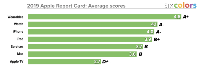
One more thing: For consistency, Jason has maintained the same ordering for the categories since the 2016 report card, but there are lots of ways to look at the results. Here, I’ve clipped out and rearranged just the “product” categories:

Services, of course, isn’t a product, but Apple treats it as such in its quarterly reports, so I’ve followed its lead.
This seems right, doesn’t it? For “Wearables,” you can substitute “AirPods,” and it’s clearly the outstanding current product. Then there’s kind of a stew of second-tier quality, where we all might have our own slight reordering, but there’s certainly consensus that the iPhone should be at or near the top of this group and the Mac should be at or near the bottom. And then there’s the AppleTV.
