Ur
March 5, 2020 at 9:01 PM by Dr. Drang
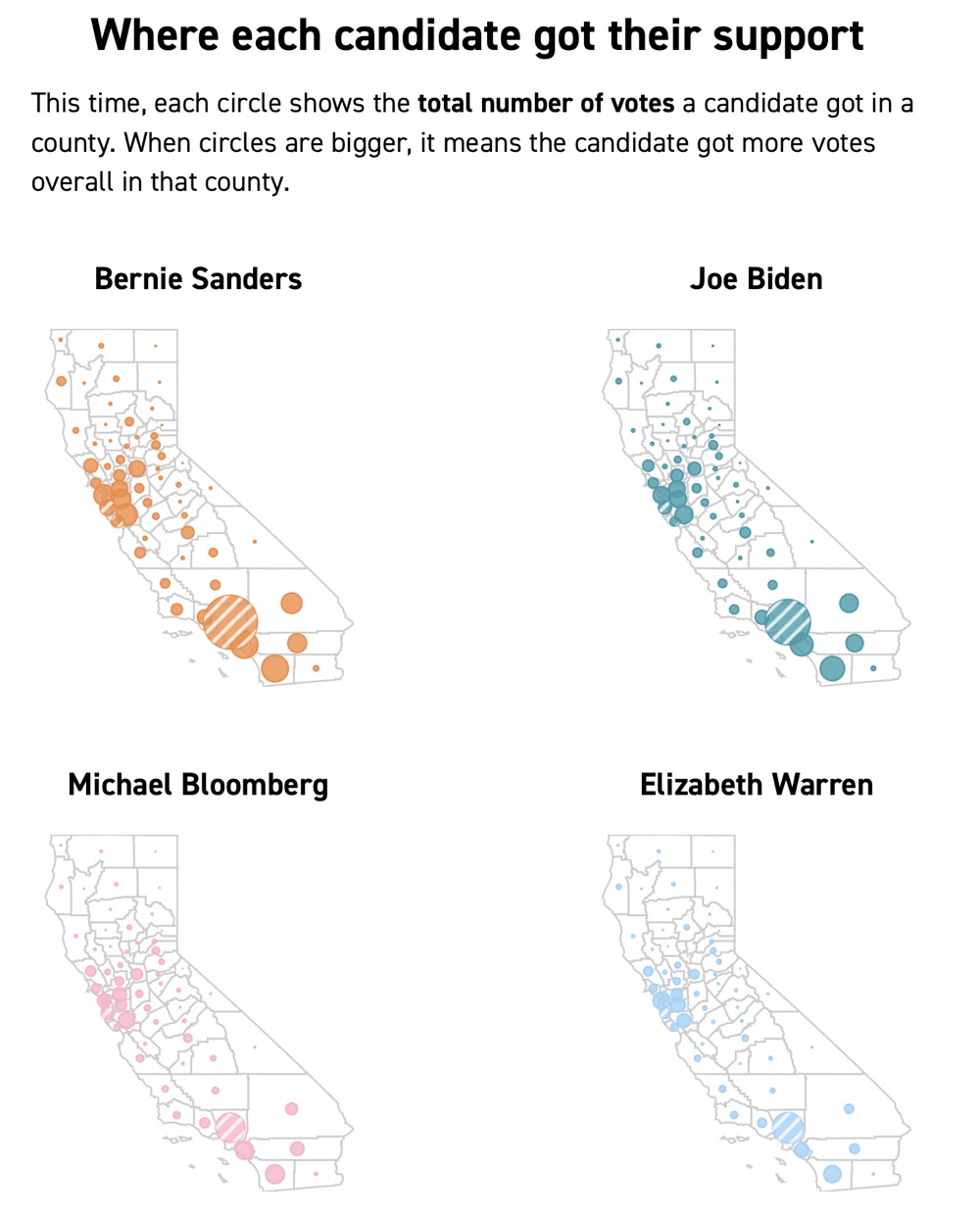
As I was looking through the Super Tuesday results yesterday, I came upon this infographic from Politico.

If you look carefully, you can see that the Biden circles are smaller than the Sanders circles. And it’s easy to see that the Bloomberg and Warren circles are distinctly smaller yet. But is that really worth the digital ink used to make the maps?
After all, at the time I took the screenshot, Sanders was at 34% of the vote, Biden at 25%, Bloomberg at 14% and Warren at 12%. Wouldn’t we expect the circles to be sized the way they are?
In theory, a bundle of maps like this would show some sort of regional division in where the different candidates got their support. But with regard to the title of the graphic, where did each candidate get their support? Where the people live.
Politico’s maps are Golden State relatives of what Kieran Healy calls America’s Ur-Choropleths. As Kieran says, too many supposed geographic explanations of America’s political life are little more than recapitulations of maps of Population Density and Percent Black:
Those two variables aren’t explanations of anything in isolation, but if it turns out it’s more useful to know one or both of them instead of the thing you’re plotting, you probably want to reconsider your theory.
Politico doesn’t seem to have any theory of the California results; they’re just following the current journalistic fad of filling up space with colorful graphs. But it’s certainly true that if you know the state’s population density, you won’t learn anything from these maps.
