Small multiples and normalization
April 24, 2020 at 9:40 AM by Dr. Drang
In my last post, I mentioned Kieran Healy’s article on Apple sales data and how he created graphs that showed a cyclic (or seasonal) component on top of an overall trend. Yesterday, he did it again, although this time the seasonal aspects were only a minor part of the article and he worked with a different Apple time series.
The time series was what Apple is calling its Mobility Trends, a set of data that summarizes requests for directions in Apple Maps. The data are categorized by country, by city, and by type of direction type (driving, walking, and transit). They start on January 13 of this year—more about that later—and are continually updated. You can graph certain data directly on the Mobility Trends site or download the data set as a CSV file and play with it on your own.
Apple’s primary goal is to show how requests for directions have changed as people respond to the COVID-19 pandemic. To focus on the change rather than the gross number of requests, Apple has normalized all the data. The number of requests for each country, city, and type of direction request has been set to 100 for January 13 and all subsequent data are relative to that starting point. A 50, for example, for the Chicago walking directions on April 1 would mean that there were half as many requests for walking directions in Chicago on that day as there were on January 13.
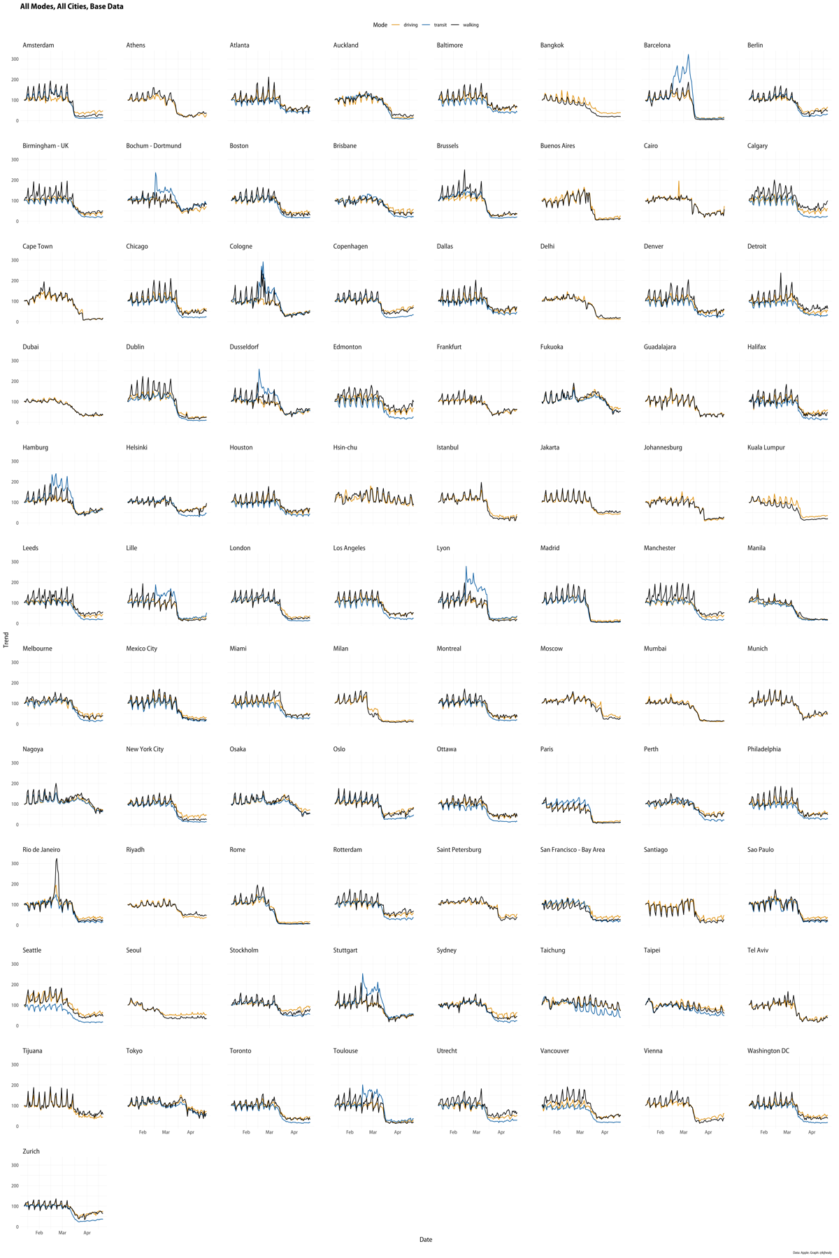
My favorite part of Kieran’s post is this small multiples chart that plots all 89 cities in the data set, with the walking, driving, and transit direction requests shown in black, yellow-orange, and light blue, respectively.

I’ve always thought the small in small multiples means the number of subplots; here it’s better applied to the size of the subplots. Despite the size of the subplots, arraying them this way allows you to pick out things that you might not otherwise see.
In his post, Kieran talks about the obvious Mardi Gras spike in Rio de Janeiro and how that led him to question the pre-Mardi Gras spikes in several French and German cities. The likely answer is both funny and a lesson in data analysis; I won’t spoil it here.
What jumped out at me when looking at the small multiples was Seattle’s transit data. Seattle is along the left edge, third up from the bottom, and you can see the blue line (transit) running below the other two for the entire length of the graph. Having the transit line below the others in late March and April is relatively common, but for it to be distinctly lower all the way back to mid-January is unique. What makes Seattle different in this way?
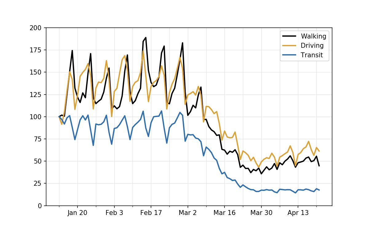
To answer the question, let’s look at the Seattle data by itself.

The vertical gridlines are positioned at every Monday to make the weekly cycle easier to see. Two things are clear:
- The number of requests for transit directions on January 13 was particularly high for a Monday and was near the peak for all the days in the data set.
- The numbers of requests for walking and driving directions on January 13 were particularly low for a Monday and were near the bottom for all the days before social distancing kicked in.
These coinciding oddities conspired to push the transit line down from the walking and driving lines. When viewed this way, it becomes clear that setting the January 13 data to 100 was probably not Apple’s best idea—not for Seattle, certainly, and not for the other cities, either, because they all show weekly cycles. Normalizing the data to a Monday implies that Mondays are the norm, even though they clearly are not. Seattle’s data stood out from the other cities only because the particular Monday Apple chose to normalize to happened to be an unusual one there.
One effect of this normalization choice is to make the recent walking and driving requests in Seattle look higher than they should. Apple’s scores suggest that they are currently averaging 50–65% of what they were pre-COVID, but those are artificially high numbers because the norm was set artificially low.
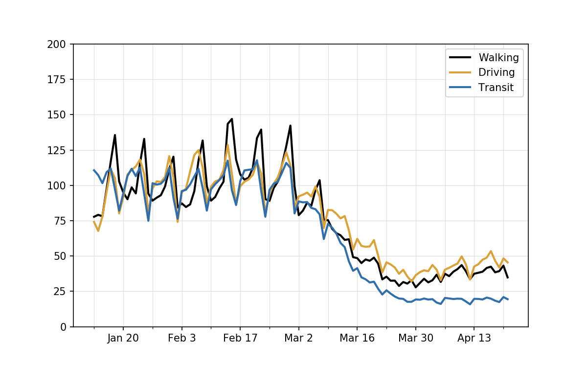
A better way to normalize the data would be to take a week’s average, or a few weeks’ average, before social distancing and scale all the data with that set to 100. If we do that, the plot shifts to look like this:

Now the early data are cycling about 100, which makes more sense if we think of 100 as an average day, and the walking and driving requests are seen to be running currently in the 35–50% range. The transit requests are slightly higher in this graph, but the difference isn’t easy to see because it’s only about two percentage points.
To be specific, what I did to make this plot was get the average of each set of requests over the first four weeks of data and scale all the data by dividing by those averages. The averages were:
| Type | Average |
|---|---|
| Walking | 128.6 |
| Driving | 135.0 |
| Transit | 90.4 |
So you can see why the walking and driving lines were reduced by about 25% and the transit line was lifted by about 10%.
If you look back at the small multiples, you can see that rescaling Apple’s numbers according to an initial 3- or 4-week average would probably be reasonable for most of the cities but certainly not all of them. Seoul, for example, which is sitting right next to Seattle, was already starting its social distancing in January, so it would be hard to get a pre-COVID average there.
The particular oddity of January 13 as a starting point for Seattle reminds me of how climate change deniers used to make global temperature plots that starting in 1998 because that was a strong El Niño year. For a while, at least, subsequent years appeared cooler,1 and they would argue that their plots were proof that global warming was a hoax. In this case, of course, there’s nothing dishonest in Apple’s numbers; it’s just that they could have been scaled in a more useful way.
If you’re interested in how I made my plots, it was pretty simple. I downloaded Apple’s CSV file, opened it in Numbers, deleted all the non-Seattle data, transposed the sheet (Apple had the dates in columns; I wanted them in rows), and exported a new CSV that looked like this for its first several lines:
Date,Driving,Transit,Walking
2020-01-13,100,100,100
2020-01-14,91.43,96.87,101.74
2020-01-15,105.28,91.73,100.47
2020-01-16,128.93,98.76,125.25
2020-01-17,150.42,101.14,150.39
2020-01-18,141.85,87.91,174.37
2020-01-19,108.22,74.18,132.22
2020-01-20,123.71,85.34,122.04
2020-01-21,145.34,96.4,115.95
If I intended to do more with Apple’s data, I’d have written a script for some of this. For a one-off, it was faster to all the data prep by hand.
With the data in the shape I wanted, I wrote this script to make the two plots:
python:
 1:  import pandas as pd
 2:  import numpy as np
 3:  import matplotlib.pyplot as plt
 4:  import matplotlib.dates as mdates
 5:  from matplotlib.ticker import MultipleLocator
 6:  from pandas.plotting import register_matplotlib_converters
 7:
 8:  # Import the data
 9:  register_matplotlib_converters()
10:  df = pd.read_csv('seattle.csv', parse_dates=['Date'])
11:
12:  # Get the 4-week  means for each type
13:  means = {}
14:  for t in ('Driving', 'Transit', 'Walking'):
15:    means[t] = np.mean(df[t][:28])
16:  print(means)
17:
18:  # Rescale the data
19:  for t in ('Driving', 'Transit', 'Walking'):
20:    df[t + 'Scale'] = df[t]/means[t]*100
21:
22:  # Set the date ticks
23:  othermondays = mdates.WeekdayLocator(byweekday=mdates.MO, interval=2)
24:  mondays = mdates.WeekdayLocator(byweekday=mdates.MO, interval=1)
25:
26:  # Plot the rescaled data
27:  fig, ax = plt.subplots(figsize=(8, 5))
28:  ax.plot(df.Date, df.WalkingScale, '-', lw=2, color='#000000', label='Walking')
29:  ax.plot(df.Date, df.DrivingScale, '-', lw=2, color='#dba237', label='Driving')
30:  ax.plot(df.Date, df.TransitScale, '-', lw=2, color='#306fac', label='Transit')
31:
32:  ax.xaxis.set_major_locator(othermondays)
33:  ax.xaxis.set_minor_locator(mondays)
34:  ax.xaxis.set_major_formatter(mdates.DateFormatter('%b %-d'))
35:  ax.set_ylim(0, 200)
36:  ax.grid(linewidth=.5, which='major', color='#dddddd', linestyle='-')
37:  ax.legend()
38:
39:  plt.savefig('20200423-Seattle data rescaled.png', format='png', dpi=150)
40:
41:  # Plot the Apple data
42:  fig, ax = plt.subplots(figsize=(8, 5))
43:  ax.plot(df.Date, df.Walking, '-', lw=2, color='#000000', label='Walking')
44:  ax.plot(df.Date, df.Driving, '-', lw=2, color='#d95f02', label='Driving')
45:  ax.plot(df.Date, df.Transit, '-', lw=2, color='#7570b3', label='Transit')
46:
47:  ax.xaxis.set_major_locator(othermondays)
48:  ax.xaxis.set_minor_locator(mondays)
49:  ax.xaxis.set_major_formatter(mdates.DateFormatter('%b %-d'))
50:  ax.set_ylim(0, 200)
51:  ax.grid(linewidth=.5, which='major', color='#dddddd', linestyle='-')
52:  ax.legend()
53:
54:  plt.savefig('20200423-Seattle data from Apple.png', format='png', dpi=150)
Nothing special here. I got the colors for the driving and transit plots by importing Kieran’s chart into a graphics program and using the eyedropper tool.
I can’t say I learned anything new in this exercise, but it did reinforce some things that are easy to forget. First, the value of small multiples in seeing patterns and deviations from patterns. And second, that some normalizations are more useful than others.
Update Apr 29, 2020 1:16 PM
Apple has added several dozen cities to its data set, and Prof. Healy has found that January 13 was also a highly unrepresentative normalization date for New Orleans. Remember college football?
-
There was some dishonesty in that, too. ↩
