The Tuesday jump
April 21, 2020 at 8:05 PM by Dr. Drang
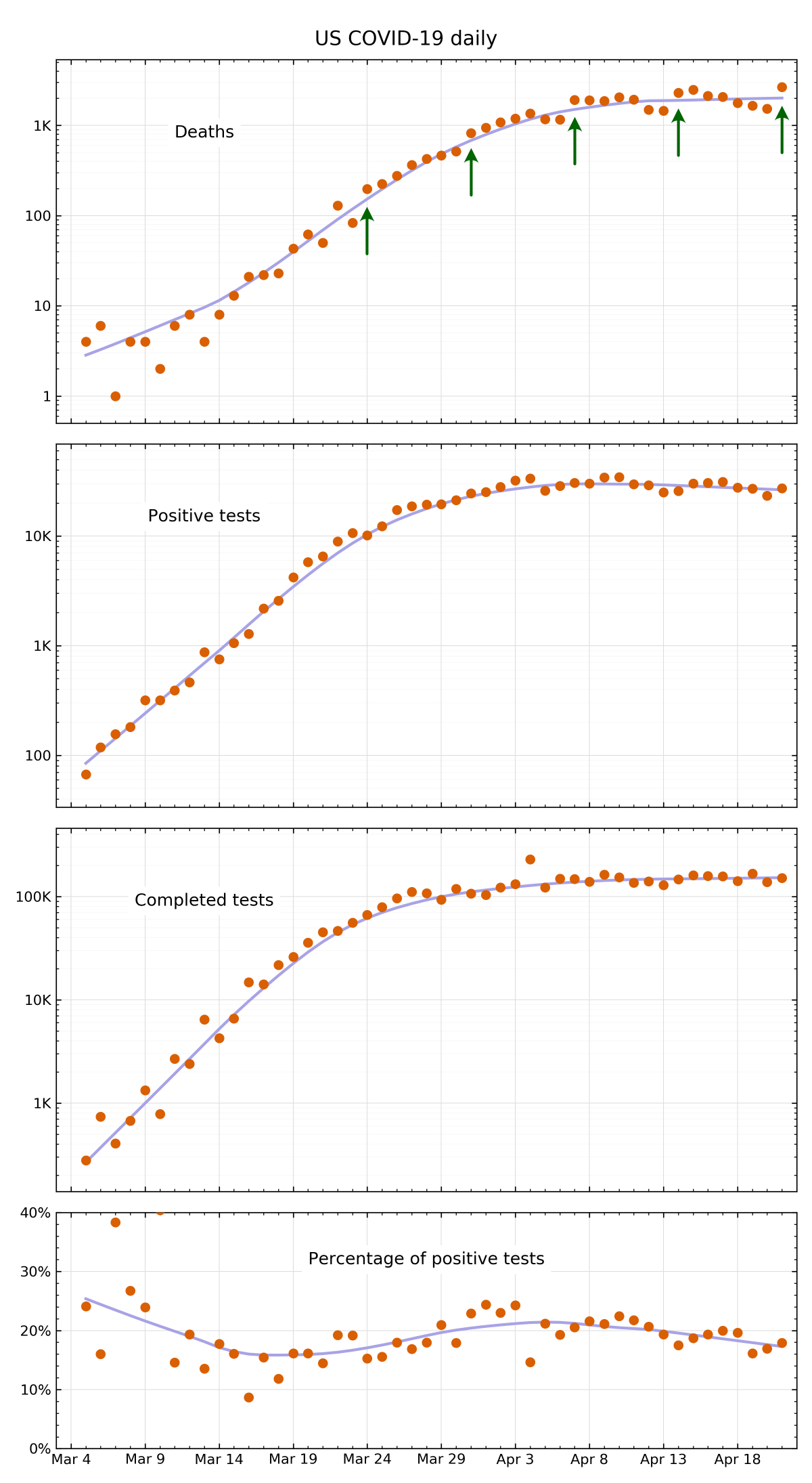
Today, like every Tuesday recently, I looked at my updated graph of COVID-19 data for the US, and saw that the number of deaths over the past day had jumped up.

These plots are for the daily figures, and you can see by the arrows in the top subplot that there’s been a distinct jump every Tuesday since late March. Why is this?
My strong suspicion is that this is due to the weekly work schedule of the people who report the figures the COVID Tracking Project compiles. Deaths over the weekend probably don’t get reported in full and the backlog of paperwork doesn’t get finished until Tuesday. And it may be due specifically to the weekly schedule of health officials in New York, as it’s New York’s numbers that dominate the country’s totals.
Update Apr 26, 2020 9:35 PM
Nope. A review of the figures from individual states shows that New Jersey is primarily responsible for the Tuesday jump, with Massachusetts also contributing.
There appear to be cyclic components superimposed on the overall trends in the positive and completed test graphs, too. If you’re interested in teasing out the details, I suggest you look at this post by Kieran Healy from about five years ago in which he analyzed the cyclic aspects of Apple sales figures. If you’re really interested in the topic, William Cleveland’s Visualizing Data is probably the best source for the underlying ideas. Kieran’s own Data Visualization is also really good, but I’m pretty sure he doesn’t get into the cyclic stuff in that book.
Update Apr 23, 2020 1:27 PM
Kieran has a new post with cyclic data from Apple. This time it’s the mobility data Apple recently published that shows, among other things, the change in requests for directions in Maps since January. I think my favorite part of his post is the small multiples chart showing the mobility trends in all the cities in Apple’s dataset. The subplots are really small and there are many multiples.
