A tardy assessment of the Apple Sports app
April 12, 2024 at 1:00 PM by Dr. Drang
I tried the Apple Sports app when it came out in February and abandoned it almost immediately. Lots was written about Sports in its first couple of weeks, but I was on a blogging hiatus back then. I’ve recently looked at it again to see if I was too hasty or if its failings had been fixed (no to both), so I figured I’d write up my thoughts.
I won’t be saying anything about how Sports fits into the Apple sports universe; go to Jason Snell for that. And I won’t be talking about how its design may be a harbinger of iOS 18; that’s Lickability’s baliwick. But I do want to talk about its design as a sports app.
You may recall that the main selling point of Sports was its ability to give you up-to-date scores. Eddy Cue said, “I just want to get the damn score of the game.” That’s Apple marketing at its best: it’s short, pithy, and it directs you to the app’s best feature, the presentation of today’s scores.
It’s easy to set up Sports to follow your favorite leagues/conferences and teams, and once that’s done the presentation of scores is logical. Games being played in your chosen leagues are displayed generally in chronological order, but the games with your favorite teams are floated to the top. That’s the right way to do it.
But scores are only part of what a good sports app is about. Sports apps are used not only when you can’t watch a game and want to be kept plugged in, they’re also used—even more often used, I think—to give you background information on the game you’re currently watching. Announcements during a broadcast are ephemeral, but a sports app can tell you how many fouls Nikola Jokić has at any time.1 And this is where Sports falls down.
In basketball, for example, the box score statistics are thin. There’s no info on free throws, steals, blocks, turnovers, or personal fouls. League standings are missing common stats like the home/away record, record over the last 10 games, and win/loss streaks, These are things fans want and that other sports apps provide. No amount of beautiful presentation is going to make up for missing data.
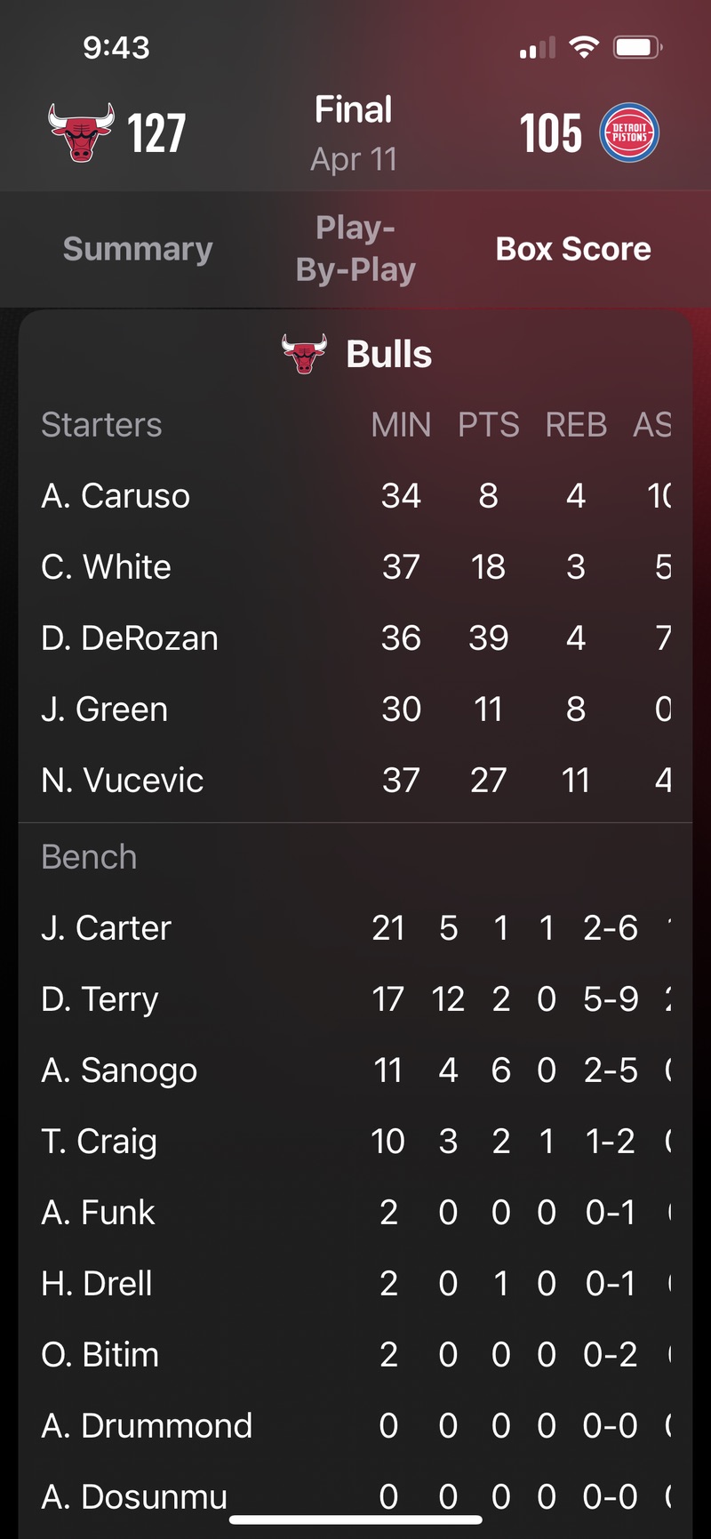
And, weirdly for an Apple app, the presentation isn’t beautiful—it’s actually awful. Here’s a screenshot of the box score from last night’s Chicago Bulls/Detroit Pistons game:

Like many sports apps, Sports splits the box score into starters and bench players (during a game, the players on the court have marks next to their names). Apple’s designers decided to put the headers only at the top of the Starters portion of the table, which I would applaud if they’d aligned the columns of the Bench portion of the table with the columns of the Starters portion. But they didn’t. Bench rebounds, for example, are more or less under the PTS header. This is not how you present a table of numbers, and it’s inconceivable to me that anyone would look at this mess and give it a pass.
The programming problem here is obvious. Although the use of a single header suggests this is meant to be seen as a single table, inside the app the Starters and Bench parts are two separate tables. The column spacing of the Starters table is based on widths that include the headers (several of which are wider than the data below them), and the column spacing of the Bench table is based on widths of the data alone. Instead of looking at both tables, getting the maximum width of each column, and applying that to both tables, the programmers simply allowed the tables to be formatted separately, thus saving themselves at least five lines of code.
Again, did nobody at Apple look at this before putting it in the App Store? And has nobody looked at it in the seven weeks since?
I admit I may be unduly irritated by this because I spent a lot of my career making tables of figures and doing my best to make them easy to read. But before you dismiss me as a crank, look at what happens when you swipe on the tables left and right to see the additional stats. They get even further misaligned because the two tables don’t scroll together.
When you use a single header, you’re telling the reader that they’re looking at a single table. But this design cheats the reader.
I’ve used several sports apps over the years. Many of them are crappy and fill your small screen with ads. A good Apple Sports app would fill a real need. But I can’t use it until it stops offending me.
-
My examples are going to be about basketball because that’s the sport I care about the most. ↩
