The unbearable sorrow of Apple Weather
June 23, 2024 at 2:58 PM by Dr. Drang
Yesterday morning, I got obsessed with the 10-day forecast section of the Apple Weather iOS app—specifically, how it presents each day’s temperature range. I still don’t understand the logic behind it.
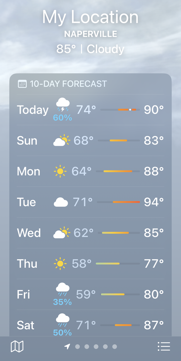
Here’s a screenshot. All ten days don’t fit on the screen of my iPhone 13 Pro, but the eight that appear here will suffice. Click on the image if you want to see a larger version.
The temperature ranges for each day are presented in three ways:
- As the low and high numbers themselves.
- As a colored bar that runs in a “slot” between the low and high temperatures. The left edge of the bar represents the low temperature for the day, and the right edge represents the high.
- As the gradient in the colored bar, with cooler temperatures represented by cooler colors and warmer temperatures represented by warmer colors.
What I’m calling the “slot” is the darker gray line that represents the total range of temperature over the ten-day period. To me, it looks like a slot into which the colored bar is placed. In the example above, the low temperature is 58° on Thursday and the high is 94° on Tuesday, so the temperature bars within the slots are jammed up against the ends of the slots on those days.
Let me start by saying I don’t have a problem with the redundancy. Although I wouldn’t think highly of a graph in a scientific paper that presented the same information three ways, the Weather app isn’t a scientific paper. Its audience is a diverse group of people who process information in different ways, so presenting it in different ways makes sense.
What bothers me is the alignment of the data (or the lack thereof). You can see immediately that the low temperatures zigzag from left to right as you look down the list. My first thought was that this had something to do with the day names, which are all left-aligned but are of different lengths. But no. “Wed” takes up much more horizontal space than “Fri,” but Wednesday’s low temperature is somehow distinctly to the left of Friday’s.
And the position of each day’s low temperature affects the left edge of the temperature slot that runs between the low and the high. Here’s the same screenshot with vertical lines marking the ends of the slots and the temperature bars. Again, you can click on it to see a larger version.
When have you ever seen a bar chart in which the origin varies from bar to bar?
One good thing about the slots is that they all end at the same horizontal position, 905 pixels from the left edge of the screen. I assume this is because the high temperatures are all right-aligned and are all two-digit numbers.
So what’s going on with the colored temperature bars? How do you decide where they start and stop when the slots in which they run vary from day to day? The rational way would be to set the left edge of the slot to the low temperature of the 10-day period, the right edge of the slot to the high temperature of the 10-day period, and then use that scale to determine the left and right edges of the colored temperature bar.
Let’s use Monday as an example of the calculations. The Monday slot starts 619 pixels from the left edge of the screen and goes to, as I said above, 905 pixels from the left edge of the screen. Therefore, those
represent the temperature range of
making the scale of this bar
So the left edge of the temperature bar (64°) should be at
and the right edge (88°) should be at
The actual ends of the temperature bar were at 669 and 855 pixels, respectively, so these were each off by about 2 pixels. I did this same calculation for all the days; the differences ran from 1 pixel to 4 pixels.
What with roundoff and the difficulty of precisely locating the end of an antialiased line, I don’t consider differences of 1 or 2 pixels to be significant. But 4 pixels off is too much. I don’t think Weather is using this approach to determine the ends of the temperature bars.
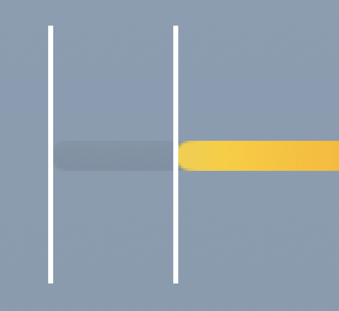
If you’ve zoomed in to the higher-resolution images, you’ll note that the lines that represent the slots and temperature bars have semicircular end caps and that my measurements were taken from the ends of the caps.

Maybe the end coordinates of the lines shouldn’t include the cap radii, and I’d get closer results if I used the centers of the semicircles instead. Well, I did the measurements and calculations that way, and the results were further off.
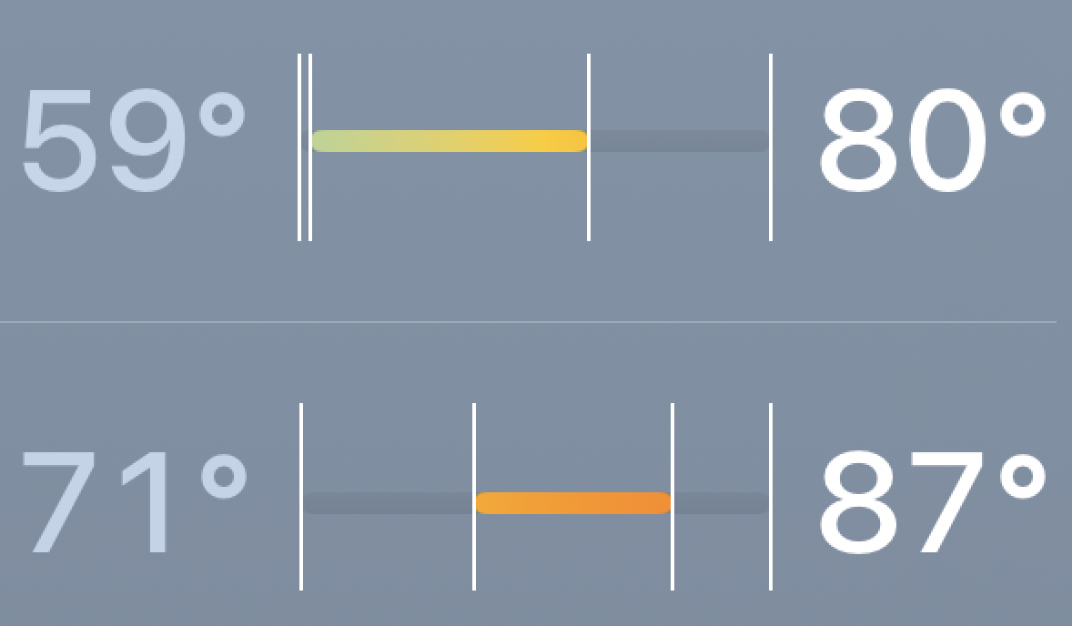
Now let’s move on to colors. We’ll zoom in on Friday and Saturday and compare the colors in the gradients where the temperature ranges overlap.

Shouldn’t the colors between 71° and 80° match up? Clearly they don’t, and it was different colors being used for the same temperature that got me started on this frustrating quest to understand how Apple is charting temperatures.
Obviously, this chart is drawn by algorithm. The positions, lengths, and colors of all the parts follow a set of rules, and I should be able to figure out what those rules are. But like Richard Kiley, I’ve found my quest to be an impossible dream.
Update 23 Jun 2024 4:11 PM
Several readers on Mastodon told me the alignment was fine on their phones and suggested Larger Text/Dynamic Type as the reason the charts on my phone are messed up. They were absolutely right. I bumped up my text size so long ago I’d forgotten all about it, but I should’ve known to look into that before posting. Interestingly, moving my text size down just one tick got all the bar ends to match up. The colors still seem a little off to me, but I’ll need to zoom in and look more carefully.
Of course, this still doesn’t answer the question of how the app is deciding where to put the bars and how to adjust the colors when the text size is large. Nor does it excuse Apple’s Weather team for failing to get the alignment right for all the text sizes they allow. Do they just assume the system will fix everything, or do they throw up their hands and say we far-sighted oldsters can just deal with it?


