A good (or bad) example
July 9, 2024 at 3:24 PM by Dr. Drang
The one rule of plotting that every newly minted data scientist can repeat without fail is that your graphs should always start at zero. A graph that doesn’t start at zero is misleading, dishonest, and possibly nefarious. This rule is, of course, bullshit. Not a rule at all.
Oh sure, there are plenty of times when you should start at zero, but the best range to plot depends on what you’re plotting. This morning I saw a great example of a plot that started at zero when it really shouldn’t have.
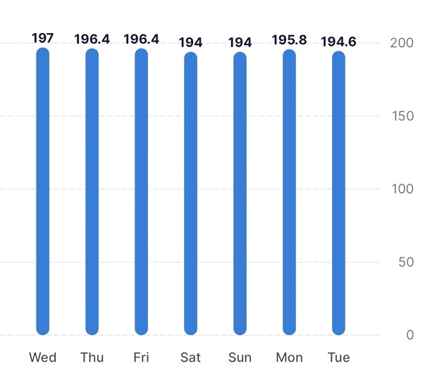
It’s in an app that, among other things, is tracking my weight. Here’s the graph:

Because my weight over these seven days hasn’t changed by more than about 1.5%, the columns are all basically the same height. Even if I were to lose a lot of weight, I’d never go anywhere near zero. The only useful part of this chart is labeling over the columns—it could just as well be a table.
Where should the y-axis start? Depends on what the graph is being used for. If I had a target weight, I’d probably start at some round number below that target. I might put a thin horizontal line at the target. But I’d never do this.
The makers of the app have either internalized the rule that isn’t a rule or have decided that following it fends off criticism by idiots who think it is a rule. Too bad.
