Screenshots and faded memories
August 21, 2024 at 4:06 PM by Dr. Drang
A couple of weeks ago, Chance Miller wrote about a new bit of security theater in the betas of macOS Sequoia: a permissions prompt that asks you to authorize an app to record your screen, e.g., if it takes screenshots. This doesn’t sound so bad until you learn that the permission you give isn’t permanent; you have to reauthorize the app every week. And since you probably have at least a few apps that need this authorization, it seemed likely that you’d be getting prompted to authorize one app or another almost every day.
In a more recent beta, the prompt frequency has changed from weekly to monthly, which is better (by a factor of about four), but still annoying, especially for those of us who have many apps that need to record the screen, whether as a video or a still image. This includes apps that you might not think of as recording your screen. For example, Default Folder X takes screenshots to prevent screen flicker when it puts up its Open and Save dialog enhancements.
Unsurprisingly, serious Mac users like Jason Snell and John Gruber are pissed about this. Apple seems to have forgotten that it made fun of this behavior on Windows in the I’m a Mac/I’m a PC commercials. More important, Apple seems to have forgotten that the user experience is what’s supposed to set Apple products apart.
The writing of the permissions prompt is as bad as its frequency:
App name is requesting to bypass the system private window picker and directly access your screen and audio.
This will allow App name to record your screen and system audio, including personal or sensitive information that may be visible or audible.
As Jason and Myke Hurley said on this week’s Upgrade, who knows what a “system private window picker” is, other than programmers?
I know it’s a dangerous world out there, but there must be a better way to protect us than this. And Apple used to spend a lot of effort figuring out that better way.
I had a vague memory of how the original Macintosh OS handled a similar situation. I mentioned it on Mastodon, and asked if anyone remembered it the way I did:
After reading stories about the weekly warning for apps that do screenshots in the macOS beta, I remembered that in the very early days (1985, say), certain apps would put up an alert when you were about to do something “dangerous.” If you repeatedly dismissed the alert by telling the Mac to go ahead and do the “dangerous” thing, it would, after a few such instances, stop showing the alert and just do what you wanted, albeit with a beep.
Do any of you remember this? Can you point to any documentation that talks about it? (I skimmed the old MacWrite manual but didn’t find anything.) Was there something similar that I’ve twisted? Or am I all wet?
A couple of days later, Russell Finn came to my rescue:
As I recall, you could specify a value n the ‘alrt’ resource such that the first 0-3 calls for that resource would simply beep instead of opening the alert window. So if the user tried an operation that wouldn’t work just then, it could just beep a couple times before opening an alert to explain why the action was invalid.
Is that what you’re remembering? I don’t have my Inside Macintosh handy at the moment but it ought to be documented in the Dialog Manager chapter.
My copy of Inside Macintosh (I had the hardcover with Volumes I–III bound together) was given away during a move back in the 90s, but it’s not hard to find PDFs online. I downloaded Volume I, which had the Dialog Manager chapter, and started reading.
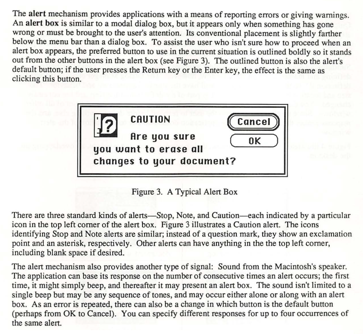
In the original Macintosh OS, warnings were conveyed to the user through a specific type of dialog box called an alert. Here’s an excerpt from Inside Macintosh (p. 401) introducing alerts:

The last paragraph of this excerpt spells out how alerts could change with each occurrence and gives an example of how Apple expected this mechanism to be used.
The alert mechanism also provides another type of signal: Sound from the Macintosh’s speaker. The application can base its response on the number of consecutive times an alert occurs; the first time, it might simply beep, and thereafter it may present an alert box. The sound isn’t limited to a single beep but may be any sequence of tones, and may occur either alone or along with an alert box. As an error is repeated, there can also be a change in which button is the default button (perhaps from OK to Cancel). You can specify different responses for up to four occurrences of the same alert.
So there was a way of changing warnings with each occurrence, but it was exactly the opposite of what I remembered. The idea was to give you a gentle warning the first time you screwed up, then more annoying warnings if you kept it up. Not at all what we’d want for a screenshot warning.
By the way, the example alert in the excerpt above is a Caution alert. Later in the chapter, Apple shows us all three standard alert icons—Stop, Note, and Caution—which brought back fond memories:
![]()
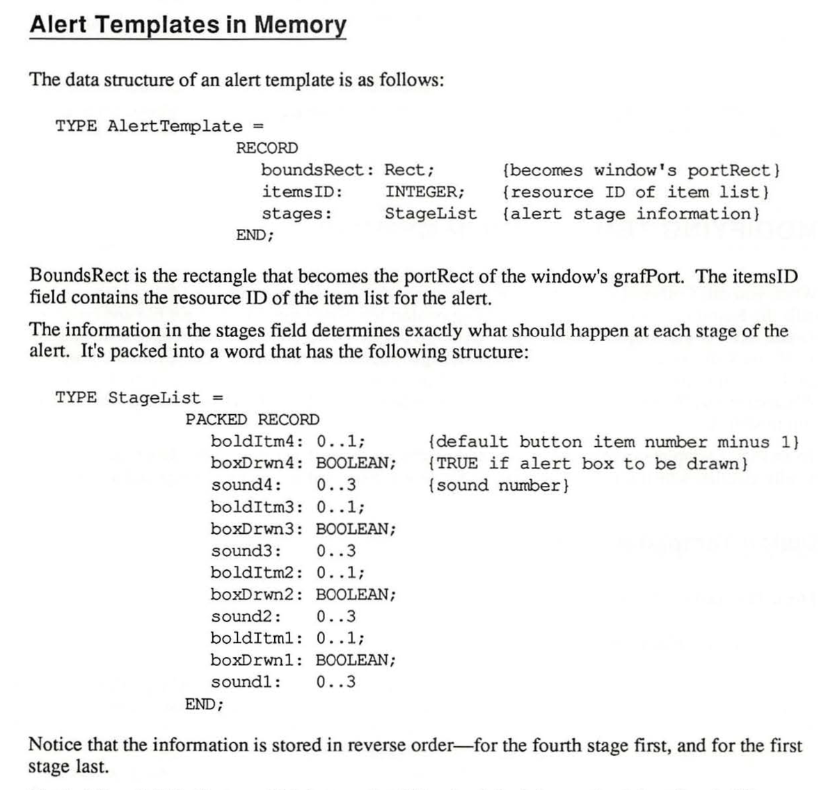
You may recall that Russell mentioned the ALRT resource. For those of you who are ResEdit fans, here’s the excerpt that covers the structure of that resource:

Here’s the text. The code is in Pascal, because that’s how routines and data structures in the Macintosh Toolbox were defined.
The data structure of an alert template is as follows:
TYPE AlertTemplate =
       RECORD
         boundsRect: Rect;  {becomes window's portRect}
         itemsID: INTEGER;  {resource ID of item list}
         stages: StageList  {alert stage information}
       END;
BoundsRect is the rectangle that becomes the portRect of the window’s grafPort. The itemsID field contains the resource ID of the item list for the alert.
The information in the stages field determines exactly what should happen at each stage of the alert. It’s packed into a word that has the following structure:
TYPE StageList =
       PACKED RECORD
         bolditm4: 0..1;     {default button item number minus 1)
         boxDrwn4: BOOLEAN;  {TRUE if alert box to be drawn}
         sound4: 0..3        {sound number}
         bolditm3: 0.. 1;
         boxDrwn3: BOOLEAN;
         sound3: 0..3
         bolditm2: 0..1;
         boxDrwn2: BOOLEAN;
         sound2: 0..3
         bolditm1: 0..1;
         boxDrwn1 : BOOLEAN;
         sound1: 0..3
       END;
Notice that the information is stored in reverse order—for the fourth stage first, and for the first stage last.
There’s nothing in the definition that says the alerts have to get more annoying with subsequent occurrences, but that was certainly the intention and, now that Russell reminded me of it, that is how apps like MacWrite used to work.
(By the way, it’s been ages since I programmed in Pascal, but I’m pretty sure there should be semicolons ending the lines that define sound4, sound3, and sound2. No semicolon on the line that defines sound1 because that’s the last one in its clause.)
So the upshot is that although the original Mac OS had a mechanism for changing alerts with each occurrence, it wouldn’t work for the screenshot warning that we’re seeing in the Sequoia betas. But it’s clear that the Mac software designers back in the 80s thought an awful lot about user interface. The four-part alert system was more complicated than absolutely necessary, but it made the Mac more comfortable to use. The current OS designers could learn something from Inside Macintosh.
