Am I blue?
September 17, 2024 at 12:23 PM by Dr. Drang
The popular “Is my blue your blue” game is questionable as a test of color perception, in that monitor settings and lighting conditions differ, but it presents its results in a way that I really like.
The game fills your screen with a series of colors along a blue-green spectrum and asks you whether the displayed color is blue or green. The colors get closer together as the game proceeds until it has enough answers to tell you the boundary between your ideas blue and green. If you’re like me, the last few colors should all have been answered “neither,” but that’s not a choice. The idea is to insist on a binary choice and find your boundary between the two.
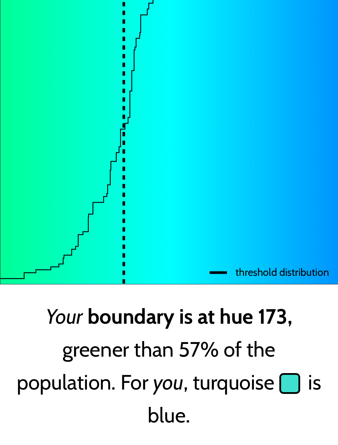
I played it yesterday on my iPhone and got these results:

What I like about the graph is that it’s both clever and self-explanatory. When you look at it, these are the things you know immediately:
- The horizontal axes represents the hue, which has been spread across the entire background of the graph. This is a much better way of presenting the hue than using a value.
- Your threshold between green and blue is the dashed vertical line. This comes from both the graph and the text below it.
- The vertical axis represents the fraction (or percentage) of people who categorized all colors to the left of the given color as blue. We know that because the jagged S-shaped curve, called the “threshold distribution” in the little legend at the bottom right corner, starts out low at the green end and runs up to the top as it moves toward the blue end. Also, the text says my boundary was at the 57% mark, and the vertical line intersects the jagged curve somewhat above the center of the graph.
Those of us who remember our probability and statistics class would call the jagged curve the cumulative distribution function (CDF) of the population’s blue/green threshold. But you don’t need to know this to figure out what the jagged curve means. I assume that the “population” in this case is the people who’ve played the game and that the CDF curve gets updated with every play.
So what we have is a game that presents statistical information at a glance without any long-winded explanation.1 The only improvements I would make are:
- Replace the hue value (173) in the text with a square filled with my threshold color, paralleling what’s done with turquoise. Hue values weren’t used in the game or along the horizontal axis; there’s no need for them in the results text.
- Make the “threshold distribution” line in the legend the same thickness as the CDF. It shouldn’t be the same thickness as the dashed vertical line.
-
Like the explanation I just gave. ↩
