Sinusoidal sunlight
October 23, 2024 at 4:24 PM by Dr. Drang
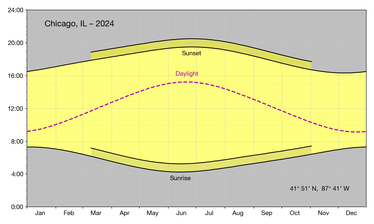
I started my morning walk earlier than usual today, and it was still fairly dark out. I thought about this post from last year and the Daylight line in the graph:

I wondered how hard it would be to alter the code to plot the slope of the Daylight line. That would give perhaps a better sense of how rapidly we gain daylight in the spring and lose it in the fall. But I soon decided against trying that for two reasons:
- Numerical differentiation (i.e., finding the slope) tends to create noisy data and therefore jagged graphs. I figured this was especially likely with the US Naval Observatory data, since it gives the sunrise/sunset times rounded to the nearest minute.
- If the Daylight line really was a sine wave, its slope would also be a sine wave, just shifted by about three months. Not very interesting.
But the second objection got me thinking: how close to a sine wave is the Daylight line? I could try fitting a sine function to the data and see how much the error is. This would give me a chance to learn something new about Mathematica Wolfram.1
Here’s the notebook I made to check the fit:
The first three evaluation cells create a list of (day, daylight) pairs that cover a 16-year period starting on January 1, 2009 and ending on December 31, 2024. I used a multiple of four years so leap years would appear in the same proportion they normally do, at least over the period from 1901 through 2099.
The day is an integer, starting at 0, and the daylight is given in minutes. We usually talk about “daylight hours,” not “daylight minutes,” but because I was going to plot the difference between the actual length of daylight and the best fit sine curve, I thought minutes would be an easier unit to work in.
The daylight list is calculated through the Sunrise and Sunset functions, which give results to at least the nearest second. (They display a time to the nearest second but may keep fractions of a second internally.)
We’re going to fit the data to a curve of this form:
where
- is the length of daylight (in minutes),
- is the time (in days),
- is the mean daylight (minutes),
- is the amplitude of the sine wave (minutes),
- is the period of the sine wave (days), and
- is the offset, or phase, of the sine wave (days).
The phase of a sine wave is usually expressed as an angle in radians, but here I’ve rejiggered the equation to give it the same units as time.
The best fit of the data to this equation is found through the FindFit function. Because this is a fit to a nonlinear curve, I thought it best to give decent initial guesses for each parameter,
fit = FindFit[data, model, {{m, 12*60}, {a, 3*60}, {f, 80}, {p, 365}}, t]
The mean daylight value is going to be near 12 hours, so the initial guess for is 720 minutes. Here in the Chicago area, we go from about 9 hours of daylight in the winter to about 15 hours in the summer, which puts the initial guess for at 3 hours or 180 minutes. The period has to be about a year, so the initial guess for is 365 days. Finally, because 12-hour days happen at the equinoxes, our initial guess for is 80 days, which is about where March 21 lands.
As you can see, the best fit values for the parameters are
{m -> 733.182, a -> 176.722, f -> 79.5656, p -> 365.249}
so our initial guesses were pretty good. Note that the best fit period is 365¼ days, which matches up with the frequency of leap years.
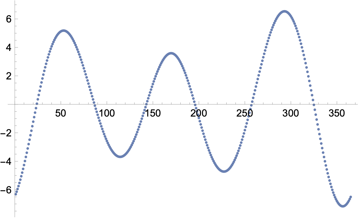
Finally, we get the difference between the actual data and the best fit curve and plot it. The first plot covers the entire 16-year period and is kind of hard to read. The error of each year is basically the same, so we can get a decent idea of how the error varies by looking at just the first year, which is shown in the second plot and reproduced here:

The largest error (in absolute value) is about 7 minutes at or near the winter solstice. The error varies in a sort of sinusoidal fashion with a period of about 4 months, so the peaks and valleys of the error function are roughly 2 months apart.
You can decide for yourself whether an error like this—7 minutes out of 9 hours—makes the real data “close” to a sine wave. I’d say ~1% isn’t bad for such a simple model. Mostly, though, I’m happy to have learned a little more about the Wolfram Language.
-
Wolfram Research recently decided to change the name of Mathematica to Wolfram, thereby giving up on decades of branding and ruining Google searches. The name change isn’t complete—you still see Mathematica in several locations in the app—but the executable has the new name. ↩
