Rescaling a graph
November 3, 2024 at 10:29 AM by Dr. Drang
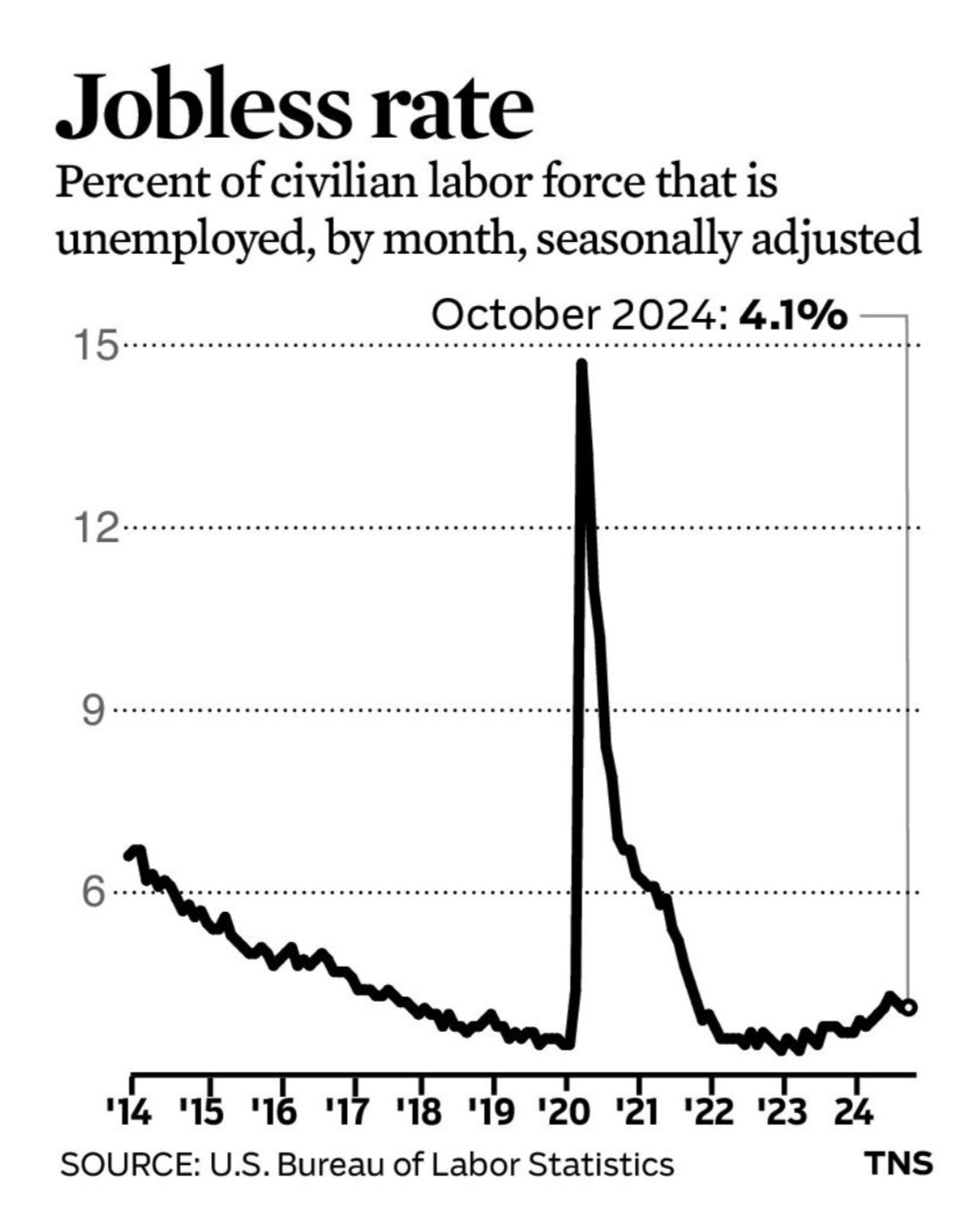
The business pages of the Chicago Tribune usually have a little graphic showing a plot of some economic data. There’s no story to go along with the graph; it’s meant to stand on its own. In yesterday’s edition, it was a graph of unemployment over the past decade or so:

Is this a good graph? As with all graphs, that depends on what’s being communicated. If the idea is to show how high unemployment got during the pandemic, it’s a good graph. But because it was published shortly after the monthly data for October came out—you can see the callout of 4.1% for the last data point—I’d say it’s really meant to show the current unemployment and put it in the context of recent history. For that purpose, it’s OK, but the graph’s vertical scale reduces its value. The large range of the y-axis interferes with our ability to see variations during the non-pandemic years.
People often use a log scale when they need to plot over a large range of data, but that wouldn’t be appropriate here. A general audience may have difficulty interpreting a log scale. More important, the range here isn’t due to long-term growth or decline, it’s coming entirely from that spike in 2020.
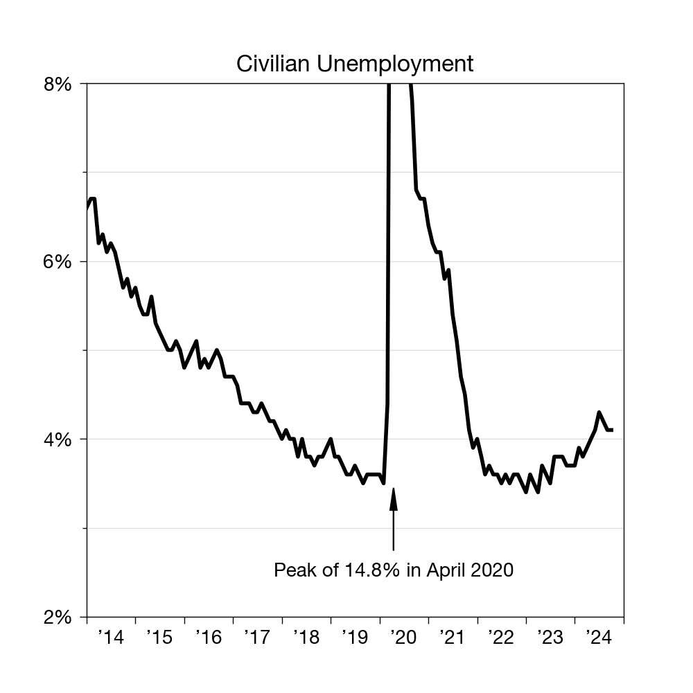
My suggestion would be to cut the y-axis off at about 8%, put labeled ticks every 2%, and add a note showing where the peak unemployment occurred. Something like this:

I didn’t bother matching the font style of the Tribune’s graph, but I did make sure to use an apostrophe on all the years along the x-axis. Like the Tribune, I got the data from the US Bureau of Labor Statistics.
Is this a huge improvement? No, but it brings the unemployment of the past few years up off the bottom of the graph and makes all the data (except the spike) easier to interpret.
