Ticks tricks
November 4, 2024 at 3:46 PM by Dr. Drang
As I often do after a post with a graph, I’m going to follow up by showing how I made it. In this case, the plotting was done with Matplotlib, the Python graphing library with which I’m most familiar.
Matplotlib makes decent graphs by default. If you’re just doing some exploratory plotting for your own purposes, the defaults can be just fine. But when you want your graphs to look better than “just fine,” you need to dig into Matplotlib’s many (many) functions to customize the look.
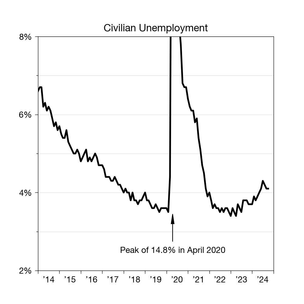
Here’s yesterday’s graph:

And here’s the code that produced it:
python:
 1:  #!/usr/bin/env python3
 2:
 3:  import pandas as pd
 4:  import matplotlib.pyplot as plt
 5:  from datetime import datetime
 6:  from matplotlib.ticker import MultipleLocator
 7:  from matplotlib.dates import DateFormatter, YearLocator
 8:
 9:  # Import data
10:  df = pd.read_csv('unemployment.csv')
11:  x = pd.to_datetime(df.Date, format="%b %Y")
12:  y = df.Rate
13:
14:  # Create the plot with a given size in inches
15:  fig, ax = plt.subplots(figsize=(5,5))
16:
17:  # Add a line
18:  ax.plot(x, y, '-', color='black', lw=2)
19:
20:  # Set the limits
21:  plt.xlim(xmin=datetime(2014,1,1), xmax=datetime(2025,1,1))
22:  plt.ylim(ymin=2, ymax=8)
23:
24:  # Set the major and minor ticks and add a grid
25:  ax.xaxis.set_major_locator(YearLocator(1))
26:  ax.xaxis.set_major_formatter(DateFormatter('        ’%y'))
27:  plt.setp(ax.get_xticklabels()[-1], visible=False)
28:  ax.yaxis.set_major_locator(MultipleLocator(2))
29:  ax.yaxis.set_major_formatter('{x:.0f}%')
30:  ax.yaxis.set_minor_locator(MultipleLocator(1))
31:  ax.grid(linewidth=.5, axis='y', which='both', color='#dddddd', linestyle='-')
32:
33:  # Title and axis labels
34:  plt.title('Civilian Unemployment')
35:
36:  # Annotations
37:  plt.text(datetime(2020, 4, 1), 2.45, "Peak of 14.8% in April 2020", ha='center')
38:  plt.arrow(datetime(2020, 4, 1), 2.75, 0, .45, head_width=50, head_length=.25, lw=.75, fc='black', zorder=100)
39:
40:  # Make the border and tick marks 0.5 points wide
41:  [ i.set_linewidth(0.5) for i in ax.spines.values() ]
42:  ax.tick_params(which='both', width=.5)
43:
44:  # Save as PNG
45:  plt.savefig('20241103-Improved unemployment graph.png', format='png', dpi=200)
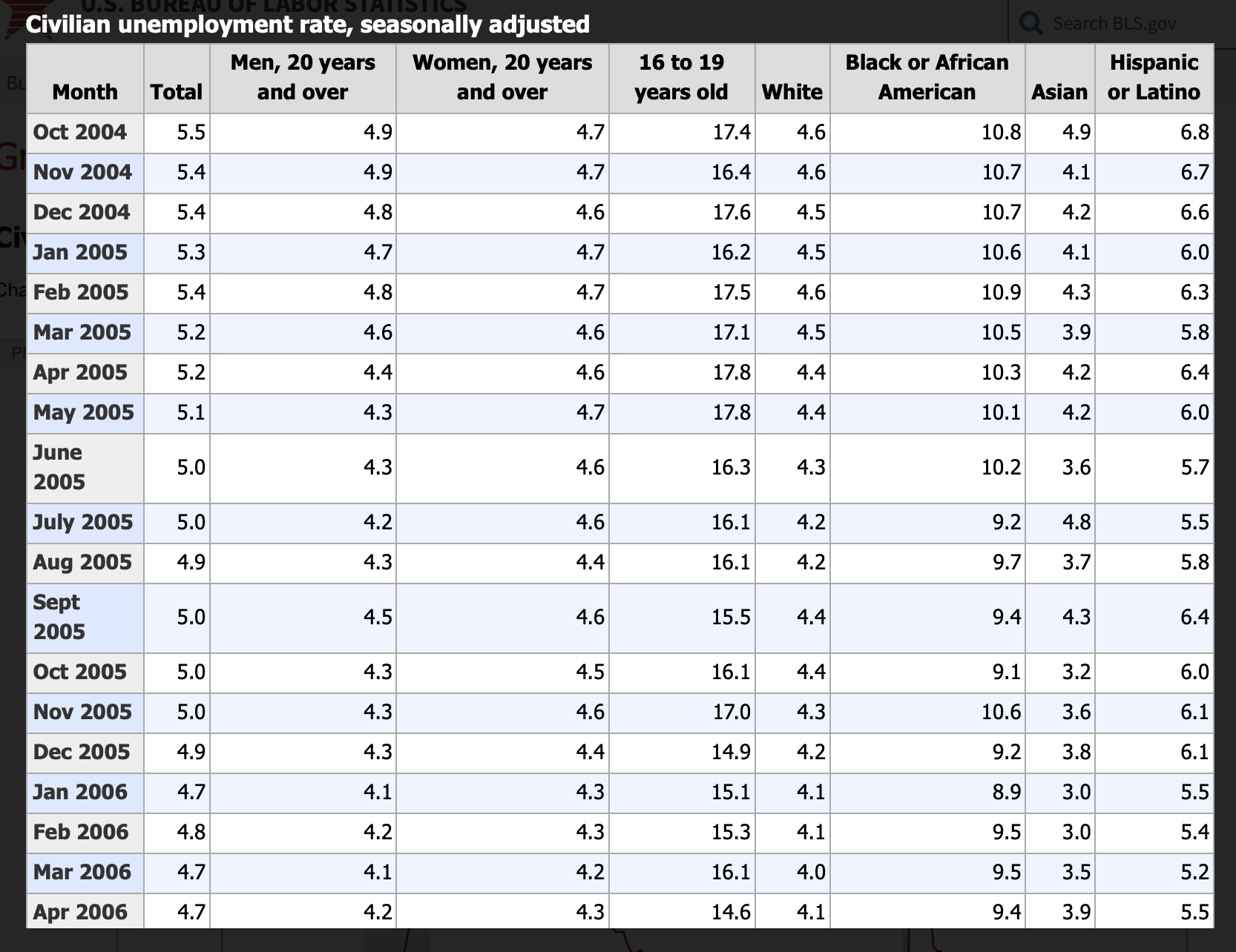
Lines 10–12 get the unemployment data from a file, unemployment.csv, and put the values into the variables x and y for later use. As I said in yesterday’s post, the data came from the US Bureau of Labor Statistics. The Bureau’s page is dominated by a graph of civilian unemployment that goes back about 20 years, but there’s also a link you can use to bring up a table of data, which looks like this:

To match the graph in the Chicago Tribune, I selected the data from January 2014 through October 2024, copied it, and pasted it into a new Numbers spreadsheet (I used to make sure the fonts and colors didn’t come out funny). I then deleted all the columns except the first two, the ones with the month and the total unemployment rate for that month. I labeled those columns Date and Rate and exported the table to a CSV (comma-separated values) file, named unemployment.csv. Here are the first several lines of that file:
Date,Rate
Jan 2014,6.6
Feb 2014,6.7
Mar 2014,6.7
Apr 2014,6.2
May 2014,6.3
June 2014,6.1
July 2014,6.2
Aug 2014,6.1
Sept 2014,5.9
Oct 2014,5.7
Nov 2014,5.8
Dec 2014,5.6
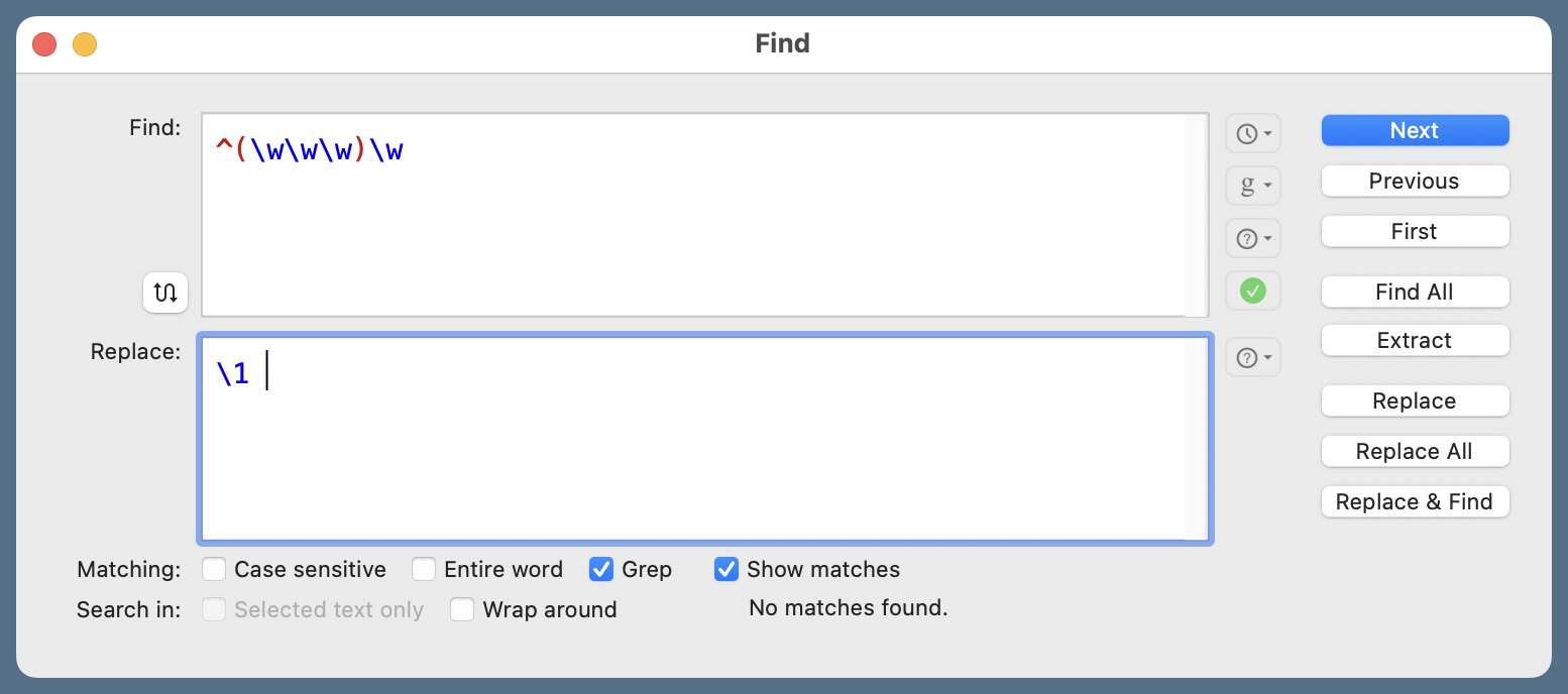
This is not quite in the form I need. Although most of the months are given with the standard three-letter abbreviations, June, July, and September are not. With the file open in BBEdit, I did this Find and Replace operation:

The regular expression in the Find section is
^(\w\w\w)\w
If you select that line you’ll see there’s a space at the end of it, which is important. The Replace regex is
\1
and there’s a space character at the end of it, too. There may be more clever regexes that will do the job, but as this is a one-off filter, I used what came to mind first. Now the file looks like this
Date,Rate
Jan 2014,6.6
Feb 2014,6.7
Mar 2014,6.7
Apr 2014,6.2
May 2014,6.3
Jun 2014,6.1
Jul 2014,6.2
Aug 2014,6.1
Sep 2014,5.9
Oct 2014,5.7
Nov 2014,5.8
Dec 2014,5.6
and the dates are in a standard format for parsing.
The table is imported into a Pandas data frame in Line 10, and the Date field is converted to datetime objects in Line 11. The %b %Y formatting string is strftime code for “three-letter month abbreviation followed by a space and the four-digit year.” Now you see why I needed to lop the fourth character off of June, July, and Sept.
(There are, by the way, ways to do the date parsing within the read_csv function itself. I seldom do the parsing that way, because I find the parameters to read_csv too complex. I prefer to do the importing in one step and the date parsing in another.)
(To compound parentheticals, I suppose I didn’t need to use the Pandas library just to import a CSV file; there are other ways to do that. But I use Pandas a lot and I’m comfortable with it. My efficiency is more important than library minimalism.)
Line 15 creates a 5″×5″ plot, and Line 18 plots the x and y data on it. The data points will be connected by lines ('-') that are black (color='black') and two points thick (lw=2). From now on, all of the commands will be customizing the appearance of the graph.
Lines 21–22 set the limits of the plot. The limits of the x-axis have to be specified as datetime objects because that’s what the x data is. The ymax parameter in Line 22 is what cuts off the pandemic spike, limiting the graph to unemployment values of 8% and below.
Lines 25–27 set the tick marks for the x-axis. Matplotlib lets you have both major and minor tick marks, but we’re using only major tick marks on the x-axis. They are set one year apart in Line 25. Line 26 establishes how the tick labels will appear. The DateFormatter function takes an argument that uses the same strftime formatting codes we saw earlier. To get an apostrophe followed by the last two digits of the year, the code is ’%y.
But what about all those space characters in the DateFormatter argument? That’s the result of a certain eccentricity of mine. Each tick mark on the x-axis is set at January 1 of that year—more specifically, at midnight on the morning of January 1.1 And tick mark labels are centered on the tick. But the year associated with a given tick mark is actually the interval between that tick and the next, so I think the label should go in that interval. What all those spaces do in Line 26 is shift the label over to (about) the midpoint between the ticks.
I seem to be basically alone in this way of formatting date-related labels. Everyone else seems to think it’s just fine to put the label for a year right under the tick associated with January 1 of that year. But I say it’s wrong, and I’m sticking to my guns.
While I may be eccentric, I’m not crazy. If the data set includes just one value for each year, I’m happy to put the year labels right under the tick marks. It’s only when there are multiple values per year that I insist on offset labels.
Line 27 deals with a consequence of my eccentricity. Because the maximum x value is January 1, 2025 (that’s how I get a tick mark at the end of the x-axis), there will be a label for that tick mark, and it will be placed off the end of the axis. Kind of embarrassing. Line 27 eliminates the embarrassment by using the setp function to make the label for the last ([-1]) x label invisible.
Lines 28–30 handle the ticks and labels for the y-axis. Here, the major tick marks are set every 2% (Line 28), and the minor tick marks are set every 1% (Line 30). By default, the labels on the y-axis would be presented without percent signs, so Line 29 takes care of that by invoking the set_major_formatter function with an argument of '{x:.0f}%. This code comes from Python’s format string syntax. You may be wondering why it has an x when we’re dealing with the y-axis. In this case, the x is a local placeholder and has nothing to do with the axis whose labels we’re formatting. Just an unfortunate choice of variable name by the Matplotlib developers.
The last item in this section of the code is Line 31, which tells Matplotlib to put a thin gray horizontal grid aligned with the major and minor tick marks. I have a tendency to use more grid lines than most people. Part of this comes from my belief that they help viewers keep their eyes aligned as they compare values. Another part undoubtedly comes from my using actual graph paper back when I was plotting data in college (long enough ago that students didn’t have computers). I do try to keep the grid unobtrusive.
The annotations that deal with the pandemic spike I cut off are defined in Lines 37–38. The text is centered at April 2020, as is the vertical arrow. Note that the x-coordinates of the positions have to be given as datetime values because that’s how the x-axis is measured. The large value for the zorder parameter in Line 38 insures that the arrow is drawn above the grid lines.
I have to say I find the head_width and head_length values in Line 38 troublesome. They seem to be given in the same units as the x- and y-axes, respectively, and that’s fine for a vertical arrow. But what should you do if the arrow is drawn at an angle? Discretion being the better part of valor, I didn’t do any experimenting to see how that would work. My ignorance may bite me in the future.
As with the grid lines, I try to make the border and tick marks as unobtrusive as possible by making them thin. That’s what Lines 41–42 do. They’re not gray because the border and ticks shouldn’t be as unobtrusive as the grid.
I guess I lied above when I said that all the code after Line 18 was customization. Line 45 saves the graph as a PNG file. The 200 dpi parameter combines with the 5″×5″ plot size in Line 15 to make the PNG 1000 pixels square.
-
There are ways to set the tick mark elsewhere in the year, but this is the default, and I like it there. ↩
