Retrobatch droplet improvement
January 3, 2025 at 3:31 PM by Dr. Drang
Shortly after I published my CleanShot X/Retrobatch post, Allison Sheridan posted this on Mastodon:
That’s a great use of those tools. I am a big fan of Clean Shot X and Retrobatch but never thought of combining them. My main use of Retrobatch is to make featured images for blog posts that match what most if not all of the social media services will recognize. That droplet thing is money. I keep mine in the toolbar of Finder though since I always have a Finder window open when I’ve made a screenshot.
What’s actually money is Allison’s last sentence. Having the screenshot-trimming droplet sitting on my Desktop was the one thing about it I didn’t like. Putting it in the Finder toolbar is perfect because, like Allison, I always have at least one Finder window open when I’m writing blog posts and making screenshots for them.
So I moved the Trim Screenshot app into the Applications folder and set about adding it to my Finder toolbar. I control-clicked on the Finder window’s toolbar, selected , and dragged the Trim Screenshot icon into the toolbar, putting it to the right of the folder name. Since I keep a post’s screenshots in the same folder as the Markdown source, I always have that folder open when writing. It’s now a simple matter to drag the screenshot from the Finder window up into the toolbar and drop it on the Trim Screenshot icon.
There was one more problem. The icon in the toolbar was the generic Retrobatch droplet icon. A fine icon, to be sure, but what if I come up with another Retrobatch workflow that I want in my Finder toolbar? How would I tell them apart? I refuse to change my toolbar display to .
The solution is to change the icon of the Trim Screenshot app. I opened Acorn and built this image:
![]()
It’s started as 1024×1024 image saved as a PNG file and is meant to convey the idea that the droplet reduces the Desktop padding in a window screenshot. I later expanded the size to 1400×1400 by adding transparent padding around the outside. I’ll explain why in a minute.
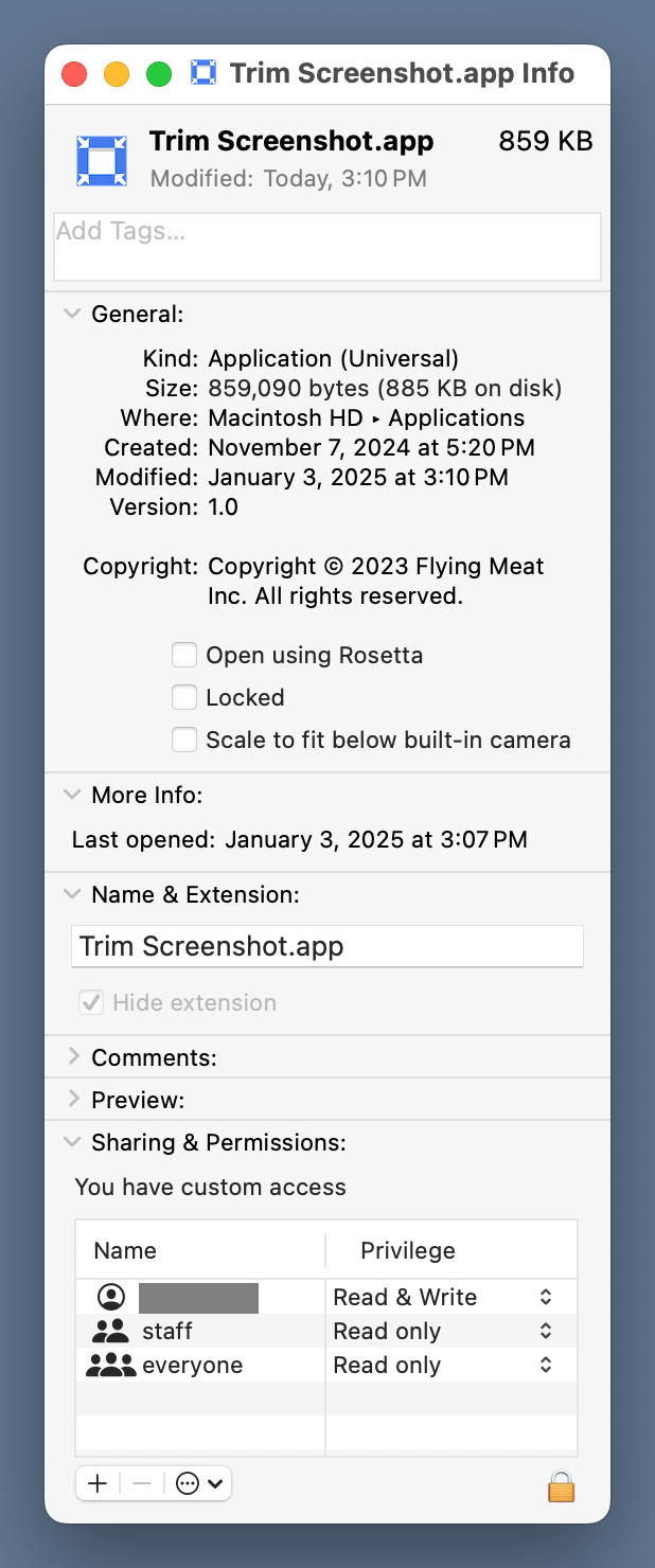
Then I opened Trim Screenshot’s Get Info window and dragged the PNG file onto the icon spot at the upper left corner.

That changed the icon of the droplet in both the Applications window and, most important, in the Finder toolbar.
![]()
You may have noticed that the blue in the icon is much brighter than the blue of my Desktop. That’s because when I used my Desktop blue in the icon it just looked gray when the icon was shrunk down. I had to brighten it up to make it look blue to me in the Finder toolbar.
Also, the icon was distinctly bigger than the others in the toolbar when it was 1024×1024. The transparent padding brought it down to a more reasonable size. It could probably be made even smaller, but I don’t want the arrowheads to get too small to see.
Now I have workflow for trimming screenshots that’s easy to use and keeps my Desktop clean. Thanks, Allison!
