Miscounting sheep
August 4, 2025 at 2:04 PM by Dr. Drang
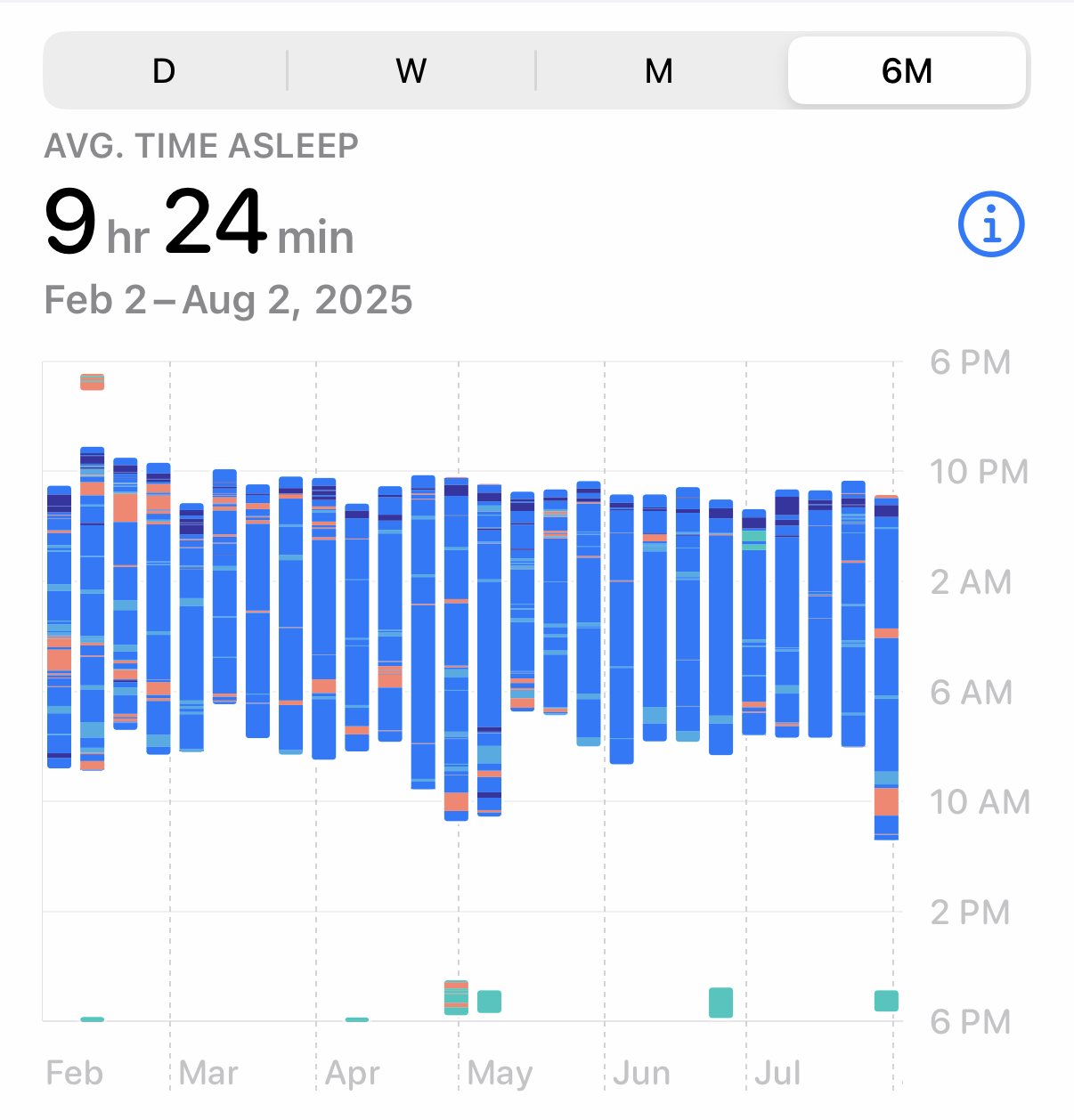
This morning, I checked the iPhone Health app to see how long I’ve been sleeping recently. I wanted to look at the past month but mistakenly tapped the button instead of the . This is what I saw:

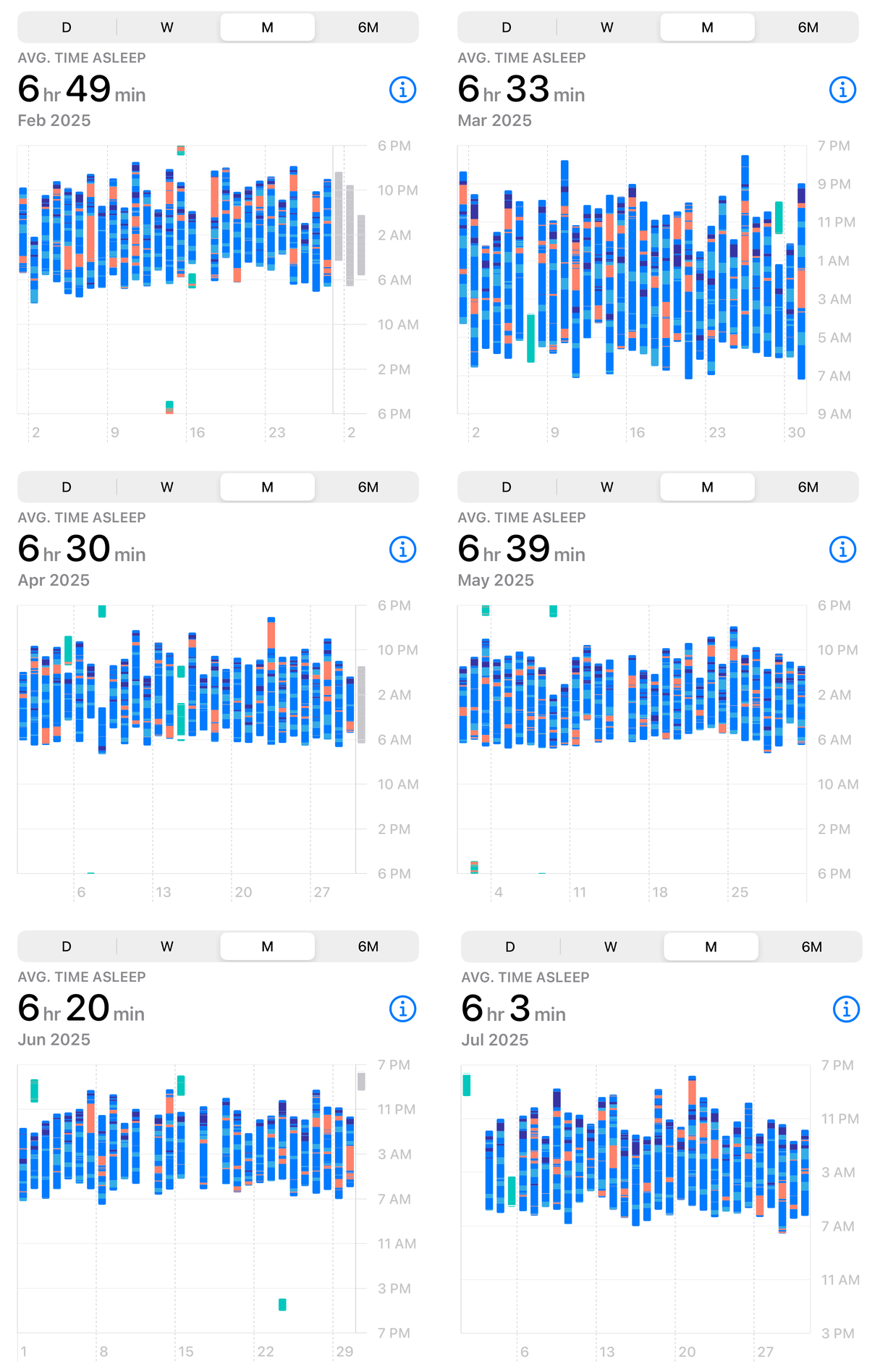
Now, I certainly don’t sleep 9½ hours per night. Or 9½ hours per week, which I guess could be another interpretation, given that each column in this chart represents a week. I decided to look back at the graphs for each of the past six months to see what they said:

All of these graphs make sense to me.
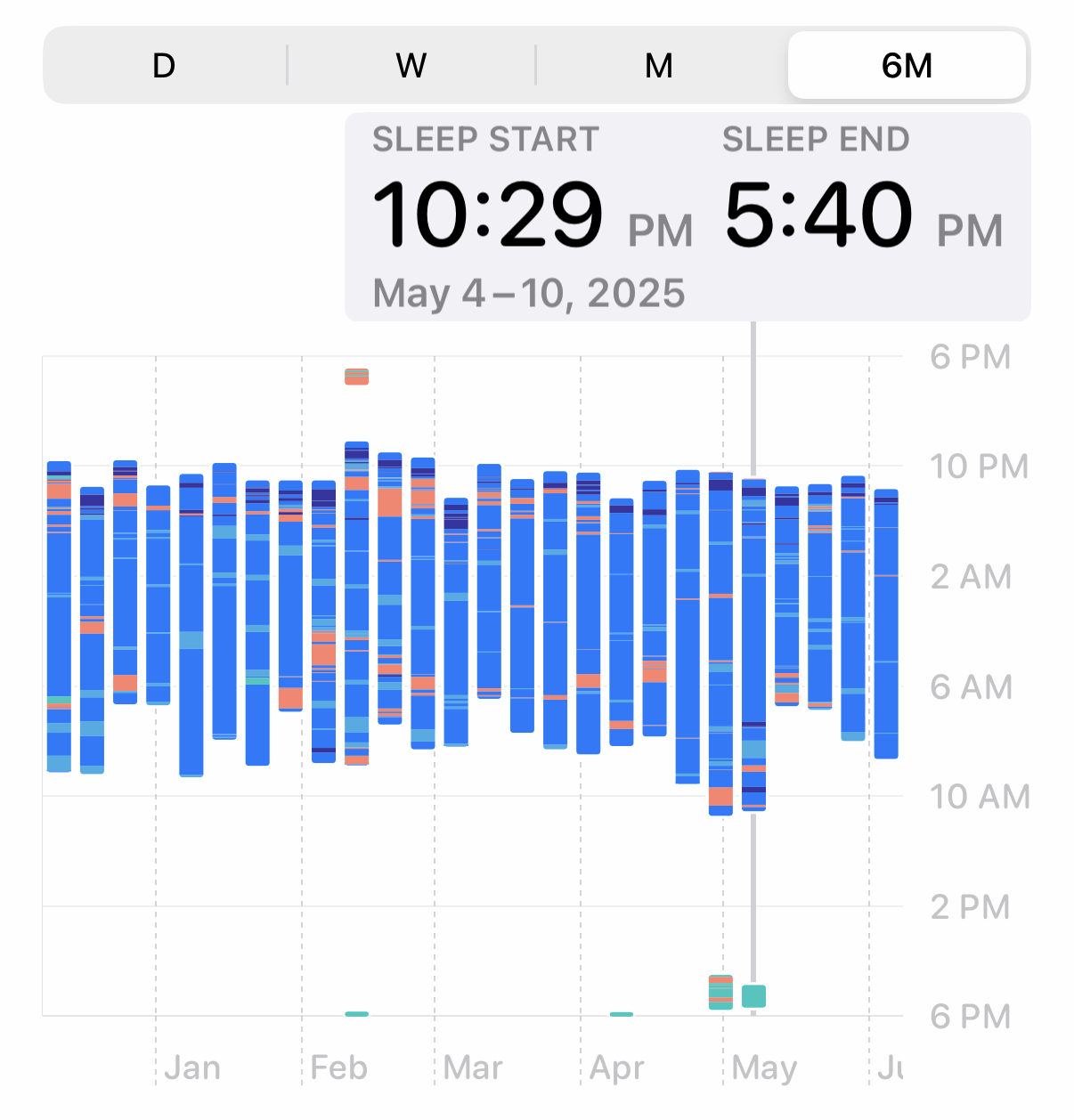
So what’s going on with the six-month graph? I thought I might find the answer by tapping on one of the weeks,

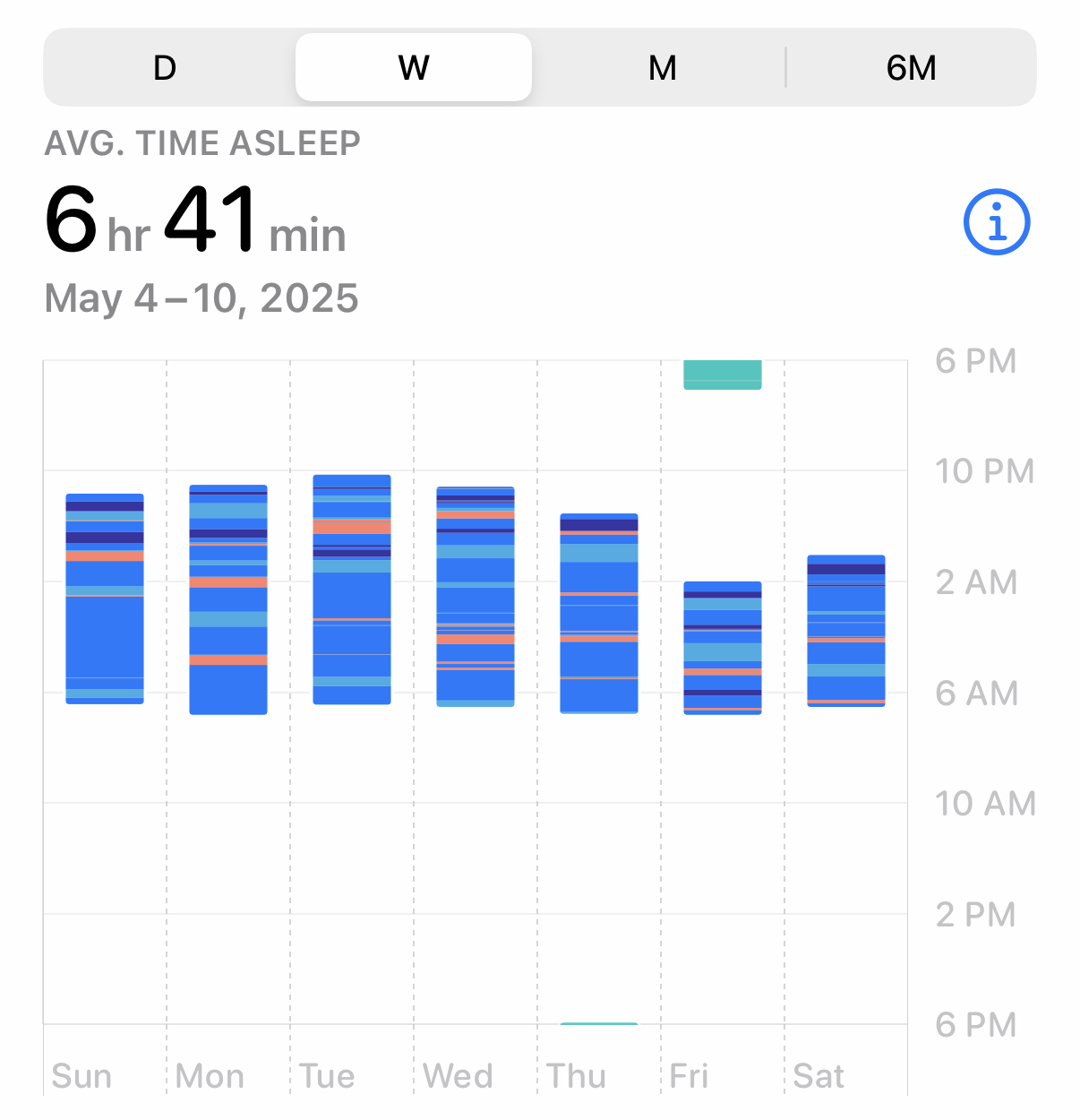
and comparing it to that same week in the “W” tab,

The weird bit of sleep around 6:00 pm (probably me falling asleep reading) is there in the both one-week graph and the six-month graph, so that makes sense. But there’s no sleeping much past 6:30 or 7:00 in the morning in the weekly graph, while the main body of the column extends past 10:00 am in the six-month graph. It’s just weird.
Normally, my posts are critical of graphs that make poor style choices or are otherwise bad at telling the story they’re meant to tell. But in this case, the data just look wrong. I don’t get it.
