A bad response
September 23, 2025 at 9:06 PM by Dr. Drang
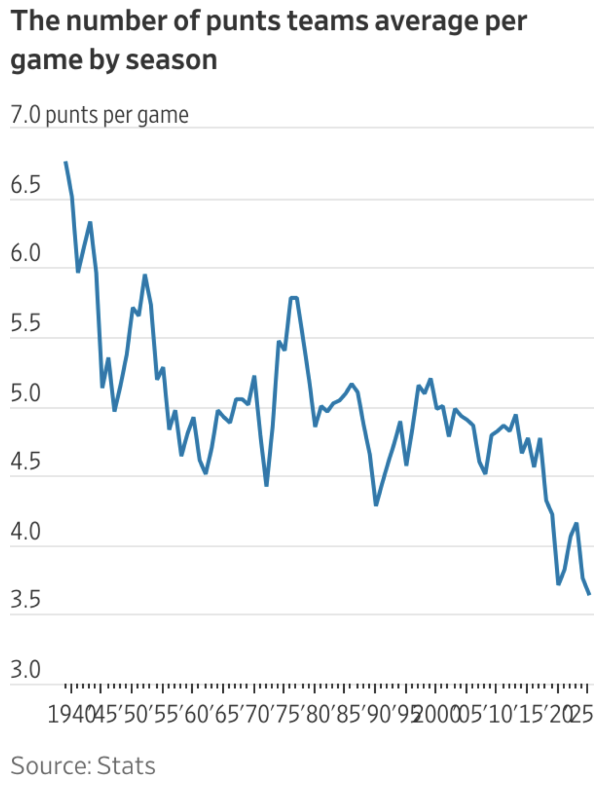
This morning, as I was scrolling through Apple News, I came upon this article from the Wall Street Journal about how NFL teams are punting less than they used to. It included this terrible graph:

Who would make their horizontal axis look like that, with the labels jammed together? I was reading the article on my phone, but image above came from the Mac version of Apple News—the two are the same.
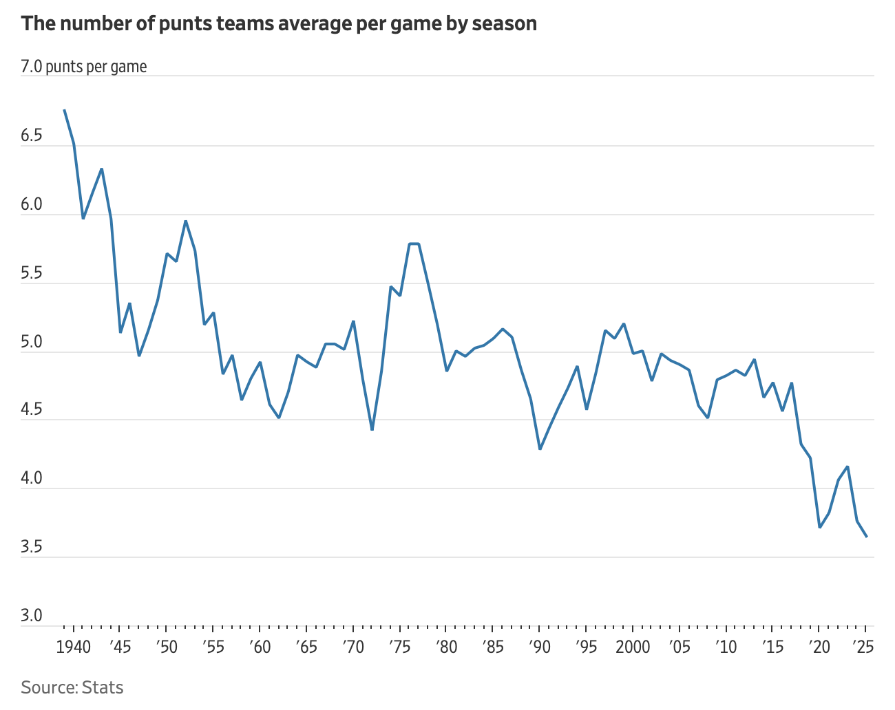
I had a feeling the WSJ wasn’t at fault here and went to look at the same article on its website. Viewing the page on my Mac in a normal-width Safari window, the graph was much better:

There are some nits I’d pick with this, but overall it’s a good graph and shows what the writer wants to get across.
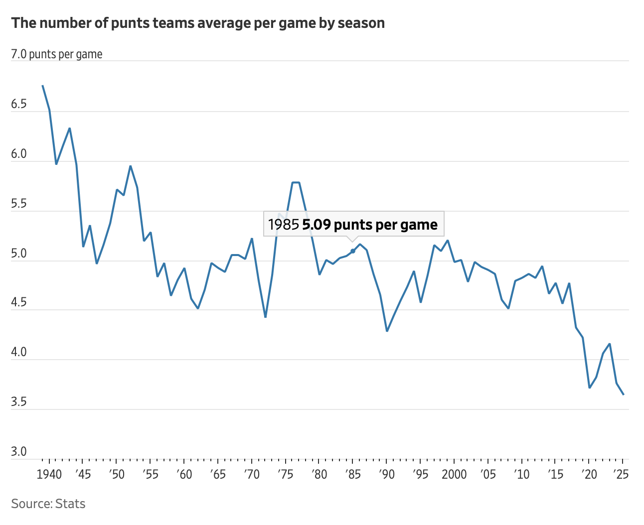
The website graph isn’t a static image, it’s built from JavaScript and has a sort of simple interactivity. If you run your pointer across the graph, a little marker will appear on the line and a popup will show the year and average punts per game for that year. Here’s a screenshot I took while the pointer was aligned with 1985:

I said above that I took the screenshots with my Safari window at what I’d consider a normal width. Narrowing the window to less than about 1300 pixels wide, the graph suddenly changed its look and matched what I’d seen in Apple News (it also lost its interactivity). So the ugly graph is due to WSJ’s responsive design. I switched to my phone to look at the web page there, and sure enough, I saw the ugly version of the graph again.
As you’ve probably guessed, the graph on the web page looks fine on my iPad when Safari takes up the full screen—it’s wide enough to avoid the switch to ugly mode.
So I was wrong. The awful horizontal axis is the WSJ’s fault, it’s just that they’re only torturing people who read the site on their phones. Or through Apple News.
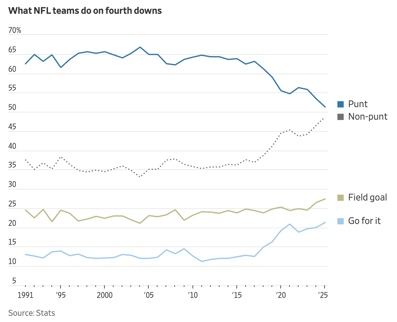
I feel compelled to mention that a later graph in the article looks fine at narrow widths and in Apple News. It’s this graph showing the changing history of play calling on fourth down:

Because it’s looking at only 35 years of data instead of 85, narrowing the chart doesn’t jam the horizontal tick labels together. This should have shown the chartmakers at WSJ how to fix the other graph: fewer tick labels. I suspect that putting labels every ten years instead of every five (and making the unlabeled minor ticks five years apart) would’ve done the trick.
