Dot plots in Mathematica
October 2, 2025 at 5:52 PM by Dr. Drang
I ran across Mathematica’s NumberLinePlot function recently and wondered if I could use it to make dot plots. The answer was yes, but not directly.
By “dot plots,” I mean the things that look sort of like histogram but with stacked dots instead of boxes to represent each count. Here’s an example from a nice paper on dot plots by Leland Wilkinson (the Grammar of Graphics guy):
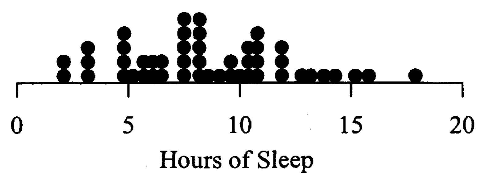
The paper is referenced in the Wikipedia article on dot plots, and rightly so. Here’s another in a slightly different style from Statistics for Experimenters by Box, Hunter, and Hunter (who call them dot diagrams):
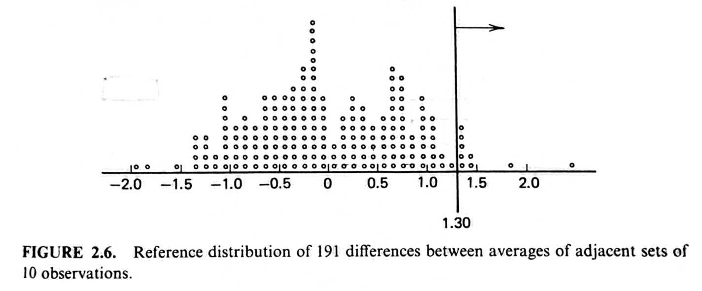
(The vertical line and arrow are add-ons to the dot plot pertinent to the particular problem BH&H were discussing.)
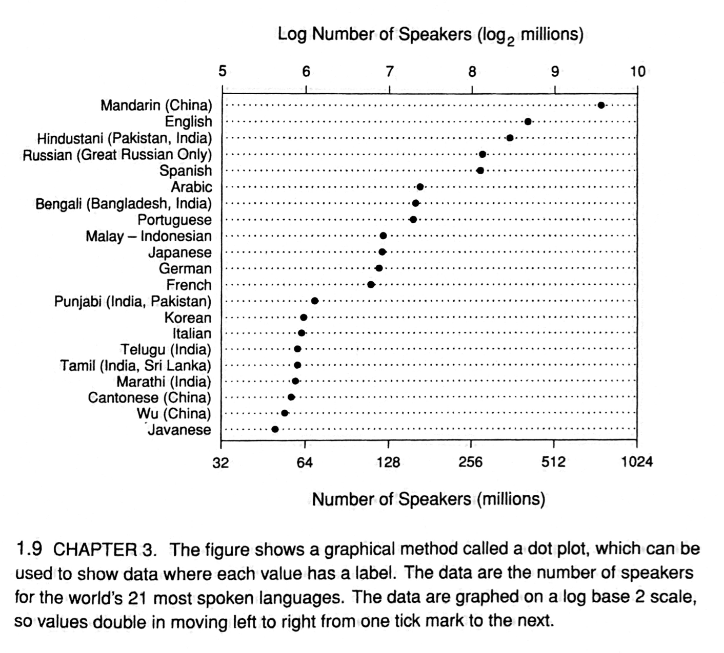
If you’re a William Cleveland fan, you should be aware that the kind of dot plots I’ll be talking about here are not what he calls dot plots. His dot plots are basically bar charts with dots where the ends of the bars would be. Like this example from The Elements of Graphing Data:
With that introduction out of the way, let’s talk about Wilkinson-style dot plots and NumberLinePlot.
In a nutshell, NumberLinePlot takes a list of numbers and produces a graph in which the numbers are plotted as dots along a horizontal axis—very much like the number lines I learned about in elementary school. I wondered what it would do if some of the numbers were repeated, so I defined this list of 30 integers with a bunch of repeats,
a = {7, 2, 4, 8, 5, 7, 4, 2, 1, 3, 7, 5, 7, 8, 7,
     2, 5, 6, 7, 6, 1, 5, 2, 1, 6, 5, 8, 3, 8, 3}
and ran NumberLinePlot[a]. Here’s the output:

Unfortunately, it plots the repeated numbers on top of one another so you can’t see how many repeats there are. I looked through the documentation to see if I could pass an option to NumberLinePlot to get it to stack the repeated dots vertically, but no go.
There is, however, a way to get NumberLinePlot to stack dots. You have to pass it a nested list set up with sublists having no repeated elements. For example, if we rewrite our original flat list, a, this way,
b = {{1, 2, 3, 4, 5, 6, 7, 8}, {1, 2, 3, 4, 5, 6, 7, 8},
     {1, 2, 3, 5, 6, 7, 8}, {2, 5, 7, 8}, {5, 7}, {7}}
and run NumberLinePlot[b], we get this graph:
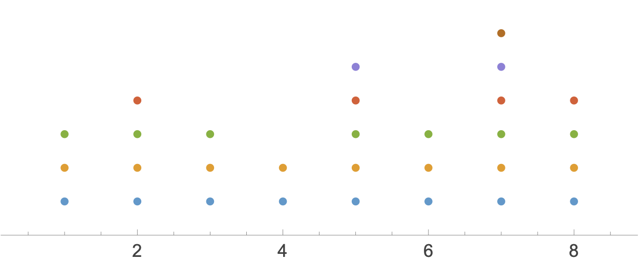
As you can see, each sublist is plotted as its own row. That’s why each row has a different color: Mathematica sees this as a combination of six number line plots and gives each its own color by default. But don’t worry about the colors or the size and spacing of the dots; those can all be changed by passing options to NumberLinePlot. What you should worry about is how to turn flat list a into nested list b. Doing it by hand is both tedious and prone to error.
As it happens, someone has already worked that out and combined it with NumberLinePlot to make an external function, DotPlot, that makes the kind of graph we want. Running ResourceFunction["DotPlot"][a] produces
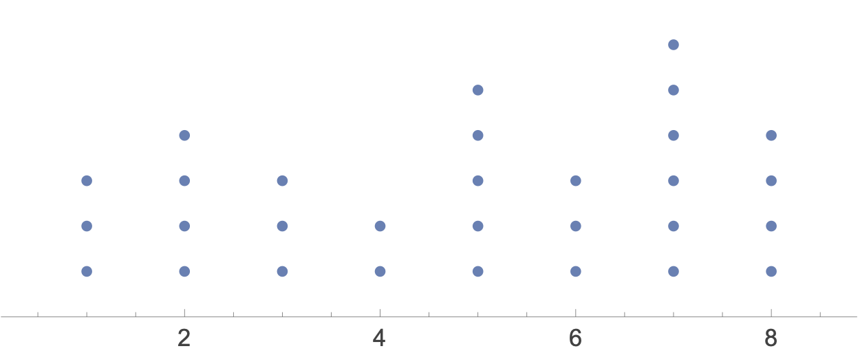
Again, we can add options to DotPlot to give it the style Wilkinson suggests. Calling it this way,
ResourceFunction["DotPlot"][a, Ticks -> {Range[8]},
   AspectRatio -> .2, PlotRange -> {.5, 8.5},
   PlotStyle -> Directive[Black, PointSize[.028]]]
gives us

After setting the aspect ratio to 1:5, I had to fiddle around with the PointSize to get the dots to sit on top of one another. It didn’t take long.
This is great, but I wanted to know what DotPlot was doing behind the scenes. So I downloaded its source notebook and poked around. The code wasn’t especially complicated, but there was one very clever piece. Let’s go through the steps.
First, we Sort the original flat list and Split it into a list of lists in which each sublist consists of a single repeated value.
nest = Split[Sort[a]]
yields
{{1, 1, 1}, {2, 2, 2, 2}, {3, 3, 3}, {4, 4}, {5, 5, 5, 5, 5},
 {6, 6, 6}, {7, 7, 7, 7, 7, 7}, {8, 8, 8, 8}}
Compare this with the nested list b we used above and you can see that they’re sort of opposites. If we think of these nested lists as matrices, the rows of b are the columns of nest, and vice versa. That suggests a Transpose of nest would get us to b, but the problem is that neither nest nor b are full matrices. They both have rows of different lengths.
The solution to this is a three-step process:
- Pad the rows of
nestwith dummy values so they’re all the same length. - Transpose that padded list of lists.
- Delete the dummy values from the transpose.
The code for the first step is
maxlen = Max[Map[Length, nest]];
padInnerLists[l_] := PadRight[l, maxlen, "x"]
padded = Map[padInnerLists, nest]
This sets maxlen to 6 and pads all of nest’s rows out to that length by adding x strings. The result is this value for padded:
{{1, 1, 1, "x", "x", "x"}, {2, 2, 2, 2, "x", "x"},
 {3, 3, 3, "x", "x", "x"}, {4, 4, "x", "x", "x", "x"},
 {5, 5, 5, 5, 5, "x"}, {6, 6, 6, "x", "x", "x"},
 {7, 7, 7, 7, 7, 7}, {8, 8, 8, 8, "x", "x"}}
I should mention here that Map works the same way mapping functions work in other languages: it applies function to each element of a list and returns the list of results.
Now we can transpose it with
paddedT = Transpose[padded]
which yields
{{1, 2, 3, 4, 5, 6, 7, 8}, {1, 2, 3, 4, 5, 6, 7, 8},
 {1, 2, 3, "x", 5, 6, 7, 8}, {"x", 2, "x", "x", 5, "x", 7, 8},
 {"x", "x", "x", "x", 5, "x", 7, "x"},
 {"x", "x", "x", "x", "x", "x", 7, "x"}}
The last step is to use DeleteCases to get rid of the dummy values.
nestT = DeleteCases[paddedT, "x", All]
yields
{{1, 2, 3, 4, 5, 6, 7, 8}, {1, 2, 3, 4, 5, 6, 7, 8},
 {1, 2, 3, 5, 6, 7, 8}, {2, 5, 7, 8}, {5, 7}, {7}}
which is exactly what we want. This is what DotPlot does to prepare the original flat list for passing to NumberLinePlot.1
Now that I know how DotPlot works, I feel comfortable using it.
You may be wondering why I don’t just run
Histogram[a, {1}, Ticks -> {Range[8]}]
to get a histogram that presents basically the same information.
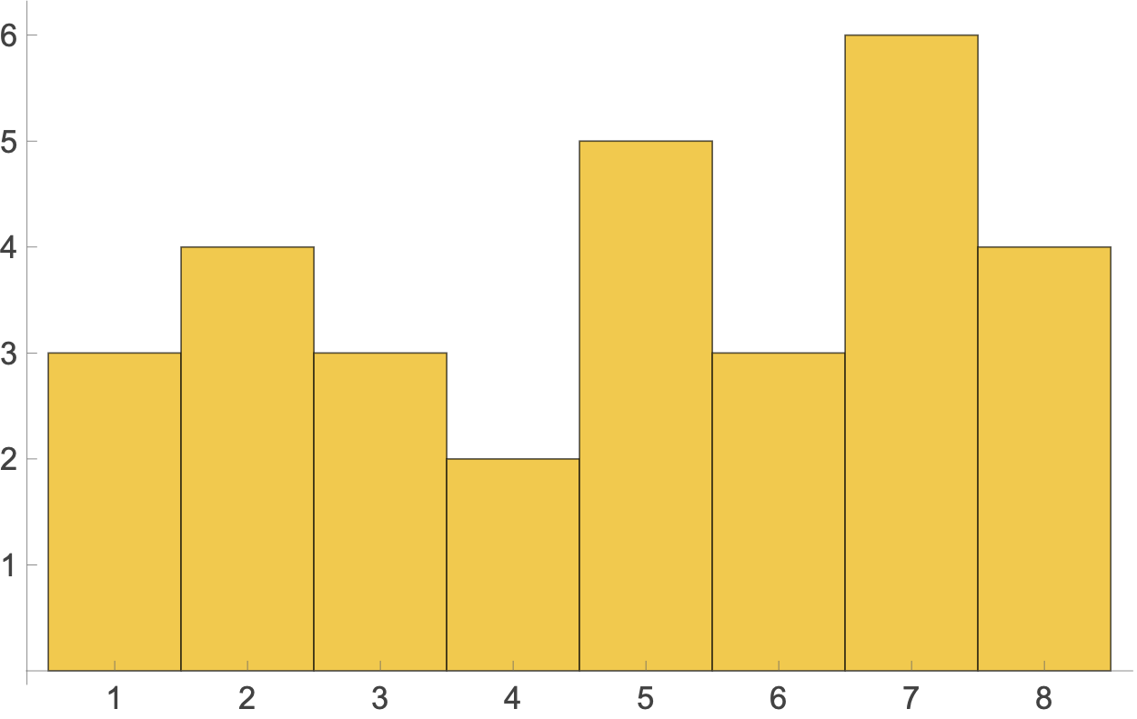
First, where’s the fun in that? Second, dot plots appeal to my sense of history. They have a kind of hand-drawn look that reminds me of using tally marks to count items in the days before we all used computers.
-
DotPlotuses anonymous functions and more compact notation than I’ve used here. But the effect is the same, and I wanted to avoid weird symbols like#,&, and/@. ↩
