Charting malpractice
November 20, 2025 at 5:43 PM by Dr. Drang
I expect Fox News to make bad charts as part of its predisposition to promote right wing views. But today I saw an incredibly bad chart that, as far as I can tell, doesn’t promote its usual awful agenda. It’s terrible for politically neutral reasons.
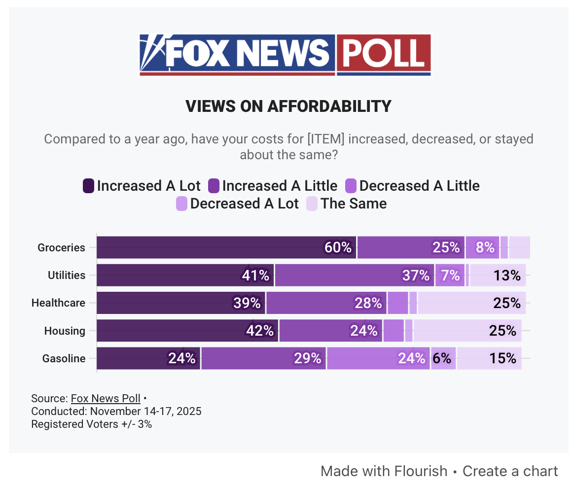
I saw it first in today’s post from Paul Krugman. He got it from this article. With that attribution out of the way, here it is:

As you can see, it’s made with an interactive tool called Flourish, but this is not Flourish’s fault. It’s the fault of the writer of the piece, Dana Blanton, or some dataviz minion at Fox. It’s a poor craftsman who blames his tools, and this chart was made by a very poor craftsman.
The chart uses colors in the purple range, ranging from hex #522B67 (imperial) to hex #E9D7F8 (pale lavender). It’s often a good idea to use colors in the same family but with varying levels of darkness or intensity to represent increasing (or decreasing) levels, but that’s not what Fox did. The categories in each bar cover different levels of price change, but the ordering of the colors doesn’t match the ordering of the price changes:
| Price change | Color |
|---|---|
| Increased a lot | |
| Increased a little | |
| Decreased a little | |
| Decreased a lot | |
| The same |
“The same” should be in the middle, not at the end. It has no business being slightly less intense than “Decreased a lot.” And “Decreased a little” shouldn’t be more intense than “Decreased a lot.” You shouldn’t have to keep looking back at the legend to see what’s what.
I suspect the order of the price changes used in the chart is the same order used in the poll question. Whoever made the chart just fed that same order to Flourish, and Flourish dutifully responded with a chart whose categories are in the order given to it. That’s fine for Flourish; software is supposed to respond robotically. People are not.
With increases and decreases, this is a perfect occasion for a diverging color scheme. I don’t know what color schemes are native to Flourish, but ColorBrewer has a nice five-category diverging scheme that has purples on one side of neutral and greens on the other. It’s also color-blind safe:
| Price change | Color |
|---|---|
| Increased a lot | |
| Increased a little | |
| The same | |
| Decreased a little | |
| Decreased a lot |
The off-white in the center of this scheme would be troublesome in the chart as it is because Fox has little wisps of white separating the colors in each bar. The wisps should be removed, though, because the point of a percentage bar chart like this is for the sum of the lengths of the parts to equal the length of the whole. The wisps mess that up. I would’ve mentioned this problem earlier, but it pales in comparison (ha!) to the outright malpractice of the ordering.
Update 21 Nov 2025 7:55 AM
Nathan Grigg pointed out an oddity I failed to: the five bars are of different lengths, even though you’d think they’re all supposed to represent 100%. This could be due to entering rounded numbers into Flourish, or it be due to a “don’t know” category in the poll that wasn’t included in the chart. I confess I don’t have the stomach to dig through the story to see if I can find the reason.
