Snow and memory
November 9, 2025 at 5:01 PM by Dr. Drang
Two things came together over the past few days. First was my longstanding belief that winters here in the Chicago area were snowier when I was a kid than they are now. I’m not sure why that popped back into my head, but it did. Second was my concern that I’ve been losing my Pandas skills since I retired and stopped having data analysis work projects. With both of these things floating around in my head at the same time, I decided to put together a small project to address them: an analysis of Chicago snowfall data over several decades.
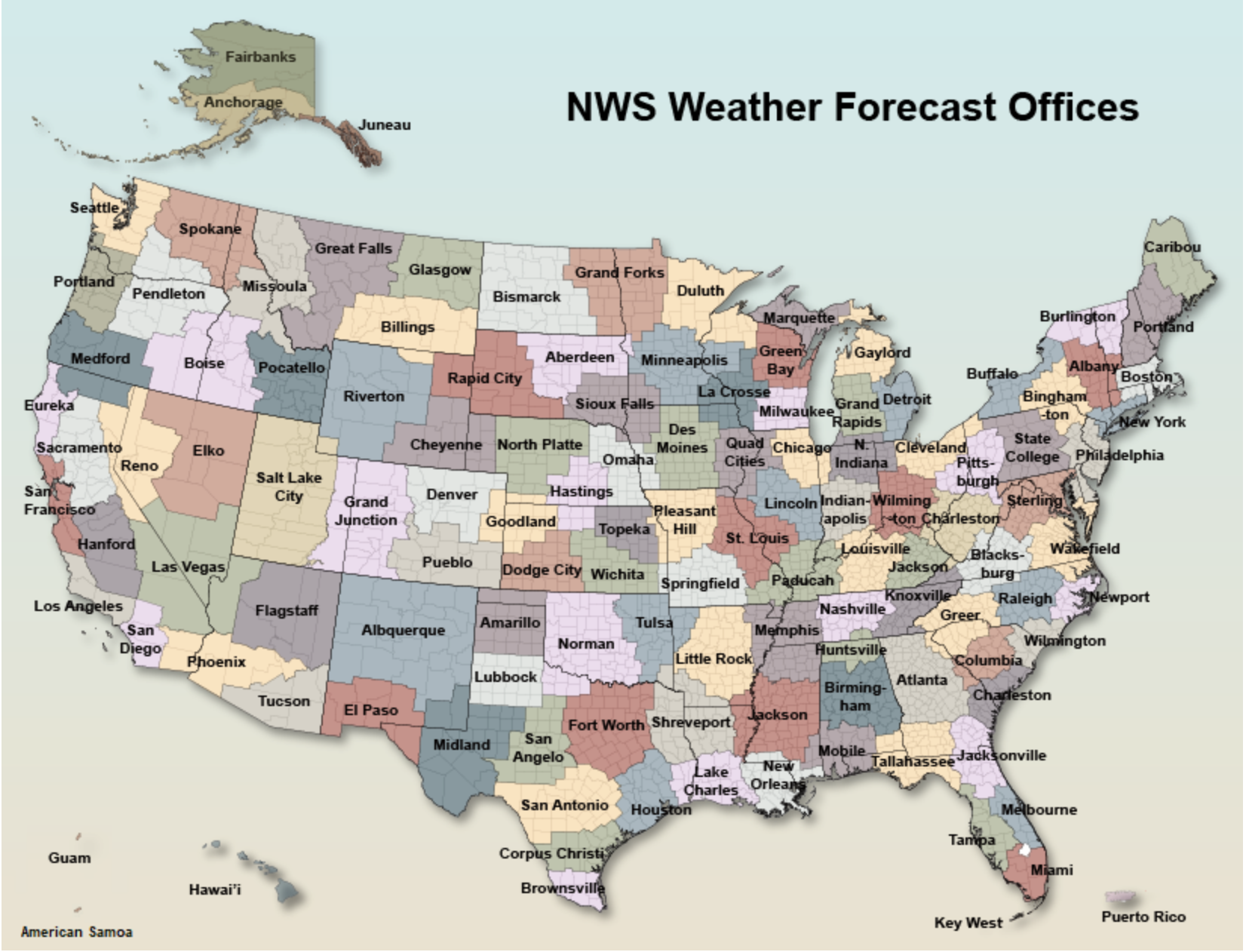
The first problem was getting the data. You can download lots of historical weather data from NOAA, but I’ve never found its website easy to search. I’m sure the terminology NOAA uses makes sense to regular weather analysts, but as a dilettante, I’ve never felt comfortable with it. Still, I was able to find this page, which presented a clickable map with local forecast offices across the US.

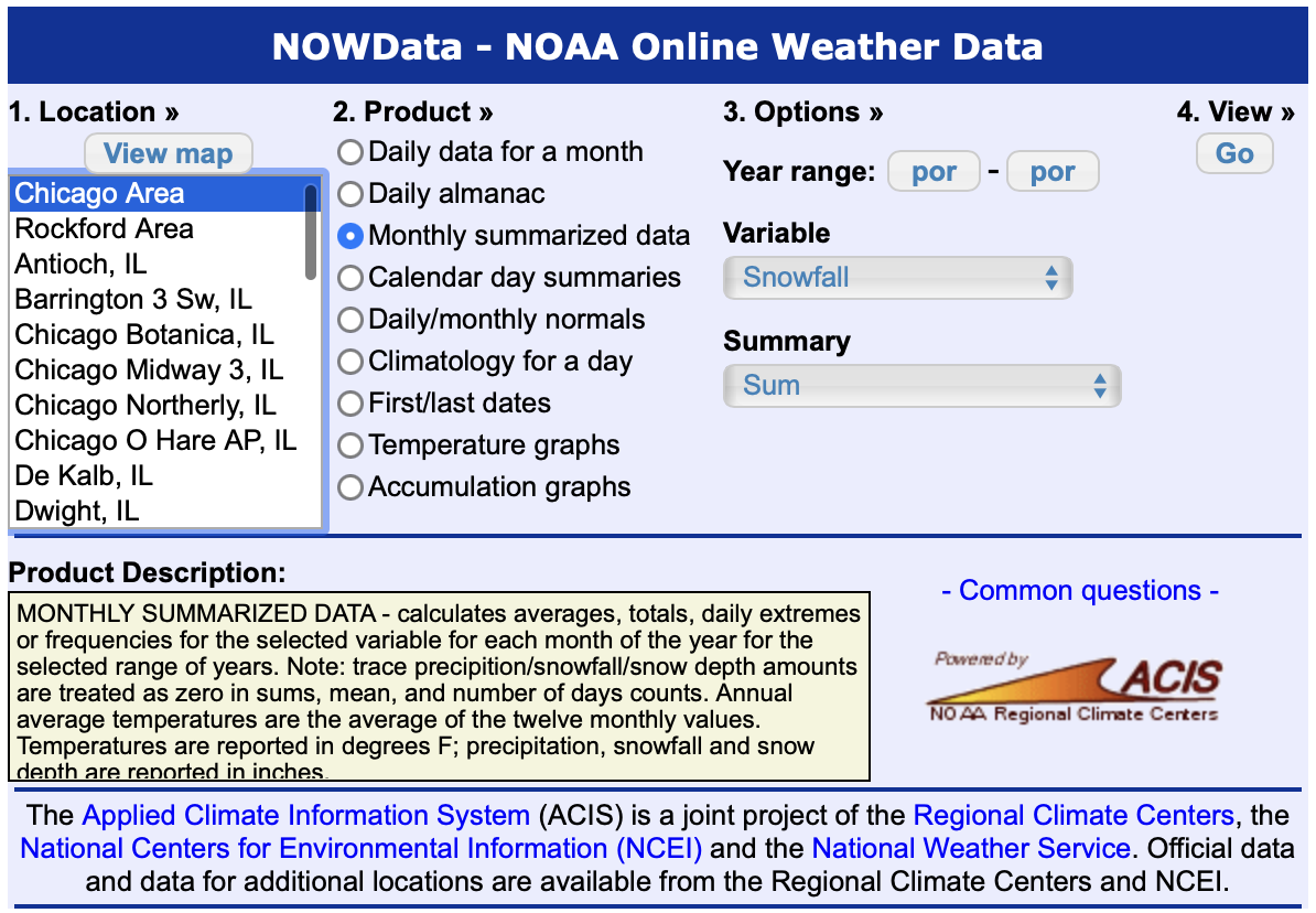
Clicking on northern Illinois brought me to another page that let me choose the data to download. They call it NOWData,1 and I selected monthly summarized snowfall data for the Chicago area.

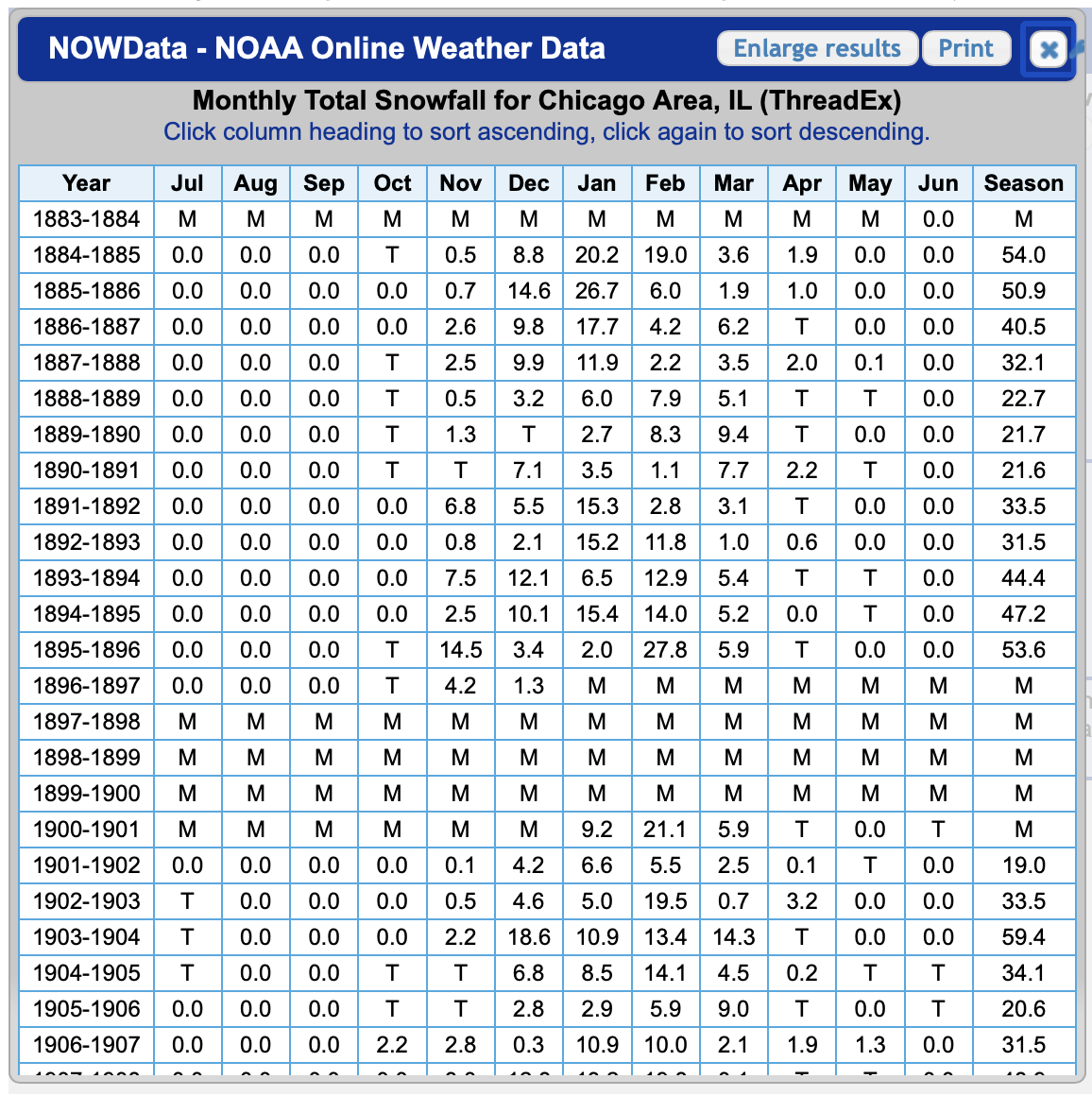
After clicking Go, this overlay appeared:

This is in nearly perfect form for the analysis I want to do. Each row represents a 12-month period centered on New Year’s Day, so the total at the end of the row is that entire winter’s snowfall.
I selected all the rows of the table (apart from some summary rows at the bottom) and used a combination of BBEdit and Numbers to clean things up and convert it to a CSV file. Here are the first several rows:
Season,Jul,Aug,Sep,Oct,Nov,Dec,Jan,Feb,Mar,Apr,May,Jun,Total
1883,,,,,,,,,,,,0.0,
1884,0.0,0.0,0.0,0.0,0.5,8.8,20.2,19.0,3.6,1.9,0.0,0.0,54.0
1885,0.0,0.0,0.0,0.0,0.7,14.6,26.7,6.0,1.9,1.0,0.0,0.0,50.9
1886,0.0,0.0,0.0,0.0,2.6,9.8,17.7,4.2,6.2,0.0,0.0,0.0,40.5
1887,0.0,0.0,0.0,0.0,2.5,9.9,11.9,2.2,3.5,2.0,0.1,0.0,32.1
1888,0.0,0.0,0.0,0.0,0.5,3.2,6.0,7.9,5.1,0.0,0.0,0.0,22.7
1889,0.0,0.0,0.0,0.0,1.3,0.0,2.7,8.3,9.4,0.0,0.0,0.0,21.7
1890,0.0,0.0,0.0,0.0,0.0,7.1,3.5,1.1,7.7,2.2,0.0,0.0,21.6
1891,0.0,0.0,0.0,0.0,6.8,5.5,15.3,2.8,3.1,0.0,0.0,0.0,33.5
1892,0.0,0.0,0.0,0.0,0.8,2.1,15.2,11.8,1.0,0.6,0.0,0.0,31.5
1893,0.0,0.0,0.0,0.0,7.5,12.1,6.5,12.9,5.4,0.0,0.0,0.0,44.4
1894,0.0,0.0,0.0,0.0,2.5,10.1,15.4,14.0,5.2,0.0,0.0,0.0,47.2
1895,0.0,0.0,0.0,0.0,14.5,3.4,2.0,27.8,5.9,0.0,0.0,0.0,53.6
1896,0.0,0.0,0.0,0.0,4.2,1.3,,,,,,,
As you can see, I turned all the Ms into explicit missing values and all the Ts into zeros. I also deleted the “second half” of the first column, identifying each season by the calendar year in which it starts.
Although the table goes all the way back to 1883, I wasn’t interested in the early figures. Part of that came from what I saw as questionable data—trace amounts of snow in the Julys of 1902–1904?—and part was just disinterest in snowfall more than about a generation before I was born. So I decided to review just the data since 1932. Not an important year in weather, as far as I know, but a significant one in American history.
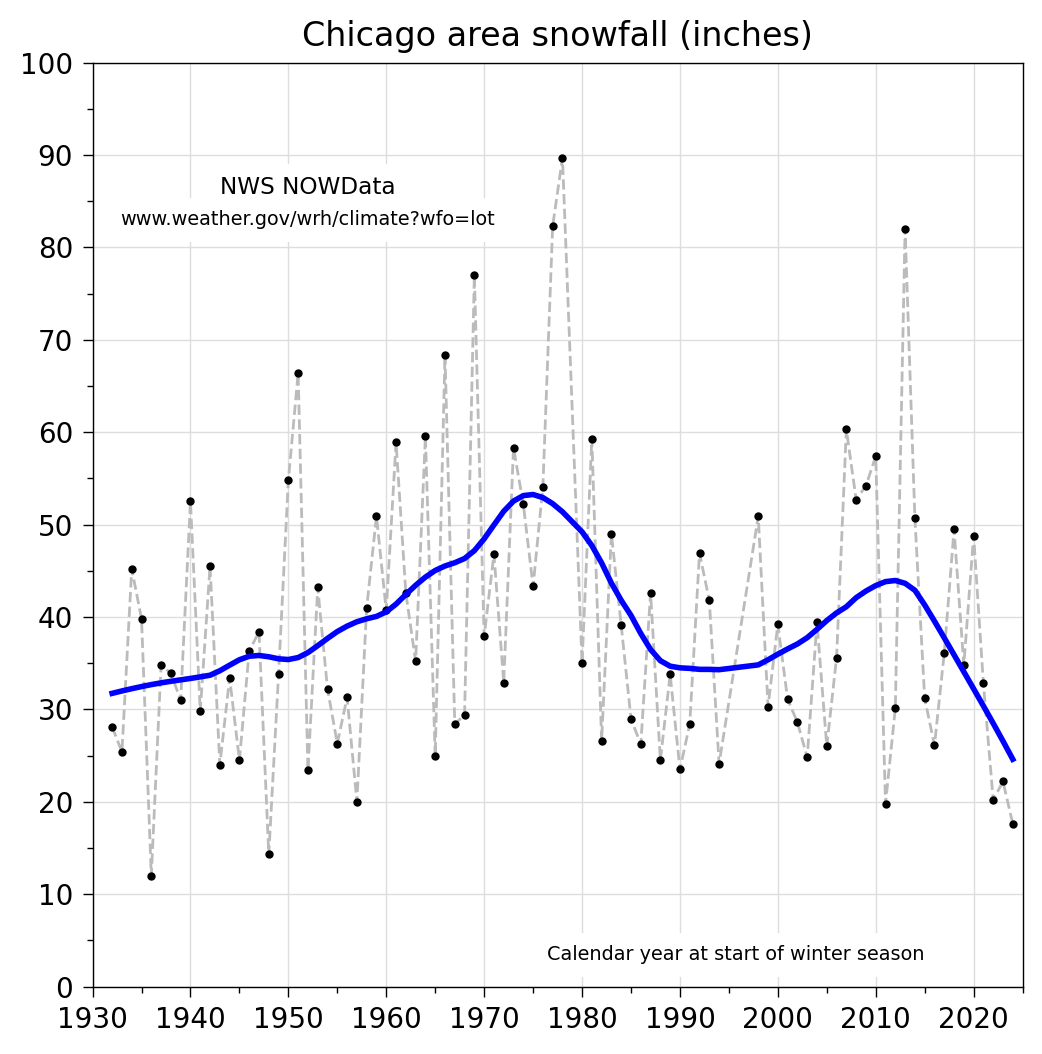
Here’s a plot of the raw data and a curve fit through it via local regression analysis. So yes, my youth was spent with more snowfall than the generation before or after. And the last three years have been nearly snowless.

You might question drawing a curve through data with this much year-to-year variation, but even without the blue line, I think it’s clear that the 60s and 70s had both the highest highs and the highest lows.
Here’s the Python code that produced the graph:
python:
 1:  #!/usr/bin/env python3
 2:
 3:  import pandas as pd
 4:  import numpy as np
 5:  import matplotlib.pyplot as plt
 6:  from matplotlib.ticker import MultipleLocator, AutoMinorLocator, FixedLocator
 7:  import statsmodels.api as sm
 8:
 9:  # Read in the data, putting only the Season and Total columns in the dataframe.
10:  df = pd.read_csv('area.csv', usecols=[0, 13])
11:
12:  # Retain rows since 1932 and when the Total isn't missing.
13:  df = df[(df.Season >= 1932) & df.Total.notna()]
14:
15:  # Smooth the yearly snowfall with local regression.
16:  smooth = sm.nonparametric.lowess(df.Total, df.Season, frac=.25, it=0)
17:
18:  # Create the plot with a given size in inches.
19:  fig, ax = plt.subplots(figsize=(6, 6))
20:
21:  # Plot the raw and smoothed values.
22:  ax.plot(df.Season, df.Total, '--', color='#bbbbbb', lw=1)
23:  ax.plot(df.Season, df.Total, '.', color='black', ms=4)
24:  ax.plot(smooth[:, 0], smooth[:, 1], '-', color='blue', lw=2)
25:
26:  # Set the limits
27:  plt.xlim(xmin=1930, xmax=2025)
28:  plt.ylim(ymin=0, ymax=100)
29:
30:  # Set the major and minor ticks and add a grid.
31:  ax.xaxis.set_major_locator(MultipleLocator(10))
32:  ax.xaxis.set_minor_locator(AutoMinorLocator(2))
33:  ax.yaxis.set_major_locator(MultipleLocator(10))
34:  ax.yaxis.set_minor_locator(AutoMinorLocator(2))
35:  ax.grid(linewidth=.5, axis='x', which='major', color='#dddddd', linestyle='-')
36:  ax.grid(linewidth=.5, axis='y', which='major', color='#dddddd', linestyle='-')
37:
38:  # Title and notes.
39:  plt.title('Chicago area snowfall (inches)')
40:  plt.text(1952, 86.5, 'NWS NOWData', ha='center', va='center',
41:           fontsize='small', backgroundcolor='white')
42:  plt.text(1952, 83, 'www.weather.gov/wrh/climate?wfo=lot', ha='center',
43:           va='center', fontsize='x-small', backgroundcolor='white')
44:  plt.text(2015, 3.5, 'Calendar year at start of winter season', ha='right',
45:           va='center', fontsize='x-small', backgroundcolor='white')
46:
47:  # Make the border and tick marks 0.5 points wide.
48:  [ i.set_linewidth(0.5) for i in ax.spines.values() ]
49:  ax.tick_params(which='both', width=.5)
50:
51:  # Save as PNG.
52:  plt.savefig('20251108-Chicago area snowfall.png', format='png', dpi=200, bbox_inches='tight')
There’s really not much Pandas in this script. The only interesting bits are in Lines 10 and 13. The usecols parameter in Line 10 limits the dataframe to just the two fields we care about in the CSV. Then the filter in Line 13 gets rid of both the years before 1932, as discussed above, and a few other years in which one or more months of missing data prevent a legitimate snowfall total.
Eliminating those missing value rows was necessary to run the lowess function in Line 16. I chose the frac and it parameters based on an “eye test” of the resulting curve. I’d try to come up with a better justification if this were more than just a blog post.
In addition to keeping my skills up in Pandas, I’d like to learn more about Polars and R. Since Polars’s main claim to fame is being faster than Pandas, it doesn’t make much sense to use it on a data set with only about 150 records. So I wrote a little R script to produce this less-than-satisfying plot:

The bulk of the plot is fine, but I didn’t stick with it long enough to get the details looking the way I like. The tick marks and major grid lines are too thick, and I’d rather not have the minor grid lines at all. I don’t understand why R created them without any associated ticks. In any event, here’s my amateurish R code:
 1:  #!/usr/bin/env Rscript
 2:
 3:  library(tidyverse)
 4:
 5:  # Import the data, including only the Season and Total columns.
 6:  df = read_csv('area.csv', col_select=c(1, 14), show_col_types=FALSE)
 7:
 8:  # Retain rows since 1932 and when the Total isn't missing.
 9:  df <- filter(df, Season >= 1932, !is.na(Total))
10:
11:  # Plot the raw and smoothed data using the bw theme.
12:  p1 <- ggplot(data=df, mapping=aes(x=Season, y=Total)) +
13:        theme_bw() +
14:        geom_line(color='#bbbbbb', linetype='dashed', linewidth=.25) +
15:        geom_point(size=.5) +
16:        geom_smooth(method='loess', se=FALSE, span=.4, linewidth=.75, color='blue')
17:
18:  # Set the scale and tick spacing.
19:  p2 <- p1 +
20:        scale_x_continuous(name=NULL, limits=c(1930, 2025), expand=0,
21:          breaks=seq(1930, 2020, 10)) +
22:        scale_y_continuous(name=NULL, limits=c(0, 100), expand=0,
23:          breaks=seq(0, 100, 10))
24:
25:  # Set the title.
26:  p3 <- p2 +
27:        ggtitle('Chicago area snowfall (inches)') +
28:        theme(plot.title=element_text(size=10, hjust=.5))
29:
30:  # Save it as a PNG file.
31:  ggsave('20251109-Chicago snowfall ggplot.png', p3,
32:          width=1200, height=1200, units='px')
I do like R’s layering approach of adding features to a plot step by step. And it’s cool that I can add a smoothing line without explicitly creating smoothed data series first. I’m not sure of the internals of R’s loess algorithm, other than it’s clearly not the same as the lowess function I used in the Python script. I had to use different parameters to get a curve that looked similar.
One thing I found absolutely infuriating was the need to add the expand=0 parameter to Lines 20 and 22. To me, when I set the limits on an axis, the plotting software should not extend that axis by an extra 5% or so by default. It should just do what I tell it to do and nothing more.
Anyway, I found the R approach to plotting interesting enough to give it another try the next time a problem like this comes up. I really should crack open Kieran Healy’s book, which Amazon says I bought nearly seven years ago. I have more time now.
-
The NOW part is one of those annoying acronyms of an acronym: NOAA Online Weather. ↩
