On the average
January 26, 2026 at 8:42 AM by Dr. Drang
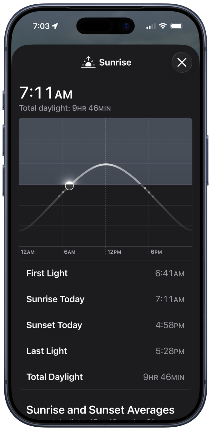
A few days ago, I was poking around in Apple’s Weather app and came across some interesting stuff hiding behind the sunrise/sunset box. First, there’s a plot that shows the movement of the sun throughout the day, followed by sunrise and sunset times:

The little dots under the “horizon” represent the beginnings and endings of civil, nautical, and astronomical twilight, which is a nice addition to the plot. I assume the vertical axis has something to do with the Sun’s altitude angle, but since the plot gives no units, it must be an example of Bezos astronomy.
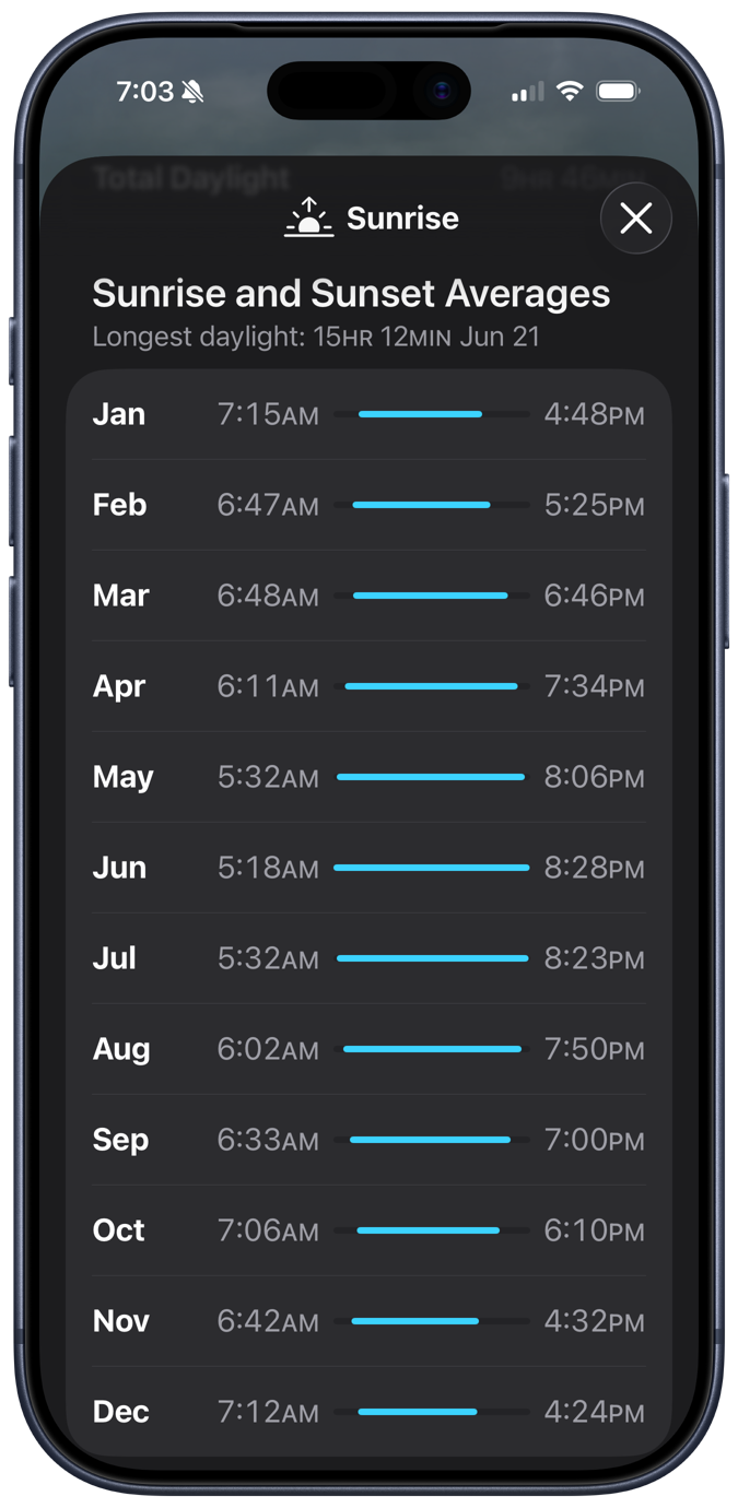
Scrolling down, we come to this odd graphic: the average sunrise and sunset times for each month of the year.

Given that I live in a state that switches between Standard Time and Daylight Saving Time, this is a troubling calculation. There’s no trouble making the calculation, of course: you just add up all the sunrise or sunset times and divide by the number of days in the month. And that’s clearly what Apple’s done. No, the trouble comes in March and November, the months when we switch from CST to CDT and back. What is the meaning of “average” when the individual values are measured differently?
On the second Sunday in March, sunrise and sunset suddenly become an hour later than they were, and the same thing happens in reverse on the first Sunday in November. Here in 2026, those days will be March 8 and November 1; in 2027, they’ll be March 14 and November 7. That the number of days we’re on CDT and CST in March and November changes from year to year makes the “averages” for those months even weirder.
After thinking about this for a while, I came to three conclusions:
- It’s nice to have on hand a simple display of how sunrise and sunset change over the course of a year.
- I may be the only person bothered by the way Apple presents this information.
- I’ve already shown how I’d like to see it done.
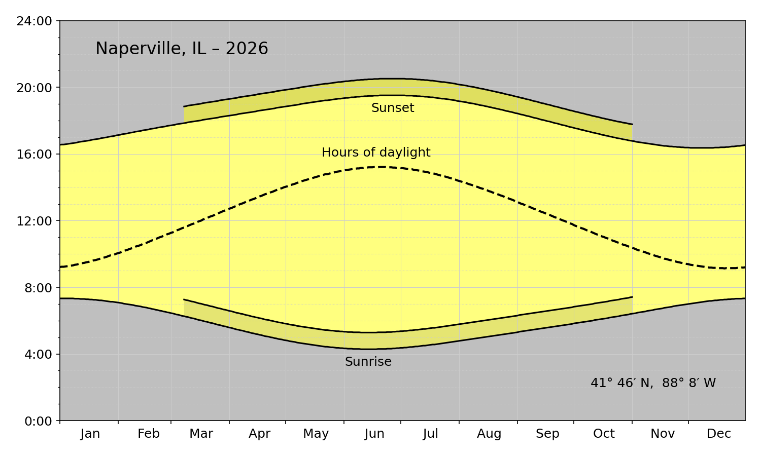
A couple of years ago, I wrote a Python script that used Matplotlib and data from the US Naval Observatory to generate plots like this:

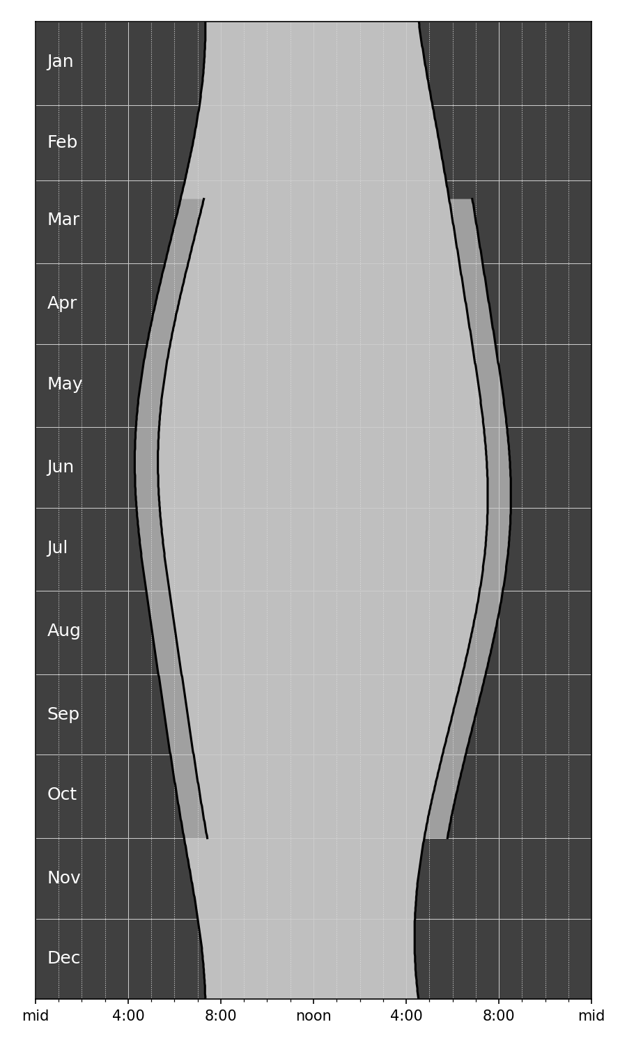
A graph like this wouldn’t work well on a phone because it’s wide instead of tall. But I figured it wouldn’t be too hard to redo it with the axes switched to give it a portrait format. I removed the various annotations because the location would be given in the Weather app. I also removed the “Hours of daylight” curve; without a 24-hour clock, I couldn’t cheat and treat the horizontal axis as both a time and a duration. I also got rid of the yellow and put everything in shades of gray to better match Apple’s aesthetic.

Apple would never include a plot with this many gridlines, but I couldn’t bring myself to get rid of them. They really help you track how the sunrise and sunsets change over the course of the year. Apple doesn’t want to scare its customers with complexity; when it feels the need to show detail, it puts it in a popup that appears when you tap inside the plot. Apple’s way is certainly cleaner looking, but I prefer seeing all the information at once.
Here’s the code that produced the plot above:
python:
  1:  #!/usr/bin/env python3
  2:
  3:  import sys
  4:  import re
  5:  from dateutil.parser import parse
  6:  from datetime import datetime
  7:  from datetime import timedelta
  8:  from matplotlib import pyplot as plt
  9:  import matplotlib.dates as mdates
 10:  from matplotlib.ticker import MultipleLocator, FormatStrFormatter
 11:
 12:
 13:  # Functions
 14:
 15:  def headerInfo(header):
 16:    "Return location name, coordinates, and year from the USNO header lines."
 17:
 18:    # Get the place name from the middle of the top line
 19:    left = 'o  ,    o  ,'
 20:    right = 'Astronomical Applications Dept.'
 21:    placeName = re.search(rf'{left}(.+){right}', header[0]).group(1).strip()
 22:
 23:    # If the place name ends with a comma, a space, and a pair of capitals,
 24:    # assume it's in location, ST format and capitalize the location while
 25:    # keeping the state as all uppercase. Otherwise, capitalize all the words.
 26:    if re.match(r', [A-Z][A-Z]', placeName[-4:]):
 27:      placeParts = placeName.split(', ')
 28:      location = ', '.join(placeParts[:-1]).title()
 29:      state = placeParts[-1]
 30:      placeName = f'{location}, {state}'
 31:    else:
 32:      placeName = placeName.title()
 33:
 34:    # The year is at a specific spot on the second line
 35:    year = int(header[1][80:84])
 36:
 37:    # The latitude and longitude are at specific spots on the second line
 38:    longString = header[1][10:17]
 39:    latString = header[1][19:25]
 40:
 41:    # Reformat the latitude into d° m′ N format (could be S)
 42:    dir = latString[0]
 43:    degree, minute = latString[1:].split()
 44:    lat = f'{int(degree)}° {int(minute)}′ {dir}'
 45:
 46:    # Reformat the longitude into d° m′ W format
 47:    dir = longString[0]
 48:    degree, minute = longString[1:].split()
 49:    long = f'{int(degree)}° {int(minute)}′ {dir}'
 50:
 51:    return placeName, lat, long, year
 52:
 53:  def bodyInfo(body, isLeap):
 54:    "Return lists of sunrise, sunset, and daylight length hours from the USNO body lines."
 55:
 56:    # Initialize
 57:    sunrises = []
 58:    sunsets = []
 59:    lengths = []
 60:
 61:    # Rise and set character start positions for each month
 62:    risePos = [ 4 + 11*i for i in range(12) ]
 63:    setPos = [ 9 + 11*i for i in range(12) ]
 64:
 65:    # Collect data from each day
 66:    for m in range(12):
 67:      for d in range(daysInMonth[m]):
 68:        riseString = body[d][risePos[m]:risePos[m]+4]
 69:        hour, minute = int(riseString[:2]), int(riseString[-2:])
 70:        sunrise = hour + minute/60
 71:        setString = body[d][setPos[m]:setPos[m]+4]
 72:        hour, minute = int(setString[:2]), int(setString[-2:])
 73:        sunset = hour + minute/60
 74:        sunrises.append(sunrise)
 75:        sunsets.append(sunset)
 76:        lengths.append(sunset - sunrise)
 77:
 78:    return(sunrises, sunsets, lengths)
 79:
 80:  def dstBounds(year):
 81:    "Return the DST start and end day indices according to current US rules."
 82:
 83:    # Start DST on second Sunday of March
 84:    d = 8
 85:    while datetime.weekday(dstStart := datetime(year, 3, d)) != 6:
 86:      d += 1
 87:    dstStart = (dstStart - datetime(year, 1, 1)).days
 88:
 89:    # End DST on first Sunday of November
 90:    d = 1
 91:    while datetime.weekday(dstEnd := datetime(year, 11, d)) != 6:
 92:      d += 1
 93:    dstEnd = (dstEnd - datetime(year, 1, 1)).days
 94:
 95:    return dstStart, dstEnd
 96:
 97:
 98:  # Start processing
 99:
100:  # Read the USNO data from stdin into a list of lines.
101:  # Text should come from https://aa.usno.navy.mil/data/RS_OneYear
102:  usno = sys.stdin.readlines()
103:
104:  # Get location and year from header
105:  placeName, lat, long, year = headerInfo(usno[:2])
106:
107:  # Month information, adjusted for leap year if needed.
108:  monthNames = 'Jan Feb Mar Apr May Jun Jul Aug Sep Oct Nov Dec'.split()
109:  isLeap = (year % 400 == 0) or ((year % 4 == 0) and not (year % 100 == 0))
110:  if isLeap:
111:    daysInMonth = [31, 29, 31, 30, 31, 30, 31, 31, 30, 31, 30, 31]
112:  else:
113:    daysInMonth = [31, 28, 31, 30, 31, 30, 31, 31, 30, 31, 30, 31]
114:
115:  # Get sunrise, sunset, and sunlight length lists from body
116:  sunrises, sunsets, lengths = bodyInfo(usno[9:], isLeap)
117:
118:  # Generate list of days for the year
119:  currentDay = datetime(year, 1, 1)
120:  lastDay = datetime(year, 12, 31)
121:  days = [currentDay]
122:  while (currentDay := currentDay + timedelta(days=1)) <= lastDay:
123:    days.append(currentDay)
124:
125:  # The portion of the year that uses DST
126:  dstStart, dstEnd = dstBounds(year)
127:  dstDays = days[dstStart:dstEnd + 1]
128:  dstRises = [ x + 1 for x in sunrises[dstStart:dstEnd + 1] ]
129:  dstSets = [ x + 1 for x in sunsets[dstStart:dstEnd + 1] ]
130:
131:  # Plot the data
132:  fig, ax =plt.subplots(figsize=(6,10))
133:
134:  # Shaded areas
135:  plt.fill_betweenx(days, sunrises, sunsets, facecolor='gray', alpha=.5)
136:  plt.fill_betweenx(days, 0, sunrises, facecolor='black', alpha=.75)
137:  plt.fill_betweenx(days, sunsets, 24, facecolor='black', alpha=.75)
138:  plt.fill_betweenx(dstDays, sunsets[dstStart:dstEnd + 1], dstSets, facecolor='white', alpha=.5)
139:  plt.fill_betweenx(dstDays, sunrises[dstStart:dstEnd + 1], dstRises, facecolor='black', alpha=.16)
140:
141:  # Curves
142:  plt.plot(sunrises, days, color='k')
143:  plt.plot(sunsets, days, color='k')
144:  plt.plot(dstRises, dstDays, color='k')
145:  plt.plot(dstSets, dstDays, color='k')
146:
147:  # Background grids
148:  ax.grid(which='major', color='#ccc', ls='-', lw=.5)
149:  ax.grid(which='minor', color='#ddd', ls=':', lw=.5)
150:
151:  # Vertical axis grid at month boundaries
152:  # ax.tick_params(axis='both', which='major', labelsize=12)
153:  plt.ylim(datetime(year, 1, 1), datetime(year, 12, 31))
154:  plt.tick_params(axis='y', length=0)
155:  m = mdates.MonthLocator(bymonthday=1)
156:  mfmt = mdates.DateFormatter('')
157:  ax.yaxis.set_major_locator(m)
158:  ax.yaxis.set_major_formatter(mfmt)
159:  ax.yaxis.set_inverted(True)
160:
161:  # Month labels inside the plot in white letters
162:  for m in range(12):
163:    middle = sum(daysInMonth[:m]) + daysInMonth[m]//2
164:    ax.text(.5, days[middle], monthNames[m], fontsize=12, color='w', ha='left', va='center')
165:
166:  # Horizontal axis labels formatted like h:mm
167:  plt.xlim(0, 24)
168:  xmajor = MultipleLocator(4)
169:  xminor = MultipleLocator(1)
170:  ax.xaxis.set_major_locator(xmajor)
171:  ax.xaxis.set_minor_locator(xminor)
172:  plt.xticks(ticks=[0, 4, 8, 12, 16, 20, 24], labels=['mid', '4:00', '8:00', 'noon', '4:00', '8:00', 'mid'])
173:
174:  # Tighten up the white border and save
175:  fig.set_tight_layout({'pad': 1.5})
176:  plt.savefig(f'{placeName}-{year}.png', format='png', dpi=150)
It’s a modification of the script given in my post from a couple of years ago. The main difference, apart from the color changes, is that instead of using Matplotlib’s fill_between function, I used the similar fill_betweenx function in Lines 135–139. Because the axes were switched, I needed to fill between vertical curves instead of horizontal curves.
The other unusual thing I did was use Matplotlib’s text function in Lines 161–164 to put the month labels inside the graph instead of along the left edge. That made the plot more compact. Because months are intervals of time, I centered the labels within their intervals. Apple (along with the rest of the world) puts labels like this at the start of each interval, but I refuse. Just because graphing software makes it easiest to do it that way doesn’t make it right.
Overall, I prefer the horizontal graph with the yellow sunlight hours, but it was fun figuring out how to make an alternative.
