Another Apple icon regression
February 9, 2026 at 10:19 PM by Dr. Drang
Apple’s *OS 26 icons have been getting some well-deserved criticism over the past couple of months. There was Jim Nielsen’s complaint about menu icons in macOS. Then came Nikita Prokopov’s more detailed criticism of those same icons.1 And a lot of fun has been poked at Tahoe’s app icons, reaching a peak in heliograph’s deadpan post on Threads.
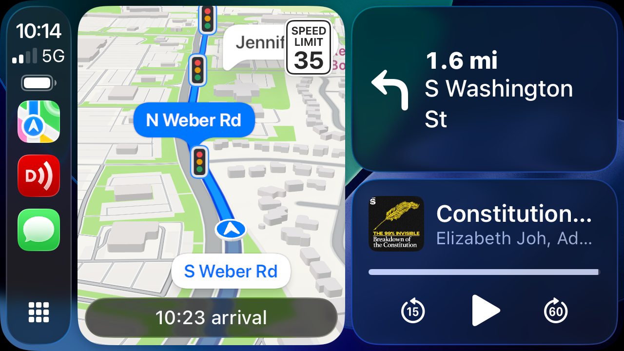
My long-overdue icon complaint is about a CarPlay icon introduced in the fall of 2024 along with iOS 18. Apart from when an app is taking over the screen, there are two primary screens in CarPlay: the app icon view, which is sort of like the home screen on an iPhone,
![]()
and the split screen view, which is sort of like the old split view in iPadOS, but with more parts,

You switch between the two views by tapping the button in the lower left corner of the screen. The button with the 3×3 grid of little squircles is clearly a way to get back to the app icon view. Yes, it used to be a 2×4 grid, which actually matched the icon layout on my screen, but it’s still obvious what the button does. The single hollow squircle, on the other hand, just makes no sense. It doesn’t look anything like the split view screen it takes you to.
This wasn’t the case before the fall of 2024. Here’s what that button used to look like:2
![]()
Kind of obvious where this button takes you, isn’t it?
It’s not that I don’t know what the single hollow squircle button does—I’ve been using it for 16 months. The icon could look like Kurt Vonnegut’s drawing of an asshole in Breakfast of Champions and I’d soon work out what the button was for,3 but the purpose of an icon is to communicate, not just be a placeholder. There’s also parallelism to consider. The icon view button looks like the screen it leads to; so should the split screen view button.
It’s probably impossible to tell the upper echelon of Apple that it’s breaking revenue records in spite of its software design, not because of it. I hope the next regime knows better.
-
Brent Simmons figured out how to get rid of these abominations, a service to humanity deserving of a Nobel Prize. ↩
-
I couldn’t find an image of this button in my Photos library, so I stole it from this TidBITS Talk page. ↩
-
Of course, Apple wouldn’t use an asshole icon—that’s Anthropic’s branding. ↩
