Plotting via Claude
February 2, 2026 at 8:46 PM by Dr. Drang
Paul Krugman included a terrible plot in his Substack post this morning. It’s meant to support his contention that Kevin Warsh, Trump’s soon-to-be nominee for chair of the Federal Reserve, is a political hack. It does, but it’s still terrible.
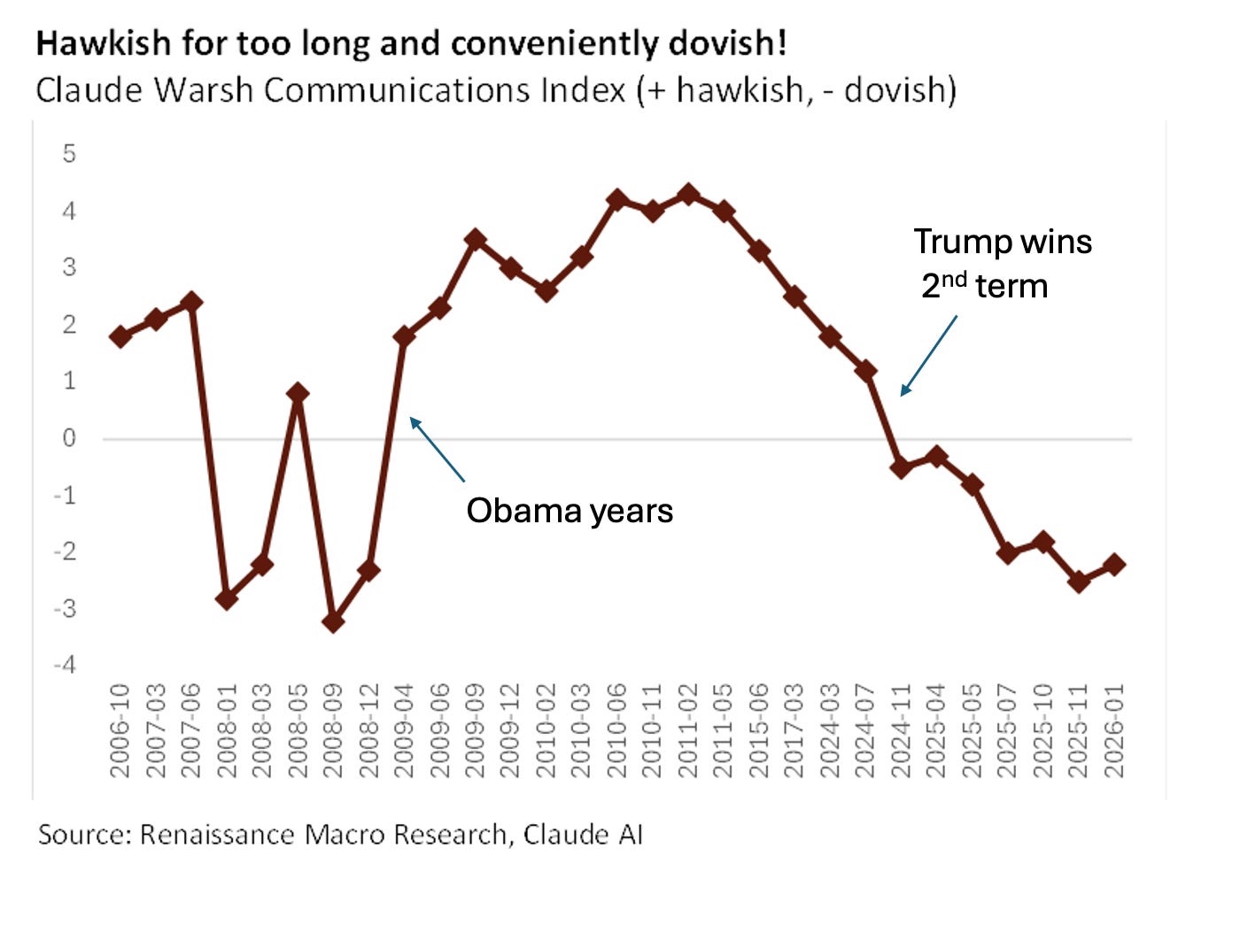
Krugman’s not to blame—at least not entirely—for how bad the plot is. It was given to him by Neil Dutta, who apparently had Claude assess the monetary hawkishness of Warsh’s statements, assign a number to it, and plot those numbers against the dates on which the statements were made. Here’s the result:

If you look along the horizontal axis, you’ll see immediately why this is an awful plot. The points are uniformly spaced horizontally, even though the spacing of the dates is far from uniform. Apparently, Claude considered entries like “2006-10” as categories rather than dates. Not especially intelligent of Claude or Dutta.
Krugman—who probably did’t want to go to the trouble of replotting the data—alerted his readers to the problem without being mean to Dutta:
If you look carefully at that chart, you’ll see that there’s a gap in the timeline for several years after Warsh was passed over for Fed chair during Trump’s first term.
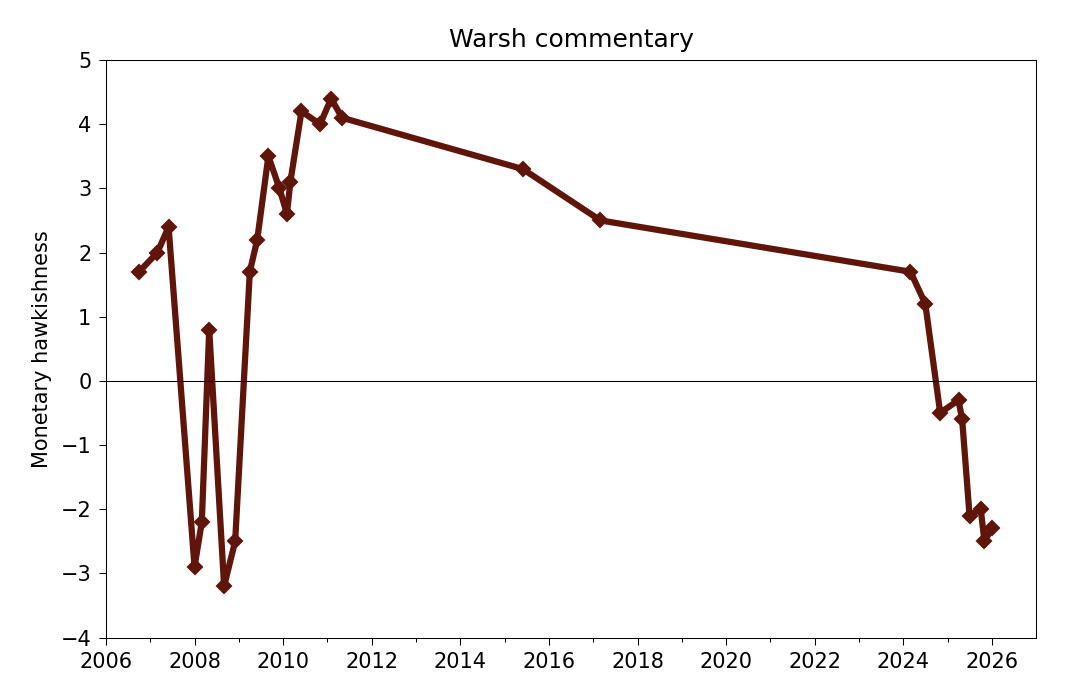
Had the data been plotted correctly, you wouldn’t have to look carefully:

Because I didn’t want to go to too much trouble in making this plot, I didn’t adjust the labels on the horizontal axis the way I usually do. The labels are aligned with January 1 of each year.
You may also notice that the y-values in my graph aren’t a perfect match with the y-values in Dutta’s original. Using a “sauce for the goose” approach, I told Claude to assess Dutta’s plot and generate a CSV file with all the points. There were some serious errors in the resulting CSV—30 data points instead of 29 and 8 negative points at the right end of the graph instead of 7—but they were fairly easy to fix.1 And since the relative hawkishness of Warsh’s commentary is a pretty soft number, I’m not worried about the individual values being off by a few tenths. The main thing was to get the dates plotted as they should be.
-
I should point out that the fixing was done by me, not Claude. I tried to get Claude to fix its mistakes, but it just added more. I also tried to get ChatGPT to generate a CSV from Dutta’s plot, and it fucked the assignment so thoroughly—and was so smarmy in its apologies—it made me question whether I should ever use it again. ↩
