Watch Workout widget worse
December 24, 2025 at 10:50 AM by Dr. Drang
Greg Pierce, top turtle wrangler at Agile Tortoise, posted this to Mastodon last week:
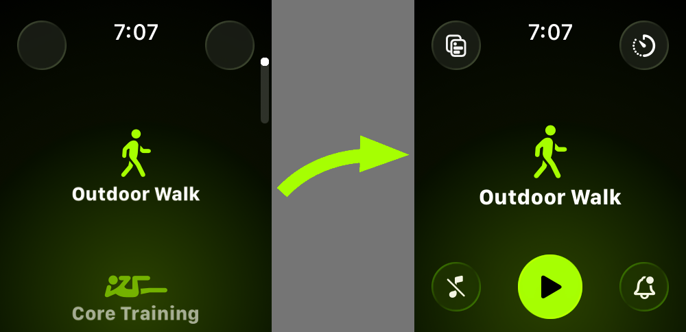
Since updating to watchOS 26, about every third time I go to start a workout, I find later it didn’t start. The way the button animation swiping between workout types works creates an unnecessary delay activating the start button. Never had this problem before 26.
Is this just me?
No, Greg, it’s not just you.
The animation Greg’s talking about is the gradual appearance of the start button near the bottom of the screen when you get to the activity you want and stop swiping. I don’t think there’s a good way to record this, so you’ll have to imagine there’s a video here filling in between these two frames:

The start button appears after only a second—maybe less—but it seems like a long time because your finger is right there ready to tap it. Also, in previous versions there was no delay, so we’ve been trained to tap as soon as the desired activity appears.
Which brings me to my main gripe about the new Workout interface: that there’s a start button at all. It used to be that items in the scrolling list of activities were themselves the buttons to start a workout. We didn’t have to wait for the start button because there wasn’t one. And because the tap target was the entire item, it was bigger and easier to hit. Now you actually have to tap the little round button to start a workout.
Like Greg, I often find myself several minutes into a workout when my watch taps me to ask if I want to start recording the activity. For me, I think this happens more often because my finger missed the start button than because I tapped too soon, but the new UI has introduced both problems.
Winter has made this problem worse. My most common workout now is an outdoor walk—kayaking and biking are off the table—which means that I have to push my coat and shirt sleeves up my arm to reveal the watch, then reach over with my index finger to tap the button. I’m not saying this is the most difficult thing in the world, but it’s more difficult than it needs to be. And the proof is that it’s more difficult than it used to be.
Some lotto math
December 23, 2025 at 10:44 PM by Dr. Drang
I planned to talk about this post from Mathew Ingram, but things went in a different direction, and I learned something new.
The story is about a couple who recently won their second lottery prize of over £1 million. They won the EuroMillions Millionaire Maker back in 2018 and just won the UK National Lottery’s Lotto in November. According to the National Lottery operators, the odds of this are over 24 trillion to one. I was certain that this calculation had been done by multiplying the probabilities of each lottery win, and I meant to throw a little cold water on that.
First, that calculation would apply only if they played each lottery once, which I thought extremely unlikely. Also, it would apply only before their first win; after the first win, their odds of getting the second one are the same as anyone else’s.
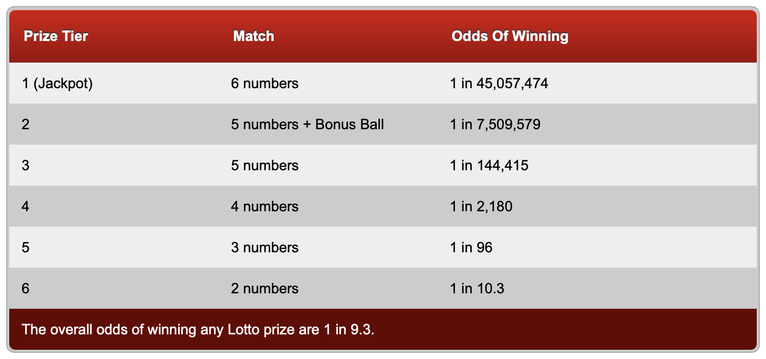
I wanted to include the odds of both games and show the calculation, but I was derailed. According to this page, the odds of the EuroMillions game “depend on how many prizes are offered and how many tickets are sold, so they are always different.” Then I saw this page with a table of odds for the UK Lotto game and realized that I didn’t know how to reproduce it. That was kind of embarrassing, so I decided to dig in and force you to dig with me.
Here are the rules of the UK Lotto game: There are 59 balls, numbered 1–59. Six of these balls are chosen in a drawing. Players choose six numbers and win if two, three, four, five, or six of their numbers match the drawn balls.1 The winnings go up with more matches. It’s the same as the New York Lotto except that New York’s game doesn’t give out money for only two matches.
Six matches
The probability of matching all six balls was the one calculation I could do immediately. The number of ways to choose 6 items from a pool of 59 is
This is the number of combinations. It’s equal to the binomial coefficient, and there are different notations for it. I’m going to use for the balance of this post.
Since there’s only one way to match all 6 balls, the probability is
Lotteries like to express probabilities as “1 in n,” so this appears as “1 in 45,057,474” in the table.
Five matches
This is where I started having trouble. The probability of getting 5 matches is not . The lottery math page on Wikipedia gives the right formula,
but I didn’t think much of its explanation. Other explanations I found in combinatorics texts didn’t fit with my way of thinking, either, but after reading a few, I was able to put together an explanation that stuck:
Separate the 59 balls into two groups: the “good” group consists of the 6 balls selected in the drawing and the “bad” group consists of the 53 other balls. My ticket has 6 numbers on it, 5 of which are in the good group and 1 is in the bad group. (I’ve emphasized the and because we’ll return to it soon.) The number of ways of getting 5 items from a group of 6 is
The number of ways of getting one item from a group of 53 is
In set theory and probability, and implies multiplication, so there are
ways to get exactly 5 matches on my ticket. Therefore, the probability of getting exactly 5 matches is
There is no way to further reduce the fraction in this formula, so a lottery would express this as “1 in 141,690.17” or maybe just “1 in 141,690.”
Four matches
Now that I understand the formula, I can apply it again and again. For exactly four matching numbers, the probability is
which can be expressed as “1 in 2,179.85” or “1 in 2,180.”
Three matches
Here, the probability is
which can be expressed as “1 in 96.17” or “1 in 96,” although rounding to just two digits might be a little too much.
Two matches
This probability is
which can be expressed as “1 in 10.26” or “1 in 10.3.”
The bonus ball
The values calculated above match the odds table for 6, 4, 3, and 2 matches, but not for 5 matches or “5 numbers + Bonus Ball.” What’s that about?

As mentioned in the footnote above, there’s an additional wrinkle to the game. After the six good balls are drawn, a seventh “bonus ball” is drawn from the remaining 53 balls. If five of the numbers on your ticket match five of the six good balls, you get a chance to match the bonus ball. If your bad number matches the bonus ball, that pushes you up into the “5 numbers + Bonus Ball” tier; if it doesn’t, you stay in the “5 numbers” tier.
So if you matched five of the original six numbers, the probability of your bad number matching the bonus ball is simply and the overall probability of getting into this tier is
which is the “1 in 7,509,579” shown in the table.
Similarly, the probability of your one bad number not matching the bonus ball is , so the overall probability of being in the “5 numbers” tier is
which is “1 in 144,414.98” or “1 in 144,415,” as shown in the table.
Final comments
Although the number of combinations is always an integer, the “1 in n” odds presented by lotteries are often rounded to the nearest integer, at least if n is large. I’d never realized that before.
In Mathematica, the Binomial function is the way to calculate . In Python, it’s the comb function in the math library. Both of these can return values well beyond the limit of 64-bit integers.
Learning how lottery odds are calculated may not be the best way to stave off senility, but it beats doing crossword puzzles.
-
There’s an additional wrinkle involving a “bonus ball,” but we’ll get to that later. ↩
Keyboard Maestro episode on MPU
December 22, 2025 at 11:25 AM by Dr. Drang
In the most recent episode of Mac Power Users, David and Stephen discuss Keyboard Maestro, a longtime favorite automation app and the main topic of at least three previous episodes of MPU. If you’re an ANIAT reader, it’s reasonably likely that you’re already using Keyboard Maestro, and you may think this is an episode of MPU you can safely skip. I certainly considered giving it a pass, but I’m glad I didn’t. I’ll bet there’s at least one nugget in the show that you’ll be glad to have heard.
For me, it was David’s use of Keyboard Maestro’s conflict palette. I’ve known about the conflict palette for years, but I’ve always thought of it in terms of its name: a way of resolving conflicting macros that have the same trigger. To me, these conflicts are mistakes: cases in which I’ve accidentally used the same trigger on two or more different macros.
But David treats the conflicts positively. He sees the conflict palette as a useful user interface tool, a way to avoid having to come up with distinct triggers for a number of closely related macros. It’s a way of reducing the number of keyboard shortcuts you have to remember while still being able to quickly launch the macro you want.

You could, of course, build a macro that uses the Prompt For User Input action to set up a selection of other macros to run, but it’s much easier to use the conflict palette. And it’s much much easier to add new macros to the set at a later date.
I feel compelled to comment on a couple of other things that came up in the podcast:
First, there was David breaking bad on Shortcuts. David is the most tolerant Apple user I know, so when he starts talking smack, you know he’s been pushed beyond the limits anyone else would accept. As an avowed hater of Shortcuts, I loved it.
Second, Stephen has been using Keyboard Maestro in place of TextExpander. This works because typed text is one of the trigger categories that KM accepts. When David asked if there were any downsides to using Keyboard Maestro instead of TextExpander, Stephen couldn’t come up with any problems other than the initial pain of reimplementing your snippets in a new app. As someone who did exactly what Stephen did—on two separate occasions—I have thoughts:
The great advantage of purpose-built tools like TextExpander, Typinator (which is what I use now), and TypeIt4Me is that they have very quick ways of creating new snippets from selected text or the clipboard. Keyboard Maestro has no such system.
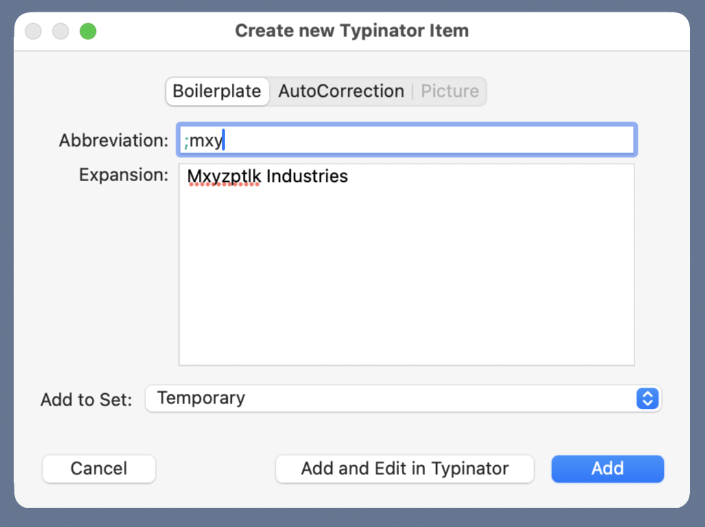
Having a speedy way to make new snippets encourages you to make temporary snippets that you may use for only a single document. These throwaway snippets are worthwhile because they save time (if you can make them quickly) and maintain consistent spelling. For example, if I were writing a report about Mxyzptlk Industries, I’d find it very helpful to have a
;mxyabbreviation that expands out to the full name. Because Typinator has a New Item From Selection… command, I can type the name once, select it, and quickly create an abbreviation to use throughout the rest of the report.
When I was using Keyboard Maestro for expansion, I found myself not making these useful temporary snippets as much as I should have because the friction was too high.
- Stephen’s lament about the time it took him to rebuild his collection of TextExpander snippets in Keyboard Maestro rang a bell with me. I got around that, to some extent, with a pair of Keyboard Maestro macros that copied most of my snippets from TE to KM with only a little work on my part. I don’t know if those macros still work—the user interfaces of both apps have probably changed in the intervening decade—but if they don’t, I bet they could be adjusted without too much effort.
One last note: I’ve included links above to a couple of the Keyboard Maestro Wiki pages. I don’t know what’s going on over there, but when I visited those pages they took an ungodly amount of time to load—like, 56k modem time. Maybe that’s just a temporary problem, but don’t be surprised if it seems like your browser has hung.
There’s nothing you and I won’t do
December 19, 2025 at 9:43 PM by Dr. Drang
I’ve talked about area moments of inertia in the past couple of posts. Today, thanks to Phil Plait, resident astronomer at Scientific American, I have an excuse to talk about mass moments of inertia, the kind you learned about in first semester physics class.
Plait’s article today takes on the Modern English song “I Melt with You” and looks into the energy it would take to stop the world.1 By “stopping,” he initially assumes that means stopping the rotation of the Earth about its axis. He gives the value, , but doesn’t explain how he calculated that number. Kind of disappointing for SciAm and definitely not acceptable here at ANIAT. Especially since the calculation is easy.
The kinetic energy of a rotating body is
where is the mass moment of inertia of the body about its axis of rotation and is its rotational speed.
The value of is kind of tricky because, as Plait points out, the Earth’s density varies with depth. But we can make an initial estimate by assuming the Earth is a sphere of uniform density. The moment of inertia for that kind of body is
We get the mass and (average) radius of the Earth from the sadly defunct NASA Earth Fact Sheet, currently available through the Internet Archive. The mass is and the mean radius is . That gives us a moment of inertia of
Relative to the stars, the Earth rotates once every hours (that’s the “sidereal rotation period” on the Fact Sheet), so the rotational speed is
Putting these together, we get a kinetic energy of
This is higher than Plait’s value, but he may have rounded down because he knew the density of the Earth is higher near the center. Also, I suspect he was mostly after an order-of-magnitude answer.
I found a better estimate of on this page from Eric Weisstein’s World of Science site. It was determined by Kurt Lambeck to be
(Lambeck’s book came out just a couple of years before “I Melt with You,” which I’m pretty sure is a coincidence.)
Using this value, we get a rotational kinetic energy of
which is a better match for Plait’s energy value.
Plait also considers another interpretation of “I’ll stop the world”: stopping the Earth in its orbit. I won’t get into the details of this, first because it doesn’t involve the moment of inertia, and second because stopping the Earth this way would have it fall into the Sun. Not much doubt about melting in that case.
-
He also gets into the question of melting the Earth’s crust, which I won’t be addressing. After all, the song says “I’ll stop the world and melt with you.” As far as I’m concerned, only the singer and his girl melt, not the whole goddamned world. ↩
