iPhone notes app comparison
February 21, 2011 at 7:58 AM by Dr. Drang
I have four note taking apps for the iPhone: Simplenote, Elements, PlainText, and Nebulous Notes. I’ve written about each of them before,
Update 3/15/11
I just wrote a similar post looking at the features of Notesy, which has taken over from Elements as my main note-taker.
The comparison will cover
- Cost
- Syncing
- TextExpander support
- Fonts
- Searching
- Sorting
- Full screen mode
- Word count
- Other features
Cost
None of these apps are particularly expensive, but in-app purchases can make the cost different from what you see in the App Store.
Simplenote
Simplenote is free, but there’s an in-app Premium upgrade option that costs $20 per year. A Premium subscription does several things:
- Removes ads. Simplenote’s ads appear at the top of the notes list and can be scrolled off screen, which isn’t all that obtrusive, but a Premium subscription removes them entirely.
- Syncs directly with Dropbox. I’ll discuss this more in the Syncing section below.
- Increases the number of backups of each note from 10 to 30. This applies to Simplenote’s own syncing system, not the Dropbox sync.
- Allows unlimited third-party app use. Simplenote has an API associated with its native syncing system, and calls to the API are throttled unless you have a Premium subscription.
- Allows note creation via email.
- Provides an RSS feed.
- Allows notes to be edited in List view.
I had a Premium subscription last year—I won it in a contest—but that was before some of these features were available, so I can’t speak authoritatively on their value. It seems to me that the most important of the Premium features is the Dropbox syncing, but there is, famously, a way to get Dropbox syncing via the API without a Premium account. We’ll discuss that in the Syncing section.
Elements
$4.99. No ads, no in-app purchases. Buy Elements and you get all the features.
PlainText
PlainText is free, but has ads that remain at the bottom of the screen in both List view and Note view. The ads vanish when the keyboard appears for editing. An in-app purchase option will remove the ads for $4.99.
Nebulous Notes
$1.99. As with Elements, this is the price for the app with all its features.
Syncing
This is an area where the differences between the apps can be huge. Dropbox syncing is the primary reason I switched from Simplenote to Elements.
Simplenote
This is really complicated.
Simplenote has its own syncing system, which I’ll call native syncing, that backs your note up to Amazon’s S3 cloud storage service. The notes can be viewed and edited through your web browser by going to simplenoteapp.com and signing in with a username and password. Before Simplenote published its API and before there was a Premium service, this was the only way to get at your notes from your computer.
Now, with a Premium account, you can sync your notes to your Dropbox account, where they’re available to be viewed and edited in any text application on your computer. This is a fairly new feature, and I have no experience with it.
Because of Simplenote’s API, there are ways to get Dropbox syncing without a Premium account. The most common, on a Mac, at least, is to use Notational Velocity. Both the standard NV and its most famous fork, nvAlt, make periodic calls to the Simplenote API to sync the notes with a folder of your choice on your computer. If you choose that folder to be one within your Dropbox folder, you now have Dropbox syncing with Simplenote.
This option pretty much forces you to run Notational Velocity all the time to get automatic syncing. If you’re an NV user, you’re probably doing this anyway. I prefer having just one text editor (TextMate) running all the time, so the NV syncing has never appealed to me. But lots of people do use the NV option to get Dropbox syncing with Simplenote and they love it. I’ve never heard anyone say that Simplenote’s API throttling interfered with syncing.
Elements
This is really simple. Elements syncs to an “Elements” folder in your Dropbox folder. When you start Elements for the first time, you give it your Dropbox login credentials, and it creates that folder. Notes you create on your iPhone are saved in that folder and are available to be edited with any text application on your computer. Notes you create on your computer and save in that folder are available to be viewed and edited on your phone in Elements.
I’ve noticed that small edits made on the computer sometimes don’t get synced immediately, and I’ve had to quit Elements and relaunch it to see those changes. I haven’t had this problem in quite a while, so it may have been a bug that got fixed.
PlainText
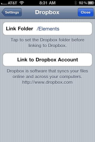
This is almost as simple as Elements, but the one extra step of complication has real benefits. Like Elements, PlainText syncs your notes to a folder within your Dropbox folder. By default, this will be a folder called “PlainText,” but you can choose any folder at all. I chose my “Elements” folder, which gives me access to all my notes from both apps. A thoughtful feature from Hog Bay.
Nebulous Notes
Now we’re back to complicated, but not as complicated as Simplenote.
Nebulous Notes can access any text file in your Dropbox folder—it’s not limited to files in a single subfolder. However, it doesn’t automatically sync all your Dropbox text files to your phone. Only files that you specifically open within Nebulous get a local copy put on your phone. These files are called “Auto-saves.”
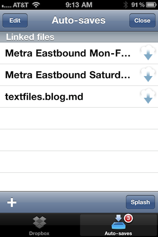
If you find yourself without a network connection, only the auto-saves can be viewed or edited; Nebulous won’t even let you see a list of the other files.
In a way, this is quite flexible, because Nebulous doesn’t force you to put your notes into a specific subfolder. But it makes the syncing only semi-automatic. If you may be going somewhere with no network access, you have to remember to turn any file you might need into an auto-save before you lose your connection.
This is a better approach than Nebulous had when I first reviewed it. Back then, there were no local copies whatsoever—if you were off-network, you couldn’t access any of your notes. Still, I prefer the fully automatic syncing of the other apps.
TextExpander support
All four apps have TextExpander support, and I wouldn’t even consider an app that didn’t.
Fonts
When it first came out, Simplenote’s two main advantages over the built-in Notes app were automatic syncing and Helvetica, and for many of us the font choice was just as important as syncing without iTunes. There were ways of getting Notes to use something other than that godawful Marker Felt, but they were annoying.
Simplenote
Simplenote still uses Helvetica and only Helvetica. If that fits your needs, you’ll be happy with it. Four font sizes are available: Small, Normal, Large, and Extra Large. What’s surprising to this middle-aged user is that Small is actually readable, and Normal is comfortably readable.
Elements
Elements offers every font on the iPhone in every style. This is overkill, as no on is going to write notes in DBLCDTempBlack. But if you like Palatino or Snell Roundhand or Verdana, they’re available to you. Also, Second Gear has included my favorite monospaced font, Bitstream Vera Sans Mono.
I’m repeating myself here, but I find a good monospaced font essential to note taking, mainly because so many of my notes are schedules and lists that are best expressed as tabular data, and a monospaced font is the easiest way to get the columns to line up.
PlainText
PlainText uses Georgia, with no option for another font. I love Georgia and it gives PlainText a beautiful overall look, but it isn’t right for my more data-centric notes. I imagine it would work really well for people who write mostly in paragraphs.
Nebulous Notes
Nebulous offers a subset of the fonts that come with the iPhone: Georgia, Georgia Bold, Heiti TC, Helvetica, Helvetica Bold, Marker Felt, Times New Roman, Times New Roman Bold, Trebuchet MS, Courier, and Courier Bold. It also includes not one but three additional monospaced fonts: Bitstream Vera Sans Mono, Monaco, and Lucida Console.
Searching
There are two ways to organize your text files: lots of little files on specific topics or a few large files covering broad categories. I use the former strategy, so I don’t need to do much searching; but if you use the latter, searching will be the best way to get to the information you want.
Simplenote
Simplenote has, without question, the best search tool. Not only does it tell you which notes contain the text string you’re looking for,
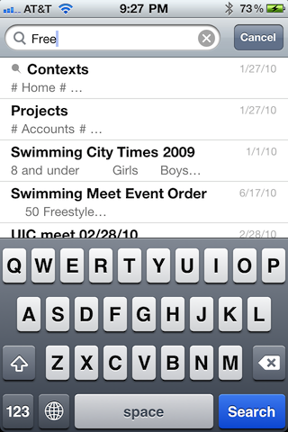
but tapping on one of the files will take you to the first spot that string occurs within the file,
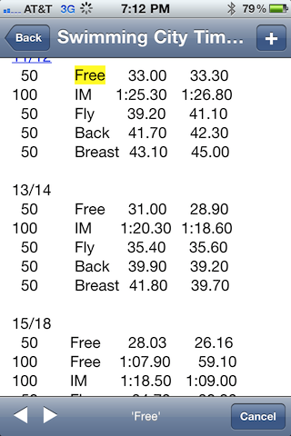
and the arrow keys in the bottom left corner will take you to all the other places in the file with that text.
Elements
Elements will do the first stage of searching, telling you which of your files contains the text,
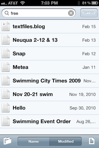
but after that, you’re on your own for finding the string within the file.
PlainText
PlainText has no search feature whatsoever.
Nebulous Notes
Nebulous, like PlainText, has no search feature.
Sorting
Simplenote has the most options for sorting the list of notes, Nebulous the fewest. My preference, both when I used Simplenote and now that I’m using Elements, is to sort by descending modification date, which puts the most recently edited file at the top of the list.
Simplenote
Simplenote can sort the list of notes by
- File name, ascending or descending
- Creation date, ascending or descending
- Modification date, ascending or descending
There’s also a “Pin To Top” option that allows you to choose files that will always be at the top of the list no matter how the other files are sorted.
Elements
Elements can sort the list of notes by
- File name, ascending only
- Modification date, descending only
PlainText
PlainText can sort the list of notes by
- File name, ascending or descending
- Modification date, ascending or descending
Nebulous Notes
Nebulous sorts by ascending file name only.
Full screen mode
Full screen mode can be great for reading; it clears all the chrome off the screen, giving you a couple of extra lines of visibility.
Simplenote
Simplenote has a well-designed full screen mode. You get into it by tapping a button at the right end of the bottom toolbar,
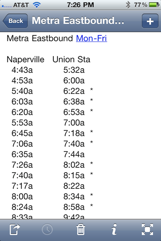
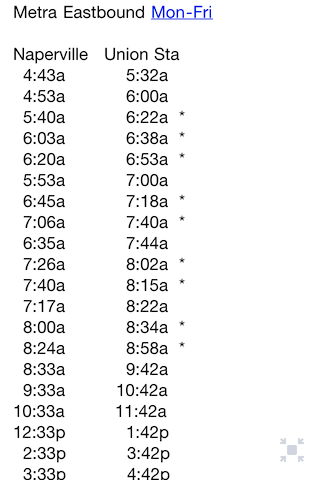
and go back to normal mode by tapping the floating “ghost” button in the lower right corner of full screen mode.
Elements
Elements has no full screen mode. You always have a title bar at the top and a toolbar at the bottom.
PlainText
PlainText always has a title bar at the top but has no toolbar at the bottom if you paid to remove the ads.
Nebulous Notes
Nebulous has a frustrating full screen mode. You access it by tapping a floating ghost button in the lower right corner of the screen,
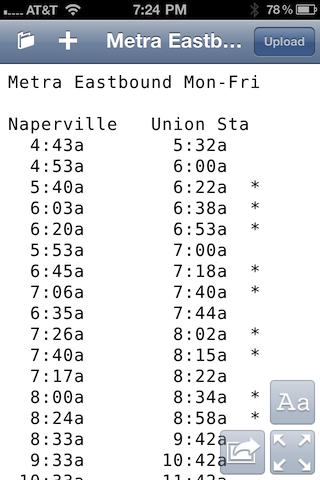
and get out by tapping a similar button at the same spot when you’re in full screen mode. I can’t show you this second button because Nebulous keeps it invisible until you tap at that spot. Worse, when you tap there, the virtual keyboard appears, whether you wanted to edit the file or not. Only then does the “regular mode” button appear.
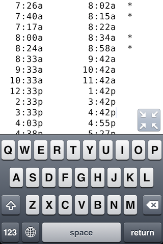
By the way, how do you dismiss the unwanted keyboard? Damned if I know. Nebulous is the only app that doesn’t have a button for that purpose. The only way I’ve found to dismiss the keyboard is to tap the folder button in the title bar to go back out to the list of files. If there’s another way to do it, I’ll happily update this paragraph; but if it’s there, it certainly isn’t obvious.
Word count
I can’t say I use this feature much, but all the apps have some form of it.
Simplenote
Simplenote has an info button in the bottom toolbar that tells you the number of words and characters in the note.
Elements
Elements has an info button in the bottom toolbar that tells you the number of words, characters, and lines in the note. It’s basically like the Unix wc command.
PlainText
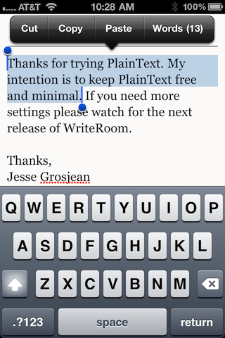
PlainText has a cute but weird way of telling you the word count. Tap and hold anywhere on a note and the usual selection bar will appear. The word count will be at the right end of the bar. If you have text already selected when you tap and hold, the editing bar will have the word count of that selection at the right end.
Nebulous
Nebulous’s word count is accessed through the settings ghost button, the one that looks like Aa. It tells you only the word count.
Other features
Elements has a Markdown preview mode; Nebulous is supposed to be getting one soon.
Simplenote has a “View As List” option, which I know nothing about because it’s a Premium feature.
Simplenote and PlainText will let you lock the orientation of the display even if the global orientation lock is off. Nice for reading/editing while lying down.
Elements has a variety of choices for foreground and background color. Nebulous has a smaller number of choices and a handful of preset themes, one of which gives you the green-on-black look of old CRTs—a look that people who never had to use those CRTs find much cooler than those of us who did.
Simplenote has a passcode lock similar to the four-digit lock you might have set on the phone itself. If you don’t like passcode-protecting the phone because it slows down access to it, you might still want to protect your notes.
Simplenote and PlainText can detect “links” in files. Tapping on a URL will open it in Safari; tapping on a phone number will dial it.
Nebulous has an optional macro toolbar that you can have displayed above the normal keyboard. It gives instant access to keys that you’d normally have to dig for.
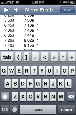
I suppose this is OK on the iPad, but it takes up too much precious screen space on the iPhone.
Simplenote has some clever ways of sharing files online with other Simplenote users, a great feature for household files like shopping lists.
Conclusions
I’ve chosen Elements as my regular note taker, and that shows in my descriptions. While I’m still not happy with its use of byte-order marks and CRLF line endings, overall it fits my way of working better than the others.
Before Elements came along, I got a lot of use out of Simplenote and have no regrets buying it. Apart from the lack of font choice, it has more features than the other apps, and I can see where one or more of those features—search, in particular—would make it the best choice for many people.
PlainText strikes me as better suited for long narrative files than short, list-like notes and probably a more comfortable fit on the iPad than the iPhone. It’s the best looking of these apps.
Nebulous Notes has lots of interesting features, but its user interface is just too flaky. And the semi-automatic syncing is a dealbreaker. I know some smart people who use it, but it’s just not right for me.
Update 2/22/11
Many good comments. I initially responded with a comment of my own but decided to move the response up here.
- I didn’t include Trunk Notes (Comment 7) because I think its wiki features make it distinctly different from the apps I covered here. You can see my impression of Trunk Notes in this other post.
- I didn’t include iA Writer (Comment 5) because it’s iPad-only and this is a post about note taking apps on the iPhone. I don’t have an iPad, and can’t speak to how any of these apps work on one (although the screenshots of PlainText on an iPad look lovely).
- One of the few advantages of aging is learning that everyone is different; another is coming to accept your own flaws and limitations. If you like Evernote, more power to you. I’ve stayed away from both it and Yojimbo because I know I’d never tag the entries and they’d turn into digital junk drawers.
- I’m leaving in Chris Miles’s naked self-promotion (Comment 10) because his product may be just right for some readers.
- I take a dimmer view of thinkery’s naked self-promotion (Comment 6) because I don’t believe his product matches the theme of this post. But I’m too tired to bother deleting it.
- Thanks to Miles (Comment 12) for describing Simplenote’s new list feature.
- Alan Schmitt (Comment 23) makes a good point about Elements not expanding TextExpander snippets in file names, something he’s mentioned to me before but which I forgot to include in the post. It’s never affected me, but it’s a bug that Second Gear should fix.
- Marcel (Comment 25) should see a doctor about the bug up his ass, but he is partially correct about Elements being restrictive in which file extensions it allows. Originally Elements wouldn’t open or list files that didn’t have a
.txtextension; that restriction was loosened several months ago, but it still won’t open, say,.rbfiles. I don’t know the full list of extensions it does support, but I’ve been satisfied since it started working with.mdfiles. - hekkipekka (Comment 26) clarifies Simplenote’s sharing feature; it’s more flexible than I said in the post.
- Michael Evans (Comment 30) links to his own comparison of Elements, PlainText, and Nebulous. It’s worth your time reading; although we cover much the same ground, you’ll get a better view of the apps if you read both his post and mine. I’m sorry I missed Michael’s article when it came out.
-
There are lots of posts about these apps, especially Simplenote and Elements. If you have any interest in seeing what I’ve written before, your best bet is to use the search field in the sidebar. ↩
