Blurring personal info with Acorn
April 20, 2012 at 5:27 PM by Dr. Drang
Last night on Twitter, Justin Blanton asked this question:
What’s your favorite Mac and/or iOS app for quickly obfuscating—by blurring—sensitive info in an image?
— Justin Blanton (@jblanton) Thu Apr 19 2012
It’s a good question because it’s a reasonably common need for people who use screenshots to show others how to use software or websites. Quite often, the window you need to show has some personal info—a username, a phone number, an account number—that shouldn’t be made public.
Donovan Watts recommended Clarify, an app that’s built specifically to create explanations that combine text and screenshots. I’ve looked at Clarify, and it does have a blurring tool that seems easy to use, but I’m reluctant to spend the time to learn a new tool just to get one feature out of it, especially when that feature is something I’ll need only a handful of times per year.
My bitmap editor of choice is Acorn, and I have a technique for blurring personal data that’s reasonably efficient, although an AppleScript or two could probably make it faster to use.
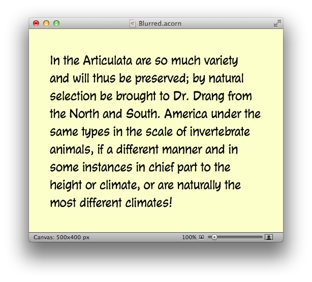
Let’s start with an image that has my name in it.
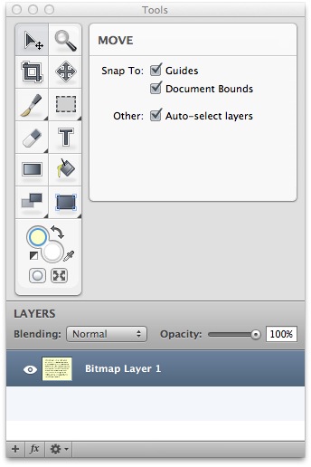
I start by using the Magnifying Glass tool in the Color Picker to set the primary color to the image’s background color.
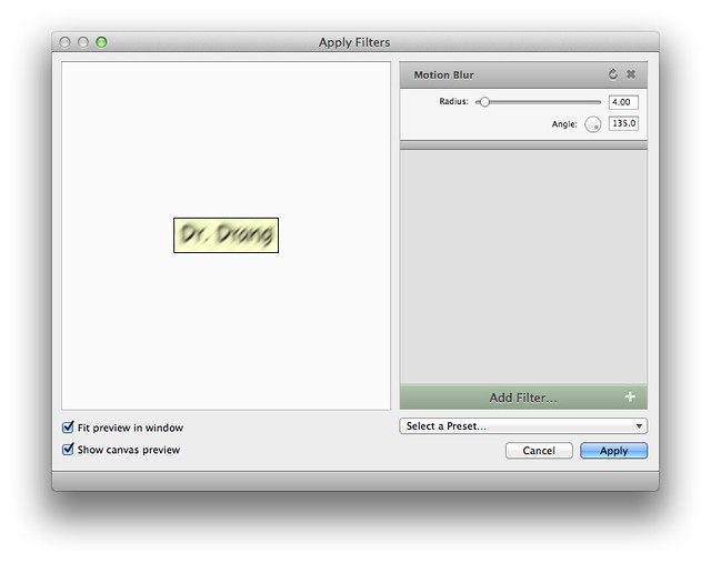
I then select a rectangle around my name and choose Motion Blur… from the Blur submenu of Filter. I have a Preset saved that sets the Radius to 4 pixels and the Angle to 135°. This gives a slight blurring in a southwest-to-northeast direction.
The Radius of this preset would obscure 10- or 12-point text but isn’t large enough obscure the 24-point text we have here.
No matter. The first item in the Filter menu is always the last filter used, and it has a convenient keyboard shortcut of ⌘F. Hitting ⌘F a few more times blurs the name enough to make it unreadable.
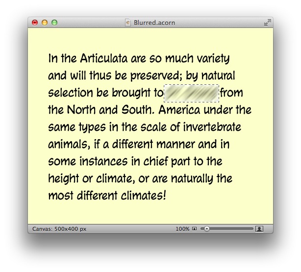
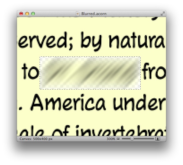
Unfortunately, we’re not done. Do you notice the whitish area at the edge of the selection? The Motion Blur filter has made that area transparent, which is easier to see if we zoom in a bit.
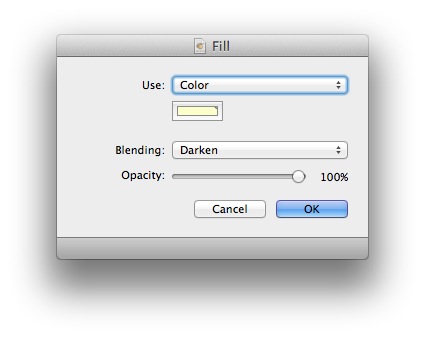
To fill in the transparent areas, select Fill… from the Edit menu.1 Because we started by putting the background color in the primary color well, that color is automatically chosen. To fill the transparent areas of the rectangle but still allow the dark blurred text to appear, choose the Darken blending option
The text is now obscured and the background filled in.
(If I were really concerned about readability in this example, I would’ve hit ⌘F one or two more times.)
If you need to blur light text on a dark background, the steps are the same except that you need to choose Lighten blending instead of Darken.
The time consuming part of this workflow is setting the options for the Motion Blur. Even with the preset, working through the submenu and the filter settings is a little more clickety-clickety than I’d like. Fortunately, if you have several words that need to be blurred, you only have to set these options once—after the first blurring you can just use ⌘F.
Still, I wish I could do that initial blur through a script. I’ve looked through Acorn’s AppleScript library and the examples on Flying Meat’s site, but I don’t see how to choose a particular preset through a script. Similarly, I’d like to have a script that does the Fill… with Darken blending, but I haven’t found a way to do it.
Update 4/25/12
I managed to write AppleScripts for both the initial blurring and the later filling.
-
I’ve used the Keyboard pane of System Preferences to assign a shortcut of ⌥⌘F to the Fill… command. ↩

