Nonresponsive design
April 20, 2012 at 11:52 PM by Dr. Drang
Eventually, I’m going to be a hot, cutting edge web designer. Not because of anything I do, but because, sooner or later, the fads in web design will swing around to the way I’ve built this site.
Remember several years ago when The Mobile Web started to take off? The hot thing then was to build a web-optimized version of your site—fewer (or no) images, fewer (or no) ads—and use some sort of sniffing code to detect the user’s browser and serve the stripped-down version if she was reading your site on her phone. If you were running a WordPress blog, there were themes for mobile users that you could just plug into your site.
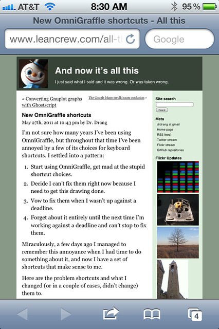
I thought about adding a mobile theme to ANIAT, but I had a problem: the site actually looks pretty good on an iPhone.1 Here it is in portrait mode, as it appears when you first visit a page:
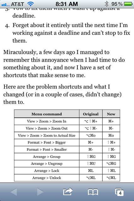
You can’t really read it this way, but a double-tap on the content area gives you this:
That’s very readable, even without a Retina display, so there didn’t seem to be any reason to build a mobile version of the site.
More recently, Responsive Design has become the buzz phrase of choice. Web sites are no longer supposed to detect your browser and serve different pages depending whether you’re mobile or desktop, they’re supposed to have a single version, but with lots of JavaScript and CSS to rearrange their parts according to the size of the window or screen on which they’re being viewed. You’ve probably seen examples with page elements that slide and jump around as you narrow and widen the window. They remind me of Professor Lupin’s trunks and suitcases packing themselves up at the end of The Prisoner of Azkaban.
This site isn’t responsive, not to the window size, anyway. It does respond to your default font size, though. The content and sidebar widths are defined in ems, and unlike many sites, this one respects your choice of default font size and doesn’t override it the first few lines of its CSS. The upshot is that the line lengths vary in pixels but are constant (or nearly so) in words. You can see the effect of this if you tell your browser to Zoom Text Only (in the View menu in Safari) and zoom in and out a few times. The images might resize themselves a bit—there are some max-width directives in the CSS–but the text in the main column will stay at about 12 words per line regardless of whether the font is 12 points, 24 points, or anything in between.
On the iPhone, as you can see in the screenshots, the text runs closer to 8 words per line when the phone is in portrait mode. That works out well, 12 words per line on the phone would require a font that’s too small to read comfortably.
This, to me, is how a word-oriented blog should behave, with the emphasis on the reading experience rather than on the width of the window. The reading experience is based on four things:
- Contrast. I know light grey text on a dark grey background looks cool, but it just isn’t as readable as black on white. Lower contrast can work for short items, but not longer ones.
- Serifed fonts. Again, everyone thinks sans serif fonts are stylish, but they just aren’t as readable. How many books have body text set in Helvetica?
- Words per line. Narrow columns with only a few words per line are tiring; wide columns with many many words per line are easy to get lost in.
- Leading. This has to be balanced against the number of words per line. Longer lines need more leading.
It’s obvious that I’m employing Items 1 and 2. Items 3 and 4 are also present, but under the hood. They’re why why ANIAT is set up the way it is, with columns widths defined in ems instead of pixels or percent of window width.
By focusing on readability as I designed and redesigned the layout of ANIAT, I unwittingly hit upon an arrangement that works as well on a phone as it does on a desktop. This, it seems to me, should be the goal of most web designs: a single format that works in both places but without gimmicks that require layers of JavaScript, jQuery, and CSS.
When web designers finally hit on this, they’ll declare it the Next Big Thing. They’ll call it universal design and write dozens of articles about it. They’ll organize conferences around best practices in universal design, and they’ll encourage everyone to tear up their old designs and get with the new paradigm.
And when they visit this site they’ll have to avert their eyes, because it will be like unto gazing at the Lord.
(It seems appropriate to mention here that my back began acting up again this week, and I’m currently on a mixture of pain pills, anti-inflammatories, and muscle relaxers. I’m not supposed to operate heavy equipment while taking this stuff because it might impair my judgement. Luckily, a MacBook Air is about as far from heavy equipment as you can come.)
-
Which is the only mobile device I care about. Unless one of my posts has been linked to at Hacker News or Reddit, Android users make up such a small part of my audience that they’re not worth fussing over. ↩


