Layers
September 21, 2013 at 8:34 PM by Dr. Drang
I installed iOS 7 yesterday afternoon, a couple of days after everyone else in the world. The process went well, and I haven’t had any slowdowns, crashes, or sudden battery drains. But I was disappointed with the Parallax effect, a part of the new UI I was looking forward to. It works well under some circumstances, but is bizarrely wrong under others.
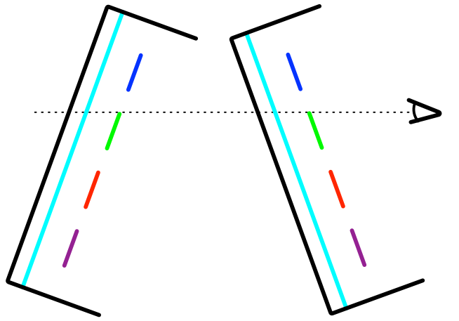
Here’s how Parallax is supposed to work. The home screen has two layers: a background layer where you put a photo or other image, and a layer for the app icons that is, conceptually, above the background layer. When you tilt the phone, the icons shift relative to the background to create an illusion consistent with the conceptual model.
For example, in a system with real layers, tilting forward causes the foreground items to appear lower against the background; tilting back causes them to appear higher.
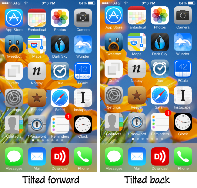
When you tilt your iPhone forward and back, iOS 7 monitors the motion sensors and shifts both the icons and the background image. Tilt forward, and the icons move down while the background moves up; tilt back, and the icons move up while the background moves down.
So far, so good. Left/right tilting also works the way it ought to when we have just the icon and background layers on the screen.
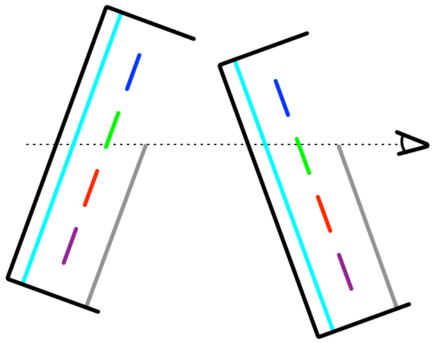
The problem arises when we bring up the Control Center. Conceptually, this is a third layer that’s above the level of the icons. Apple says it’s like looking through rice paper, and the various previews I’ve been reading over the past few months have talked about it being like looking through frosted glass. The translucency of this layer is supposed to give you a sense of depth. Unfortunately, it breaks illusion of the Parallax effect.
Here’s how a three-layer system should look. When the phone is tilted forward, more of the icon layer should show above the top edge of the Control Center; when it’s tilted back, less should show above the top edge.
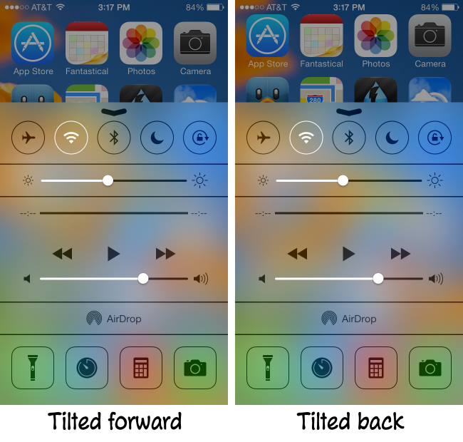
Here’s how it really looks. Exactly backward.
The problem, as you can see when the images are side-by-side, is that the icons still move as if they were the top layer and the Control Center doesn’t move at all. So we end up with a mixed message: the translucency telling us that the Control Center is in front, but the movement of the icons telling us they’re in front.
I can think of three ways to solve this:
- Dump the Parallax effect. We’ll know the icons are above the background because they cover it. This is a reversion to pre-iOS 7 behavior and probably not desired. Also, it’s an admission of defeat.
- Move the Control Center in response to tilting. Both the top edge and all the control elements would have to move, but I don’t see this as too computationally burdensome. The blur effect already works dynamically as the Control Center is opened and closed, and it follows the movement of my finger perfectly on my iPhone 5.
- Have the Control Center slide all the way to the top of the screen. This is a cheat because it wouldn’t actually solve the problem, it would only hide it. I doubt that anyone would notice that the smeary blobs behind the frosted glass were moving the wrong way. It’s the top edge of the Control Center that makes the incorrect behavior obvious.
I prefer Solution 2, partly because it’s the best solution, but also because a moving Control Center would enhance the illusion of depth in every app, not just SpringBoard.
I’m really surprised Apple didn’t handle the Control Center properly. It’s the kind of thing they typically get right. Maybe it got left behind in the rush to a September release and will be fixed when the iOS team gets to catch its breath.
Update 9/22/13
Today on Twitter, Allen MacKenzie suggested a fourth fix: making whatever layer is on top stationary and have the layers behind it move appropriately when the phone is tilted. This would mean the icons would normally not move but would when Control Center comes up. Dan Sturm had pointed out that my fix #2 has the disadvantage of smallish touch targets that move; Allen’s suggestion avoids that problem.
The downside of Allen’s fix vs. #2 is that it would limit Parallax to SpringBoard, as other apps, even Apple’s own, don’t move in response to tilting. That’s still no worse than what we have now.
Update 10/18/13
The Sharing pane does move around in a parallax-appropriate way. Maybe the Control Center will follow suit in an update.


