The new Dark Sky
January 30, 2014 at 11:13 AM by Dr. Drang
A new version of Dark Sky came out a couple of days ago, and it’s a big change, both functionally and aesthetically. Jared Sinclair’s criticism of the new design has gotten some attention, mainly through an approving link from John Gruber,1. While I think there’s plenty to criticize in the new design, I disagree with almost everything in Sinclair’s piece.
Dark Sky’s claim to fame is its highly localized, short-term predictions of rainfall, something it was exceptionally good at.2 The new design, while still focused on precipitation in the next hour, generalizes it into a more standard weather app with predictions for the upcoming week. I think the idea was to make it possible for Dark Sky to be your only weather app, something it couldn’t be in its original incarnation.
Sinclair’s criticism centers on the presentation of Dark Sky’s three main screens.
His overall impression is this:
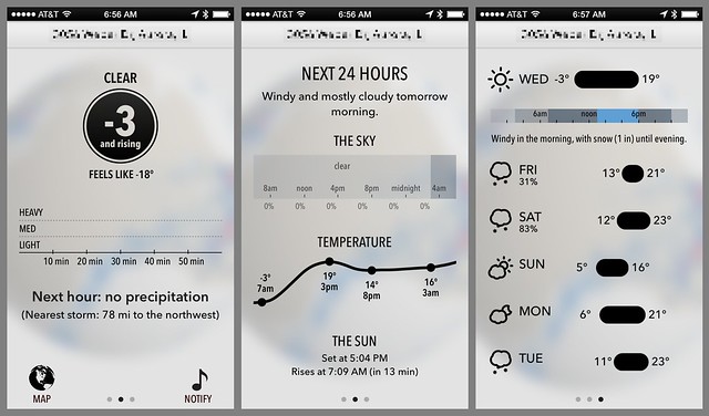
Of the three panels — current conditions, Next 24 Hours, and the week view — only the middle panel has a title, but in context the title is easily confused for a subhead. It took deliberate focus while preparing this post for me to recognize the purpose of all three tabs. I suspect a casual user will not undertake that much effort.
I can only assume he thinks “casual users” are idiots. It’s true that having a heading on only one of the screens is inconsistent, but I don’t see how anyone could mistake what these three screens are for. The only one that might not be immediately obvious is the second one, which is probably why it has the “Next 24 Hours” heading. And the reason we know the heading applies to the entire screen, and not just the text immediately below it, is because it’s at the top and is in a larger font than any of the subheads. These are the same clues we use to distinguish heads from subheads in everything we read.
The first screen3 provides a brief text overview of the current conditions, the usual Dark Sky precipitation graph (which was pretty dull when I took the screenshot), and then a text description of the upcoming precipitation. The note about the nearest storm is new. I’m not sure how valuable it is, but I find it interesting. I agree with Sinclair that putting the temperature in a big black circle is more trendy than informative, but I don’t think it detracts from the design. When Dark Sky launches, the screen is a hazy white with a throbbing black dot to indicate that it’s getting data from the network. That throbbing dot turns into the black circle on the first screen when the data arrive, so the circle ties the first screen to the launch. That could certainly be done differently, but it’s not as though the circle is entirely without purpose.
More detail on the current conditions can be revealed by tapping on the first screen, but we’ll get to that later.
The second screen summarizes the next 24 hours. Sinclair doesn’t like the temperature graph because it
… doesn’t have any bounding guides or axes to give the graph meaning. It’s just a line meandering through negative space. Graphs need axes to be legible.
No, they really don’t. This is an argument that seems plausible when you read it on Sinclair’s site because he doesn’t provide any screenshots. But when you see the temperature graph, and you see that prominent points (near the ends and at local extrema) are labeled with both the time and the temperature, the need for axes disappears. Let’s be realistic: temperature predictions, even for just the next 24 hours, aren’t accurate enough to justify detailed interpolation between the points. No one should be trying to figure out whether the temperature is going to hit 15° at noon or at 1 pm.
I suspect most users will notice that the horizontal scale of the temperature graph is the same as that of the sky graph. It’s not uncommon for aligned graphs to share a single labeled axis, but I do agree that Dark Sky has gone against convention and expectation by putting the axis on the upper graph instead of the lower one. The design would be improved if the positions of the temperature and sky graphs were switched.
Sinclair again:
On both the first and the second panels, all the individual sections are difficult to distinguish from one another. Whenever there are two or more things on the same screen, those things need boundaries… Without a real or implied border, each area of content melts into an amorphous blob. It’s disorienting and hard to read.
I’m one of those people who think iOS 7 went way too far in stripping away decoration, but I can’t agree with this. There’s simply no way anyone who’s ever read a book, a newspaper, a magazine article, or a web page would get confused about this layout. You may not like the way it looks, you may think its black-on-white aesthetic is too Bauhaus, too stereotypically “clean,” but you can’t say it’s misleading or hard to read because there are no boundaries. Each section and graph is distinct.
There is one point on which we’re in complete agreement:
Because the individual rows can be swiped open, they compete for the same panning gestures used to navigate between panels. The conflict between these gestures (and the lack of visual distinction between static and interactive content) makes me feel uneasy touching the app at all — a sin for an iOS app.
Dark Sky isn’t the only app that’s guilty of this sin, but the third screen manages to pack in seven deadly examples of it. Swiping on a day changes that day’s presentation from a bar graph of temperature to a strip of sky conditions (an example of which is shown in the screenshot), but swiping overall moves you back to the second screen. Only a left-to-right swipe can move to the second screen, so you might think that changing the day presentation would happen only with a right-to-left swipe. Not so. I have found myself bringing up the sky strip when I wanted to return to the second screen. I’m sure there’s a difference in how you swipe to get the different behavior, but it isn’t obvious, and it isn’t something that someone who’s just trying to navigate weather app should have to think about.
Update 1/30/14
After some more experimentation, I’ve learned why some left-to-right swipes led to a change in the day presentation. It was because I touched the screen and hesitated before swiping. Dark Sky interpreted that as a tap, which it also uses to switch between the temperature and sky graphs.
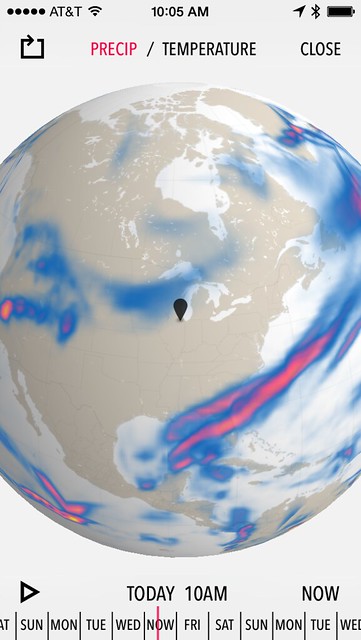
Just because I disagree with many of Sinclair’s criticisms doesn’t mean I don’t have my own. The most important has to do with the map, which you get at by tapping the button at the lower left corner of the first screen. For the first two days I used the new Dark Sky, that map always opened to a view of the globe—I’d have to pinch a few times to zoom in to my local area.4
I complained about this on Twitter and learned that while some people were getting the same behavior I was, others were seeing their local area right away. This had nothing to do with whether Dark Sky was still in memory (even I would see my local area if I closed Dark Sky and then went right back to it); those who were getting the local view would get it even after force-quitting the app and relaunching from scratch.
Today I’m getting mixed behavior. When I first launched Dark Sky, it was almost certainly purged from memory but the map started in a local view. Five minutes later I returned to Dark Sky only to find it starting with the globe. This is not how computers are supposed to work.
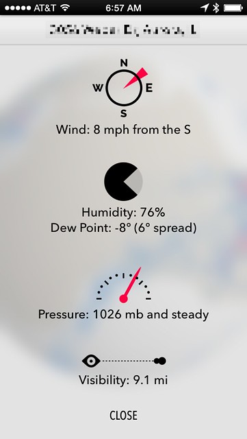
I also don’t like the detail screen for current conditions, what you see when you tap on the first screen.
The textual information here is quite good. I especially like seeing the difference between the dew point and the current temperature, something I haven’t noticed any other web app providing.
What’s bad are the icons.
- The humidity icon is worthless. There’s no need for a pie chart when you’re presenting only one piece of data.
- The visibility icon is nearly as bad. I assume that as the visibility drops, the eye and the cloud will be closer together, but there’s no sense of scale. I’m not looking for a labeled axis, but the graphic tells us nothing about whether the visibility is considered good or bad. To know that, you have to know what 9.1 miles of visibility means, in which case the graphic is useless.
- The pressure icon is actually OK. When the pressure is rising or falling, there’s a little curved arrow at the tip of the meter telling you which way it’s going. I assume the center of the meter is standard atmospheric pressure, but I haven’t had the app long enough to know that for sure.
- What really annoys me is the wind direction. What kind of dial marker spins about its tip? The fact that the red marker intersects the circle in the NE quadrant makes me think at first that that’s the wind direction. Then I see that the marker is an arrow that’s pointing SW, so I begin to think that’s the direction. Then I look at the text and see that the wind is from the south and grit my teeth.
None of these pictures tell you more than what’s in the text. They’d still be helpful if they gave you an at-a-glance impression that didn’t require reading. They don’t. They range from mildly useful to worthless to confusing to wrong.
It’s pretty clear what’s going on. Dark Sky didn’t want this information on the first screen because it would’ve been too crowded. But it’s too sparse to fill its own screen, so they added pictures to take up space. They’d have been better off taking a cue from Apple’s weather app and having this text fill just the top portion of the first screen when tapped. That would also allow the user to connect this secondary information with any upcoming storm because they’d be on the screen at the same time.
Overall, I like the direction Dark Sky is taking, and I won’t be surprised to see some of its problems addressed in updates soon. I do think the designers are a little too enthralled with whitespace, but if they get the prediction accuracy back to what it was in 2012 and fix a couple of usability problems, I can see it returning to my home screen.
Update 1/30/14
A good theory on why Dark Sky sometimes starts with the local view and sometimes with global:
@drdrang The map view seems to depend on local conditions. If there’s nothing to see in the local view, then it defaults to the globe view.
— Kyle (@kgib) Jan 30 2014 12:07 PM
Kyle later refined this theory and now believes the local view is triggered by a forecast of precipitation in the next hour. That makes sense to me, even though I once got different views just five minutes apart—Dark Sky’s forecast may have changed during those five minutes. As I write this, snow is supposedly just a few minutes away, and every time I open Dark Sky it starts with the local map.
If this is the explanation, I find it infuriating. The map I start with is my business, not Dark Sky’s. If there’s a storm more than an hour away from me, or one that’s predicted to pass a few miles south of me, that would appear on the local map and I want to see it.
-
I first saw it by following a link from Dan Frakes. ↩
-
This past summer (remember summer?) I soured on Dark Sky because it just wasn’t as accurate as it had been the year before. Several of my friends, unprompted, said the same thing. I don’t know if this was a general degradation in its predictive capability or just an oddity unique to the Chicago area, but I stopped trusting it and relegated it to folder on my second screen. I’ll give it another chance this spring. ↩
-
Don’t mind the misplaced dot at the bottom; that’s a bug that I’ve seen a few times and which I’m sure will get squashed soon. ↩
-
Double tapping doesn’t zoom. It usually starts the globe spinning because your finger slid a bit in one of the taps. I have no idea why Dark Sky decided to ignore a gesture that’s been standard since 2007. ↩


