Apple sales
January 31, 2017 at 9:20 PM by Dr. Drang
I’ve been doing this for a while, but this may be the first time I’ve managed to post my little graph of Apple unit sales on the same day the quarterly figures were announced.

As a reminder, if you want to compare this with the fine graphs produced by other people, note that my horizontal axis is based on the calendar year, not Apple’s bizarre fiscal quarters. Therefore, my last data points are plotted at the end of December 2016, which is the end of Apple’s 2017 Q1.
Lessons:
- The iPhone is basically back on the trend it was on in 2013–2014. We’ve discussed this before.
- iPad sales are back on their downward trend after nearly leveling off. This may be noise, it may be the result of there being no new iPad this past fall, or it may be that regular people just aren’t as taken with it as tech pundits thought they’d be.
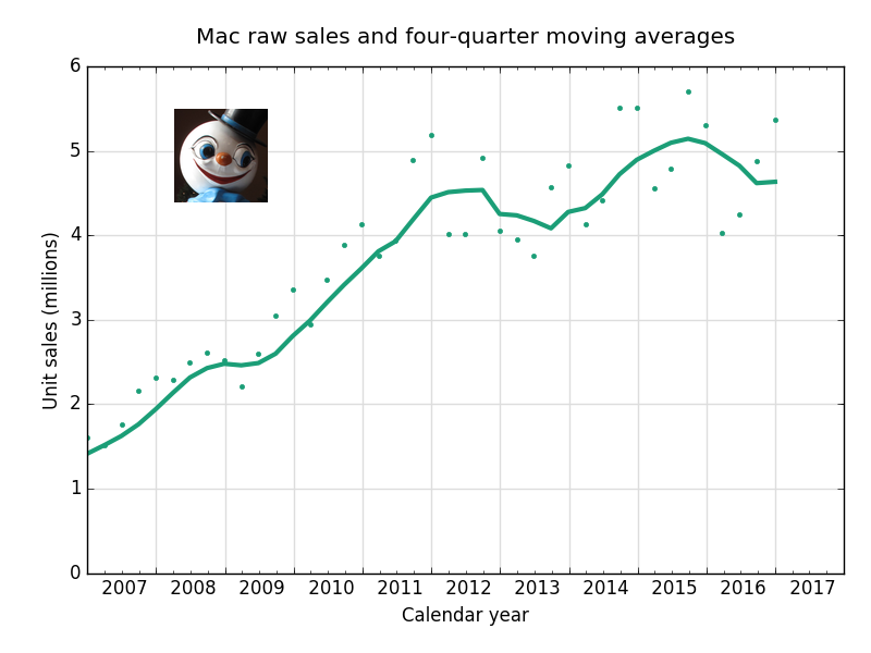
The Mac is up a bit, halting a yearlong downward trend. You can’t really see what’s going on with the Mac in the chart above because it’s dominated by the iPhone. Here’s a better one:

Amazing how sales improve when you actually introduce new models, isn’t it?
I may need to get out of the Apple graphing business. Jason and Federico are competition enough. Now this:
Breaking:
— Merlin Mann (@hotdogsladies) Jan 31 2017 3:22 PM

