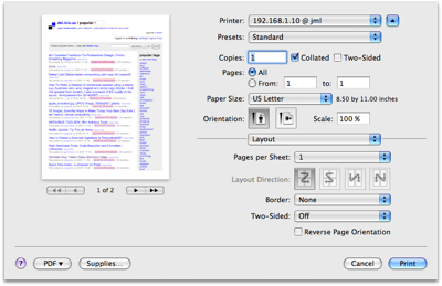
Leopard print dialog
November 9, 2007 at 10:12 AM by Dr. Drang
I like the new layout for the Print dialog in Leopard. The first time you use it, you’ll be shocked at how tiny it is.

To me, this little dialog—like the small version of the file open dialog—is almost useless. But a click on the reveal triangle near the upper right corner presents the full print dialog in all its glory (click on the thumbnail to see it full-sized).
It’s huge, but every part is useful. There’s a small preview on the left side (if the application supports previews—Safari does, TextMate doesn’t), the usual printers, copies, and pages choices are in the upper right quadrant, and the less-used options like Layout, Paper Handling, and Paper Feed are in the lower right quadrant, controlled by the popup menu centered in the dividing line.
The preview area is great, especially in Safari, because I can now instantly see how many printed pages the web page is going to turn into, and see which printed pages will have real information and which have nothing but boilerplate menus and copyright notices. Less wasted paper.
Keeping the copies and pages choices always visible was a good move. In Tiger, Copies & Pages is one of the option sets controlled by the popup menu, so it disappears when you go to change one of the other options. Maybe it’s just me, but I often found myself flipping back and forth between Copies & Pages and the other option sets. Now there’s no more flipping.
The Page Setup menu item is gone, and I don’t know where its features have moved to. I didn’t often need to create a different paper size, but when I did Page Setup was where I did it. I’ll have to do some more poking around.

