
Why are Safari's tabs upside-down?
June 11, 2009 at 10:30 AM by Dr. Drang
When Apple introduced the final version of Safari 4 at WWDC on Monday, the sighs of relief nearly blew out the windows of the Moscone Center. They put tabs back where they belong. That they did, and I’m happy about it, but they also emphasized the fact that Safari’s tabs are upside-down, and I don’t understand that at all.
No doubt you recall the tab controversy when the beta of Safari 4 was released. The tabs were moved from just above the content area into the titlebar, a la Google’s Chrome. The change looked ugly and forced the user to be more careful in where he clicked and dragged. Most people didn’t like the changes, and neither did I.
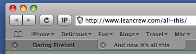
The newly released Safari 4 puts the tabs back where they were in Safari 3, but there have been some curious design changes. Here’s what tabs looked like in Safari 3:
And here’s what they look like in Safari 4:
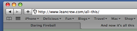
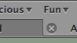
In both cases, the tabs look like they’re attached to the bookmarks bar above them because they share a common background1. In Safari 3, the sides of the tabs are nearly straight, which make them look sort of like a set of rectangular buttons. You can see in a magnified view that there is some curvature at the bottom, but it was subtle enough that I never paid any attention to it.
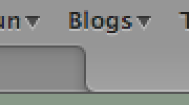
In Safari 4, the curves at the top and bottom have been made quite distinct and it immediately struck me that the tabs were upside-down.
Usability certainly isn’t affected by this, but it is odd. Physical tabs are always attached to the content,
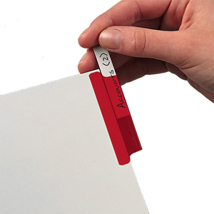
or to dividers between sections of content,
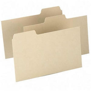
which would suggest that Safari’s tabs should be drawn the other way (and should have a line across the top). There’s no real justification for having the tabs attached to the bookmarks bar.
Apple spends a lot of time thinking about physical analogies and the intersection of graphic design and usability, so I’m sure there’s a reason. But what is it?
-
If you have the bookmarks bar hidden, the tabs look like they’re attached to the toolbar; if you also have the toolbar hidden, they look like they’re attached to the titlebar. ↩