A new Twitter SSB
June 12, 2010 at 9:13 PM by Dr. Drang
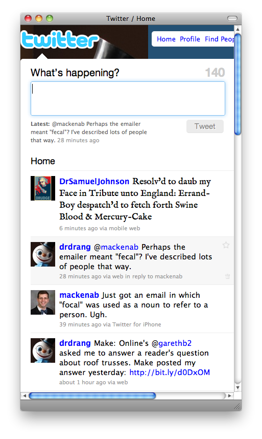
With the coming requirement to use OAuth to sign on to Twitter, I’ve had to abandon my Dr. Twoot client program and have shifted to a new Fluid-based SSB of the Twitter home page. I’m using a userscript to reformat the page and make it narrower.
Two reasons I couldn’t adapt Dr. Twoot to OAuth:
- I’ve read in several places, including in Twitter’s developer pages, that JavaScript isn’t appropriate for OAuth because it exposes certain tokens that are supposed to be secret. Dr. Twoot is written in JavaScript.
- As important, I just can’t find an OAuth tutorial that I understand. Everything I’ve seen is all about Consumers and Users and Providers and getting credentials from one site to use on another. I’m not interested in any of these two-cushion internet bank shots; I just want to log in to one site and use it.
So, barring a last-minute change in Twitter policy, Dr. Twoot will stop working at the end of the month. I’ve looked into other Twitter desktop clients, but haven’t found any I like. I’m dead set against installing Adobe Air on my computer, which cuts down the number of available applications considerably. I tried Tweetie, but for some reason it isn’t nearly as compelling on the desktop as it is/was on the iPhone. I liked the customization options of Kiwi, but didn’t like any of the themes that came with it. I didn’t want to buy an application and then spend a bunch of time programming just to get an acceptable look.
Which led me to Fluid. In a minute I had a new application—called, with a certain lack of imagination, Twitter—that was a site-specific browser for the Twitter home page. It didn’t have the look I wanted, but I eventually hammered out a userscript that gave me a nice narrow view of the timeline that I could keep over by the right edge of my screen.

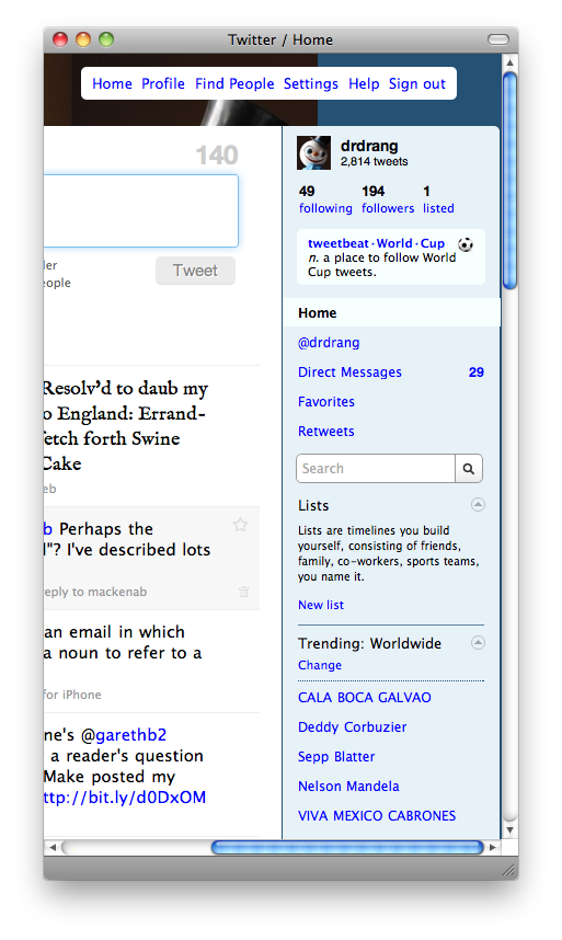
The sidebar is still available by scrolling to the right.

As you can see, I made the tweet input area taller and added the IM Fell font for rendering @DrSamuelJohnson’s tweets. Less obvious, maybe, is that I’ve boosted the font size and the line spacing a bit to make all the tweets more readable.
I knew from my earlier Twitter userscript that the Twitter home page loads jQuery, which should have made the reformatting easy. Unfortunately, the layout of the Twitter home page is a mess. You’d think it would be clean and simple: there’s a background image, a header, a footer, and a two-column content area—not much more complex than this site, really. But the HTML of the Twitter home page is a nightmare of <div>s within <div>s. Some contents are allowed to spill out of their containers, others aren’t. The two columns that make up the main portion of the page comprise a one-row <table>, which has a very 1990s vibe.
My first experiments in narrowing the timeline were very frustrating. Everything I tried that should have worked didn’t. I started Googling to see if anyone had solved this problem before me.
As it happens, there’s a userscript called Endless Tweets by Mislav Marohnić that, among many other things, very cleverly reformats the Twitter page to a narrow layout when the user resizes the window to a small width. I didn’t want to use Endless Tweets itself—it had some minor rendering problems in my tests—but it gave me hope that I could get the timeline narrowed if I just kept at it.
Success eventually came when I opened the Twitter home page in CSSEdit, a seldom-used (by me, anyway) application that came with the MacHeist 2 bundle, and started playing around with the widths of various elements. I kept track of the tests that worked and incorporated them into my userscript. Here it is:
 1:  // ==UserScript==
 2:  // @name        twitdrang
 3:  // @namespace   http://fluidapp.com
 4:  // @description Makes Twitter narrower.
 5:  // @include     *
 6:  // @author      Dr. Drang (http://www.leancrew.com/all-this/
 7:  // ==/UserScript==
 8:
 9:  function getIMFell() {
10:    $("head link:last").after('<link href="http://fonts.googleapis.com/css?family=IM+Fell+English" rel="stylesheet" type="text/css">');
11:  }
12:
13:  function twitdrang() {
14:    $("#container").css({'width':'600px'});
15:    $("#header").css({'width':'600px'});
16:    $("div#wrapper").css({'width':'400px'});
17:    $("#side_base").css({'width':'200px'});
18:    $("ol.statuses li").css({'width':'400px'});
19:    $("fieldset.common-form").css({'width':'400px'});
20:    $("#update_notifications").css({'width':'250px'});
21:    $("ol.statuses span.status-body").css({'width':'300px'});
22:    $("fieldset.common-form textarea").css({'width':'375px'});
23:    $(".actions-hover li").css({'width':'20px'});
24:    // $(".actions-hover .reply").css({'float':'right'});
25:    // $(".actions-hover .retweet-link").css({'float':'right'});
26:    $(".actions-hover .retweet-link a").css({'display':'none'});
27:    $(".actions-hover .reply a").css({'display':'none'});
28:    $(".actions-hover .retweet-link a").css({'display':'none'});
29:    $(".actions-hover .del a").css({'display':'none'});
30:    $("ol#timeline .status-content").css({"font-family": "Lucida Grande", "font-size": "15px", "line-height": "1.3"});
31:    $("textarea#status").css({"line-height": "1.4", "height": "4.2em"});
32:    $("li.u-DrSamuelJohnson span.entry-content").css({"font-family": "IM Fell English", "font-size": "120%"});
33:    $("li.u-DrSamuelJohnson.latest-status span.entry-content").css({"font-family": "IM Fell English", "font-size": "175%"});
34:  }
35:
36:  if (window.fluid) {
37:    getIMFell();
38:    twitdrang();
39:  }
40:
41:  $(window).scroll( function() {
42:      twitdrang();
43:    });
If you’re interested in a narrow Twitter SSB, follow the Fluid instructions to make an application that points to http://twitter.com, and then add this to the Userscripts folder. I call it twitdrang.user.js, but you can name it whatever you want. If you’re reading this well after the day it was posted, you should look at the twitdrang GitHub repository because it’ll have the latest version.
You may find that any time you post a new tweet, or update the timeline by clicking the “xx new tweets” link, the new tweets will not be formatted to the narrower width. That’s because those events don’t trigger the userscript. I haven’t yet figured out how to get that to work, so in the meantime there’s a kluge. See Lines 41–43 in the code above? They cause the reformatting function to be run whenever the window is scrolled. So if you just wiggle the scrollbar after the new posts arrive, they’ll narrow themselves down just like the others.
