Safari text rendering problem
June 28, 2010 at 1:15 PM by Dr. Drang
I’ve been noticing recently that text is sometimes rendering poorly in Safari. At first, I thought it was deteriorating eyesight. Then I thought it was the Retinal display on my iPhone causing me to see pixels on every other screen. but now I’m sure there’s something else going on.
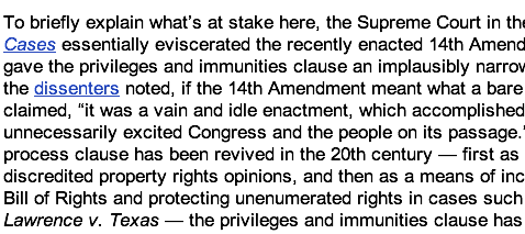
The problem seems most common when I’m reading RSS feeds in Google Reader. Reader uses a smaller font than I like, so I bump up the font size one step with ⌘+. Here’s a snippet of a post1 that rendered poorly earlier today but then rendered well when I returned to it later. The screenshot starts with the bad version and shifts to the good version when you roll your mouse over it.
Do you see the difference? Look in particular at the word “enactment” near the center of the image and at the two links. Once you see the difference in those places, you’ll start seeing it everywhere. Everything is just a little more pixelly in the bad version. It doesn’t seem like much, but it wears on you when reading long passages.
I don’t know what’s going on here. Obviously, the text isn’t always rendered poorly—otherwise, I wouldn’t have been able to get the “good” screenshot—but it happens often enough to be noticeable.
I haven’t noticed this in any other program, just Safari. I can’t say it definitely started with the recent upgrade to Safari 5.0, but that’s my suspicion.
Update 6/29/10
My suspicion was wrong.
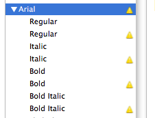
I’m pretty sure now the problem was an extra copy of Arial. I went into Font Book and saw the little yellow caution signs by all the Microsoft core fonts, indicating duplicate copies.

I used the Select Duplicated Fonts and Resolve Duplicates commands in the Edit menu, and the fuzzy text problem hasn’t arisen since.
Honestly, I’m sure I’ve removed duplicates of these fonts before; I don’t understand why they came back.
This was obviously a system-level problem and had nothing to do with Safari per se. Safari was the only application I saw it in because it’s the only application that uses Arial or the other MS core fonts.
Update 6/29/10
My belief that my suspicion was wrong…was wrong.
The duplicate fonts are gone, but the crappy looking text is back. Sometimes reloading the page fixes the problem, sometimes it doesn’t. I’m confused and annoyed.
-
From Lawyers Guns and Money. ↩

