Elements v. Simplenote, Round 2
August 31, 2010 at 10:48 PM by Dr. Drang
Last night, I was going to write a post comparing Simplenote to Elements. I’d already written a brief comparison of the two, but that was before the release of Simplenote 3. It seemed only fair to take into account the improvements in it.
But instead of writing the post, I got hooked on watching YouTube videos, and pretty soon the evening was gone. That turned out to be a lucky break, because when I opened iTunes today, I found that Second Gear had just done a small update to Elements. So now I can compare the latest and greatest of both apps.
If you’re the impatient type, here’s the bottom line: although I haven’t deleted Simplenote from my iPhone, I’ve stopped using it. All my notes are done in Elements now.
Simplenote
The primary new features in Simplenote 3 are:
The tagging of notes. A little flag/button appears at the top of each note, allowing you to add tags to that note for later searching. I have really no interest in this. To me a good title beats a set of tags any day.

A fullscreen viewing option. This is pretty cool; it gets rid of the top and bottom toolbars (or whatever they’re called) and lets you see a few more lines of the file.

That light floating button in the lower right takes you back to normal view.
Note statistics. Elements already had this, and it’s an easy to implement, so it seemed inevitable that it would come to Simplenote. Oddly, it only gives the character and word counts—no line count.

These additions don’t address the downsides of Simplenote I mentioned in my earlier comparison:
- Its own syncing solution, which forces you to use either a web browser or a restricted set of applications when you want to access your notes from a computer.
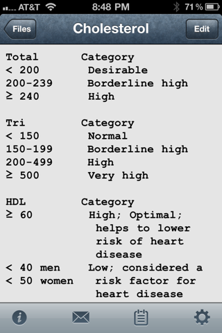
- No option for a monospaced font. Some text files are just better suited for display in a monospaced font.
Elements
The big change in Elements is that you can now use any font on the iPhone, not just the “Roman” versions. I immediately switched from Courier to Courier Bold. The font looked ridiculously thick at first because I’d gotten used to the spindly look of plain Courier, but now it seems OK, especially when combined with the Silver background.

There’s no question I’d prefer a nice sans serif monospace font, but unless there’s a way for Second Gear to package a font with the app, we won’t see a really good looking monospaced font in Elements until Apple gives us one.
Elements is not without its problems.
- The color choices for the text and background are, for the most part, ugly and don’t match either of the toolbars.
- It doesn’t recognize phone numbers in the notes and turn them into links to the Phone app.
- The enormously long list of fonts for displaying the notes could be organized better, allowing you to start by choosing a font family and then choosing a style—like every other program you’ve ever used.
These problems, though, don’t come close to outweighing the great simplicity that comes from Elements’ Dropbox syncing. I can use any text editor on my computer to create a file, save to the special Elements folder within my Dropbox folder, and it’ll be available in Elements on my phone in a minute or two. And for files edited in Elements, the syncing is just as automatic in the other direction.
Wrapup
As I said in my initial comparison, the two things that set Elements apart from Simplenote are:
- The text editor freedom provided by Elements’ Dropbox syncing.
- The ability to use a monospaced font to align columns in certain files.
That Elements can now display its notes in a font that actually looks black instead of light gray is just one more step ahead of Simplenote.
It’s true that Elements is $5, whereas Simplenote is free, but if that’s your overriding consideration, you might want to reconsider your priorities.
