Google spreadsheets on the iPhone
September 4, 2010 at 8:17 AM by Dr. Drang
I’ve mentioned before my general dislike of spreadsheets, but if the data set isn’t especially big and the calculations not especially complex, a spreadsheet can be a really useful to organize data.1
I use, for example, a Google spreadsheet to keep track of my bicycling miles. I did it as a Google spreadsheet instead of in Numbers mainly because it seemed like an interesting tool and I wanted to try it out.
I’ve been happy with the way it works and there’s been an unexpected benefit: I can see and edit the spreadsheet from my phone, which allows me to update it while I’m still standing next to my bike and haven’t yet forgotten the odometer reading. This is a big advantage when you’re 322 and you start walking into rooms forgetting why you went there.
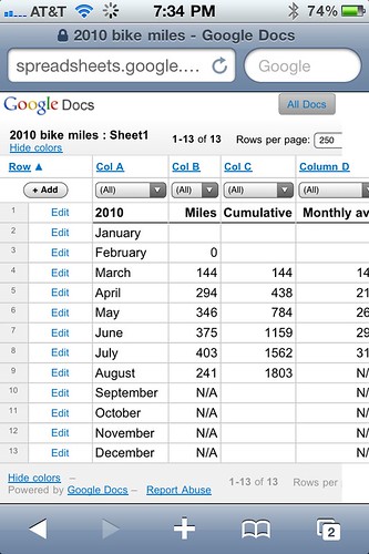
As you might expect from a Google product, spreadsheets have some weird user interface “features” when viewed on your phone. First, the gray background above and below the cells doesn’t extend the full width of the screen.

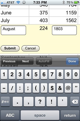
Then there are the links that appear to the left of the first column and above the top row. The Edit links are easy to figure out; tapping one turns that row into an HTML form. Only the cells not governed by formulas become editable fields.

The Submit button, though, doesn’t work in the expected way. The word Submit has for years had a special meaning in HTML forms: clicking it processed the data in the form. Traditionally, this meant sending the data back to the server to be handled by a CGI script; nowadays, the work could be done locally in JavaScript. By that convention, one would expect in this case for the spreadsheet to be recalculated. Not so. All that happens when you click Submit in a Google spreadsheet is that the data are “entered” in the cells. To recalculate the spreadsheet, you must reload the page.
By the way, you don’t need to tap the Edit link to edit a cell—you can just tap on the cell itself, as you would expect. But when you do that, the form appears as shown above and the cursor is in the first editable cell of the row, not the cell you tapped on. In my speadsheet, I’m always tapping on the Cumulative cell of the current month and finding the cursor flashing in the cell with the month name.
The behavior of the Col A, Col B, etc. links above the columns isn’t as obvious as the that of the Edit links. The little triangle next to the Row link in the upper left corner is the clue; these links cause the sheet to be sorted according to the values in the corresponding column. Repeated clicking changes the sort from ascending to descending and back again. Obviously, this is not something I want to do in my biking spreadsheet, so I do my best to avoid tapping those links by mistake.
Why aren’t these links named Sort instead of Col? Because it’s Google.
Another thing that’s weird about viewing this sheet on my iPhone is that it seems to want to be zoomed in all the time. Double-tapping, which usually toggles between zoom in and zoom out, doesn’t work. I’m not sure whether Google or Mobile Safari is to blame for this.
All in all, it’s great to have access—and, more important, editable access—to a spreadsheet from my phone. The user interface oddities aren’t dealbreakers. They’re just kind of what I’ve come to expect from Google.
