Too nebulous
November 13, 2010 at 7:48 AM by Dr. Drang
If you search around in the App Store for an iOS text editor with Dropbox support, you’ll come across Nebulous Notes, a 99¢ app with an impressive list of features. I gave it a try and found the app itself much less impressive than the list.
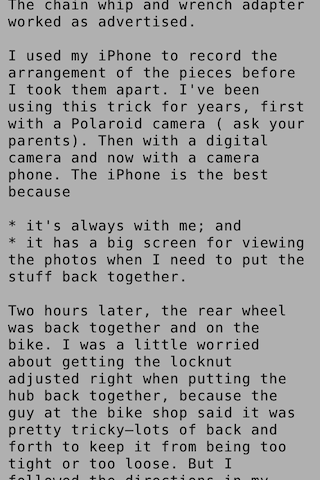
Not that there aren’t some really good things about Nebulous Notes. The best by far is its inclusion of two good-looking monospace fonts, Bitstream Vera Sans Mono and Lucida Console, to complement the ugly—and not even truly monospace—Courier that’s built into the system. This is something I’ve been agitating for in Elements, and when I first saw Vera Sans Mono in Nebulous I thought I’d found what I’d been hoping for for months.
Back in the days when Inside Macintosh ruled the Apple programming world, there was a way for developers to ensure that certain fonts were available for their applications: they could include them in the resource fork of the app. I don’t know if a similar thing is possible with iPhone apps, but I’d jump to a note-taking app that had easy online syncing and a decent monospaced font.
Nebulous Notes has a full-screen mode that shows off how clean Vera Sans Mono looks on an iPhone:

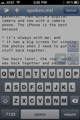
(Nebulous has a screen brightness control that I was experimenting with when I took these screen shots; the background isn’t normally this dark.)
Unfortunately, after the excellent decision to include good monospaced fonts, Nebulous’s developer made a series of poor user interface choices. It has “ghost buttons” that appear only if you tap in the lower right corner.

I can understand putting the full screen activation in a ghost button—Simplenote does that, too, and it’s necessary for the complementary full screen deactivation function—but there’s no reason for the settings and email buttons to be hidden away like this.
Also, if you study that screenshot for a bit, you may wonder where Nebulous has put the button to dismiss the keyboard. I wonder about that, too. As far as I can tell, the only ways to dismiss the keyboard are to either go to full screen mode or to close the file and return to the file list. This is really annoying, and would drive me crazy if I were using Nebulous regularly. I can’t think of any other app that works this way.
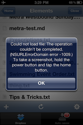
The worst characteristic of Nebulous Notes, though, is hinted at in its name. As I was editing files, I noticed the spinning network activity gear kept appearing in the status bar. Why is it saving out to the cloud so often? I wondered. I closed the file I was editing, put the phone in Airplane mode, and tried to reopen the file. Nebulous refused:

Nebulous Notes doesn’t keep a local version of your files on the iPhone. It takes the idea of the “cloud” a step too far, making it unusable on an airplane or any place where network connectivity is poor. I was almost offended by this. The whole point of Dropbox is that it gives you both a local copy and a cloud copy of your data, syncing the two when it can. Having only a cloud copy seems like a violation of the Dropbox ethos.
This was the dealbreaker. I might be able to live with an editor that makes me jump through hoops to dismiss its keyboard, but I absolutely can’t live with one that won’t let me get at my files when I’m disconnected from the network.
