Ads in a paid app - New Twitter for iPhone
March 3, 2011 at 9:15 PM by Dr. Drang
A tweet from Adam Turetzky (@turkchgo) this afternoon directed me to this disapproving review of the new official Twitter app for the iPhone from Audrey Waters at ReadWriteWeb. The key paragraphs are
But there’s an addition to the app that Twitter describes as “very cool” that I find much less so. It’s a Quick Bar, and it appears aat the top of your timeline. The Quick Bar highlights what’s currently trending on Twitter, and you can swipe the bar in order to see additional topics.
and
Although the Quick Bar is no more intrusive than a lot of ads you’ll find in mobile apps, I’ll admit, it’s annoying. It hovers at the top of your timeline, no matter where you scroll. You can’t turn it off.
This sounded awful. Trending Topics has become a mixture of advertising (via Promoted trends) and the lowest of lowest common denominator noise. If I wanted to know what’s happening on American Idol, I’d turn on my TV and watch it.
The stupidest part of Twitter is Trending Topics, and now I’ll be forced to look at it all the time?
http://rww.to/hJbyqR
(h/t @turkchgo)
I decided, though, that I should at least give it a try—maybe it’s not as obtrusive as Waters suggests. So I installed it about an hour ago by downloading it directly to my phone through the App Store app. I figured if it was really awful I could delete it from the phone and reinstall the older version from iTunes.
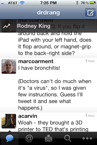
Here’s what you see whenever you open your home timeline:

The Quick Bar translucent overlay with one of the current Trending Topics sits just below the title bar. If you flick the Quick Bar to the left or right, another Trending Topic will appear. The thin horizontal line that runs across it is a clue to its animation style. The Bar “flips” like a mechanical sign—it’s mimicking the way some digital alarm clocks and arrival/departure boards at airports used to work. Given that your finger is moving sideways and the “sign” is flipping vertically, the metaphor is broken
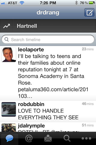
But a broken UI metaphor isn’t my main complaint. The real problem here is being forced to see something I have no interest in. On the bright side—and something that wasn’t mentioned in Waters’ article—the Quick Bar disappears whenever you scroll even the slightest amount and retreats up to a spot just above the search bar.

That makes it less annoying than I first thought. Unfortunately, the Quick Bar comes back as an overlay every time you return to your home timeline, even if you’ve just gone to check your @Replies and haven’t done a refresh.
This wouldn’t bother me so much if I were new to the app. The Twitter app is free, after all, and it seems small and whiny to complain about promotional features in a free app. But it wasn’t free to me. I bought the app back when it was Tweetie—in fact, I bought it twice: first when it was Tweetie 1 and then again when it became Tweetie 2.
I wasn’t one of the assholes who complained about the second purchase, but I am going to be one of the assholes complaining about the Quick Bar. I’ll be reverting to the previous version tomorrow and muttering vile imprecations against Loren Brichter every time I update apps and have to tiptoe around the Tweetie update.
Update 3/6/11
Version 3.3 has become the turd in Twitter’s punchbowl. As I type this, the App Store has 2205 reviews of the iPhone app and 1480 (67%) of them are 1-star.
On Friday night, John Gruber renamed the Quick Bar:
Reverted iPhone to two-day-old backup to restore Twitter 3.2 (pre-Dick-Bar).
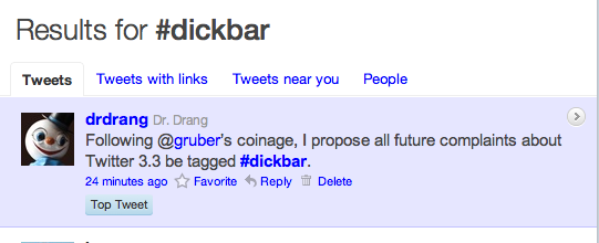
I turned this into a hashtag, Gruber retweeted it, and I became, briefly, a Top Tweet.

Since then, #dickbar has become a thing. My favorite response is this JavaScript code from Mark Beeson (@m242) at encodedrecords.com, which puts a dickbar at the top of any web page. If you’re reading this on the “single post” page instead of the main page of the blog, you can see it in action.
As Mark says:
Simply insert this Javascript at the end of your page, and you too can see a constant display of #inanehashtags, this week’s terrible movie release, and random jabberings of popular culture that don’t interest you or your users in the least.
Here’s the code:
<script type="text/javascript" src="http://encodedrecords.com/dickbar/dickbar.js"></script>
I made a local copy of Mark’s code and customized it a bit. First, it’s restricted to appear on just this particular post. Second, instead of the Daring Fireball symbol, ✪, it uses ∀, the mathematical symbol meaning “for all,” a more appropriate symbol for this site.


