Best laid CSS plans
April 29, 2011 at 9:49 PM by Dr. Drang
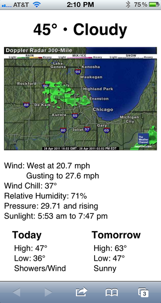
I’ve been pretty happy with the simple little weather webapp I made the other day. Yesterday I took some ideas from Ben Brooks’ fork of it, a bit of JavaScript from Remy Sharp and came up with this (a composite image from two screenshots):

Eliminating the word “Temperature” from the top header was Ben’s idea, as was the side-by-side forecast arrangement. The JavaScript I took from Remy is apparently one of the standard ways to get the address bar out of the way, leaving more room for content. I decided to put the current condition up in the header with the temperature and move the radar map up above the other text. Now the info I’m usually most interested in is at the top.
I was a bit worried about the font size of the top header. Would everything fit on one line if the conditions changed to something like “Thunderstorms”? I figured I’d wait and find out; thunderstorms are pretty common in spring.
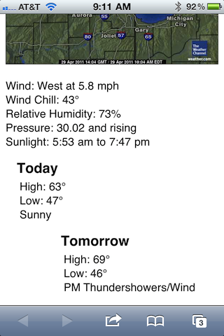
What I didn’t expect—although I should have—was how a long forecast line could mess up the side-by-side formatting. Here’s what I saw on my phone this morning:

Crap. “PM Thundershowers/Wind” is way too long for a side-by-side arrangement, especially if both forecasts have a line that long. So I went back to the sequential arrangement, with Tomorow’s forecast under Today’s. It’s not as cool looking as side-by-side usually is, but it’s more robust.
And I’ve reduced the font size in the top header a little, hoping that will prevent an ugly line wrap in the future. Tomorrow should be a good test if we get that predicted thunderstorm.
