The View-Master user interface
June 12, 2013 at 12:37 AM by Dr. Drang
Since yesterday’s preview of iOS 7, several smart things have been written about the new user interface. I don’t want to plow the same ground, but I do want to talk about the Parallax feature.
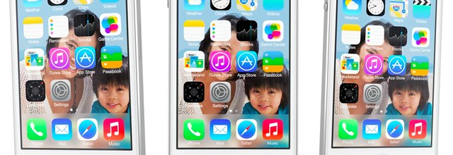
Parallax is the animation effect that shifts the background image as you move the phone, making it look as if the background image is actually some distance behind the screen surface. I can give you some screenshots, but the effect really needs to be seen in the video to appreciate it.
Despite all the talk of flatness—and there’s no question, the icons and certain other parts of the UI are much flatter—this gives iOS 7 as a whole a greater illusion of depth than it ever had before. The shadows and reflections of today pale in comparison. If Apple can enforce, or at least encourage, a consistent use of this new depth, our experience using iOS devices will improve because the software will seem even more physical.
It may seem as if this bucks the current anti-skeuomorphic trend, but it doesn’t. Skeuomorphism is giving an object a non-functional ornamentation that mimics the functional feature of another object. The much-derided green felt of Game Center and the stitching and leather of Calendar are examples because they don’t do anything. Parallax’s illusion of depth, if handled well, will do something: it will organize iOS’s increasing complexity in the mind of the user.
Most of us are better at manipulating physical objects than abstract concepts. If our software objects are given a more physical-seeming “place,” we’ll be better at using them.1 We see this in gestures like swiping and pinching. If the interface responds quickly enough to follow our fingers, it feels more realistic and we find it easier to use. In fact, we don’t even think about our actions; we just do them because they feel natural. I think the new depth—if handled well and consistently—will work the same way.
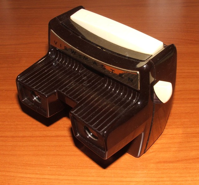
When I saw the Parallax effect in the iOS 7 video, I immediately thought of the View-Master I had as a kid. In a View-Master, the illusion of depth comes from your eyes presented with slightly different images. The same scene, but presented from slightly different angles.
Some of the View-Master discs I had were of real places, like Disneyland or the Grand Canyon, and the trick of making those discs was to photograph the scene from angles that reproduced in the View-Master the subject’s true three-dimensionality. But I also had discs with cartoon characters that were neither real nor three-dimensional. In these discs, the illusion of depth was created by photographing, from two different angles, a drawing of, say, Huckleberry Hound on a transparency that was held above a background image.2 It didn’t matter that both Huckleberry and the background were flat—I saw the depth between them and it seemed much more real than looking at a picture book or watching TV. Parallax in iOS will have the same effect, even though the icons themselves may be as flat as a pancake.
There was nothing like Parallax in the preview of OS X Mavericks, and for good reason: OS X displays don’t move. If you’re one of those people who worry about the iOSification of the Mac, you can rest assured that Parallax won’t be ported over anytime soon. Not until Apple adds a Kinect-like way to track your head movement, anyway.
-
Cue John Siracusa and his argument for the Spatial Finder. ↩
-
I believe it was done sort of the way Disney used multiple planes in its classic animated movies, only much cheaper and simpler. ↩


